
re-designing a responsive website to help communicate a Charity’s mission
Individual | Concept | Jan 2021 | 1 weeks
Role: UI Designer
Tools: Figma, Google fonts
ZYBN is a charity which works with the youth of Zimbabwe, engaging them in policy change through workshops and events to improve the protection of the local biodiversity. Their current website was in need of some serious revamping as it lacked branding throughout and failed to communicate their values and mission goals.
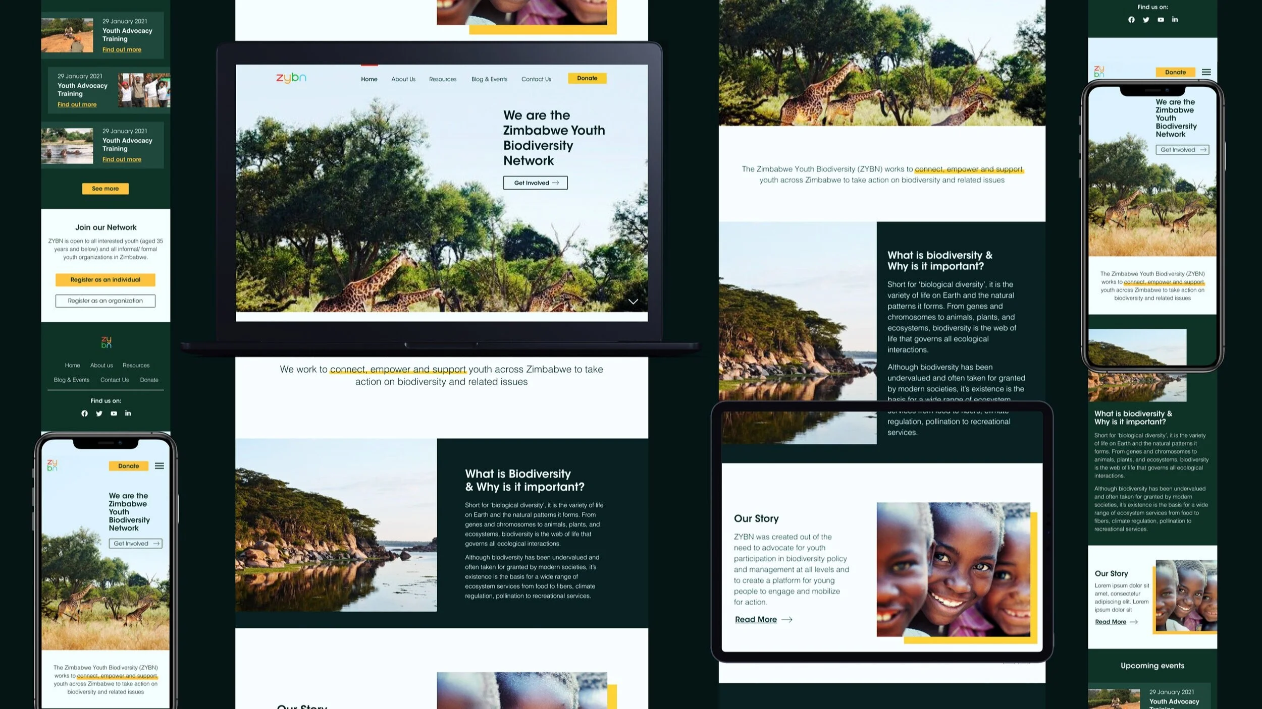
In this week-long design journey, I took a deep dive into ZYBN's user interface; tackling various visual design problems to improve their overall user experience across three different devices.
The Story (In Short)
problem
ZYBN’s existing site didn't reflect their goals or values. Visually, it was dumping ground of content which didn't do justice to the brand's mission. There was a significant lack of visual identity, content structure and information architecture. It brought more confusion than coherency.
3. solution
In conducting research through creating mood-boards and testing various design solutions I was able to redesign the site through its photography, typography, colour and composition.
2. insight
Through conducting an in-depth UX & UI audit and heuristic evaluation I was able uncover ZYBN’s core values; youth, community & biodiversity. To create a strong digital presence these values needed to be at the centre of their new branding and visual identity.
4. outcome
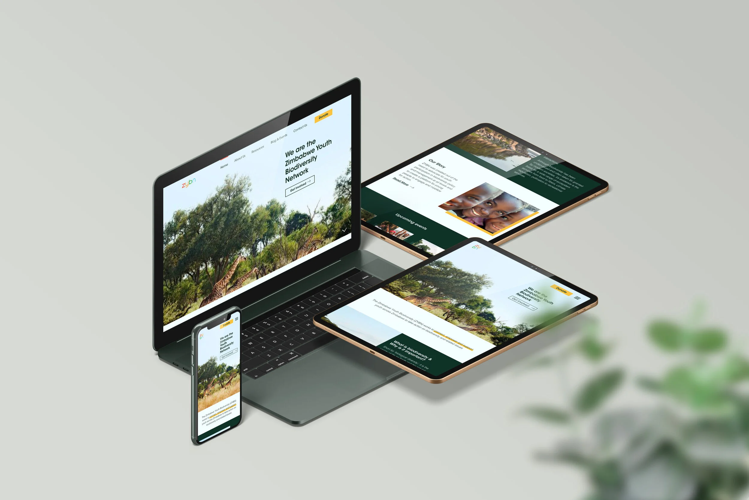
In the end, I was able to improve the overall user experience by re-design the user interface of the website across three different devices; phone, tablet and desktop. I did this by creating a brand identity which represented ZYBN’s values in a harmonious and balanced way.
ZYBN’s Mission
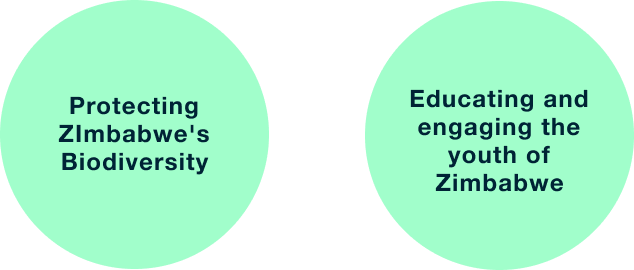
ZYBN wasn't like most charities. Most charities usually have one clear mission, ZYBN had two. This made things particularly challenging design-wise, as ZYBN's website and branding needed to represent two differing goals in tandem.
How I Helped
By conducting an extensive analysis of ZYBN’s existing website I was able to identify key problem areas, as well as identify what values and goals were central to their mission. Through creating mood-boards I was able to explore their values of youth, community & biodiversity further and understand how they could be expressed through key visual design elements. Eventually, this led to a detailed design system which incorporated ZYBN’s goals and values in a holistic way.
What I struggled with
Initially I struggled with visualising a brand identity for ZYBN as the charity had two differing goals: Youth/Community and Biodiversity. However, I was able to overcome this by exploring each value individually through creating mood-boards. I was able to understand how each value could be visually represented and find commonalities between them. This allowed me to envision a visual identity which represented the different sides of the charity in a balanced way.
What I Delivered
Responsive website which adapted to three different screen sizes; desktop, tablet and phone
Clear and organised content hierarchy and information architecture
Detailed brand personality framework & design system
Intuitive, balanced and harmonious user interface and branding
Continue reading to get the full story or
Analysing zybn’s existing brand
UX/UI Audit
My design process began with conducting a UI and UX audit of ZYBN's existing website. I used Jakob Nielsen's 10 usability heuristics as guide to analyse the site and identify key problems as well areas of improvement.
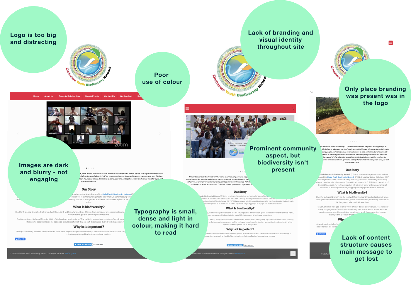
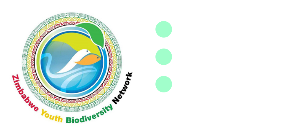
Analysing the Logo
Throughout the site there was a significant lack of visual identity. In fact, the logo was the only place that branding was present. Since this was the only clue I had regarding their brand, I decided to analyse the logo further.
The logo consisted of the following:
Analysing the photography
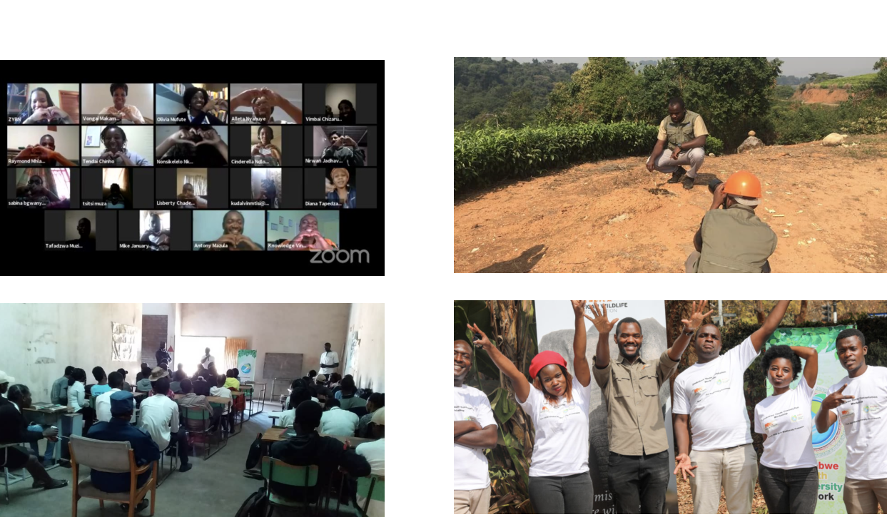
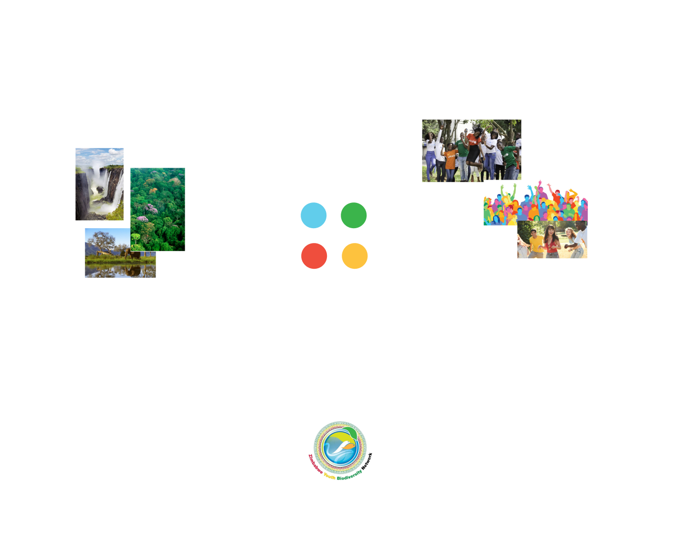
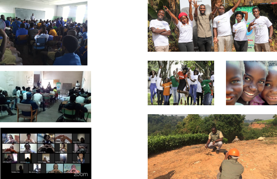
Whilst most of ZYBN's images were dark and blurry, they nonetheless showcased ZYBN's core value of community and youth.
But I found that the most engaging images on the site included people who were outside amongst nature and the local environment. Biodiversity needed to be more present in the site images as it brought colour and maintained attention.
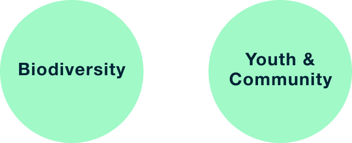
ZYBN’s Values
In analysing the site content, it was clear that the key values central to ZYBN's mission were:
The Design challenge
ZYBN’s values lacked presence throughout the whole site. Whilst youth and community were vaguely represented through the poor images on the site, biodiversity was not visually represented at all, it was only represented in the heavy blocks of text. As a result, the design challenge became clear:
“How can we make Biodiversity, Youth & Community central themes in ZYBN's branding and visually represent each of them in a balanced and holistic way?”
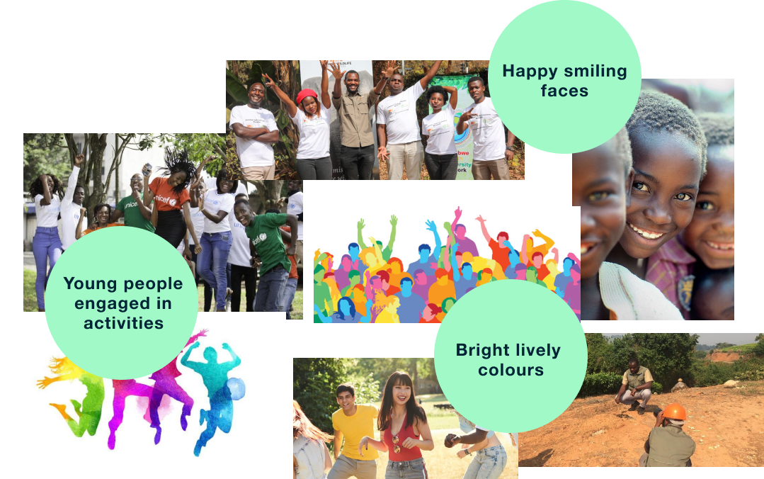
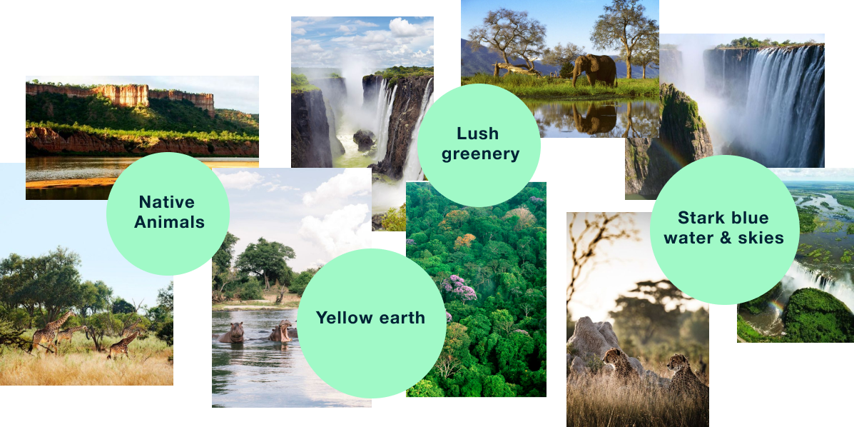
Developing the brand personality
Now that I had defined ZYBN's central values, I wanted to explore how they could be represented visually to create a brand personality. As a result, I began creating a mood-board of images which best represented the biodiversity, youth & community of Zimbabwe.
Finding Commonalities
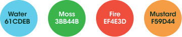
Throughout the mood-boards and ZYBN's images and logo, it was clear that blue, green, red and yellow were heavily recurring colours. Naturally, it made sense to have these colours represent ZYBN's new brand.
Getting Inspired
ZYBN's new brand colours represented their values in a balanced way but they didn't compliment each other well. I found it challenging to visualise a brand identity which incorporated these primary and secondary colours in a palatable way.
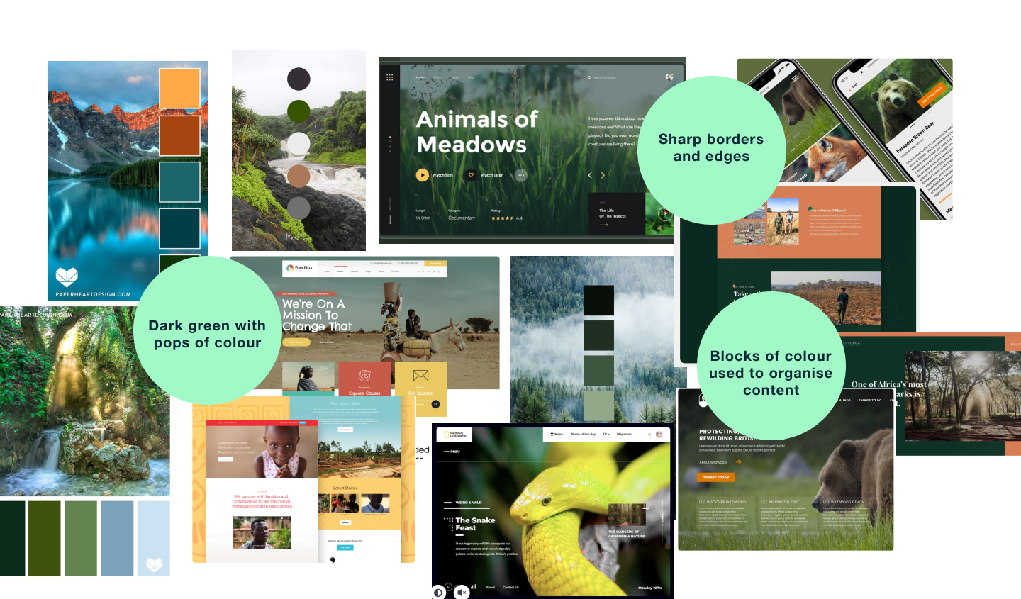
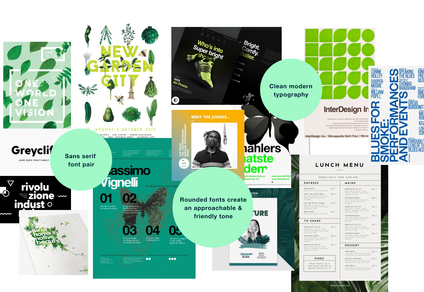
As a result, I began looking at various precedents, creating mood boards which explored composition, colour and typography; focusing on examples which incorporated ZYBN's brand values and colours.
Designing zybn’s brand
Having gained a clear understanding of how I could tackle ZYBN's design problem through the mood-boards, it was time to apply my learnings from my research to create a design solution.
Redesigning the logo
As part of ZYBN's rebranding I wanted to redesign their logo as it looked outdated and overly complex. It seemed like their existing logo was trying to convey too many ideas and as a result was very detailed - this was probably why it was so disproportionately big on the existing site.
It made more sense to simplify the logo so it could represent ZYBN in a clear and concise way, without taking up too much space.
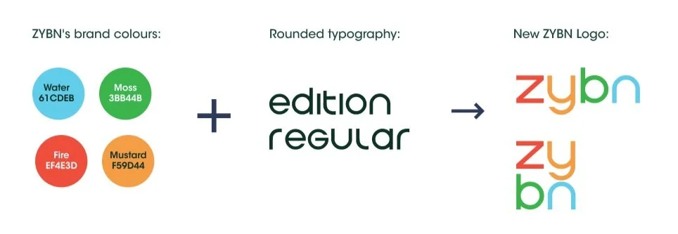
ZYBN's brand colours provided a balanced representation of community, youth and biodiversity as these were present in all the mood-boards as well as in ZYBN's old logo. I took these colours and applied them to a distinct rounded typography which further emphasised the friendly 'community-based' feel of the company.
Defining the colour palette
Looking at my mood-boards, I found that websites with primary and secondary colours applied the colours in very strategically. In controlling the shade, tone and proportions of these colours, these companies were able to create a balanced and harmonious interface which communicated their core mission. I needed to do the same to create a visual identity for ZYBN which represented its values of biodiversity, youth and community.
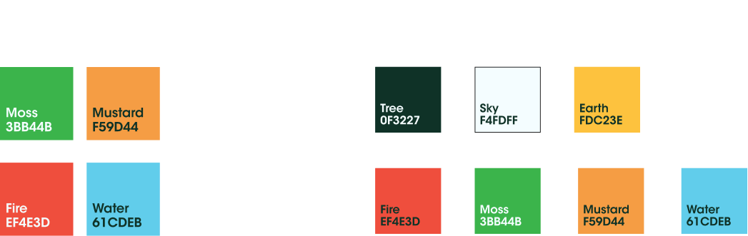
In the end, the colour palette consisted of ZYBN's brand colours which were adjusted in hue, tone and saturation to make them more compatible. These were then applied in a controlled manner throughout the site.
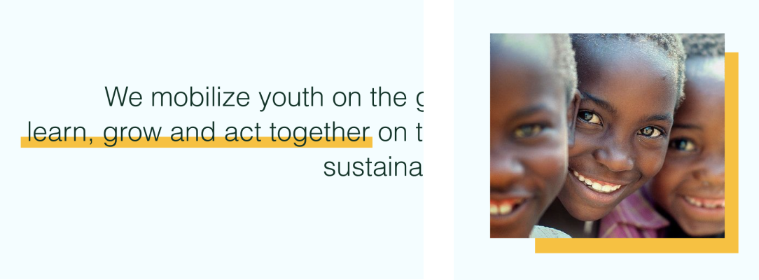
Refining the photography
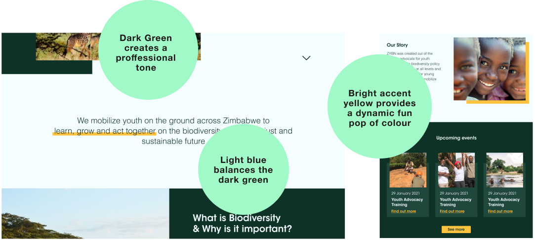
Taking note of the dark, blurry images on ZYBN’s existing website, I made sure to include colourful pictures of people in the website re-design, which were much more engaging.
An accent yellow was used sparingly to frame images and highlight key features and elements, this provided contrast and dynamism within the interface.
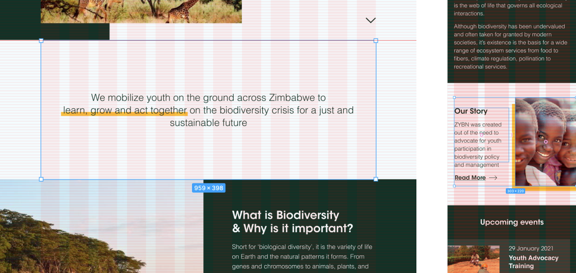
Organising the content
The neutral light blue was used as a primary colour to provide balance against the dark green. In alternating between the two colours, I was able to break up the content into digestible sections and improve its organisation.
Through utilising layout grids in Figma, I was able to make sure the website's content was organised in a cohesive manner. In doing so, I was able to keep the size and spacing of elements consistent throughout.
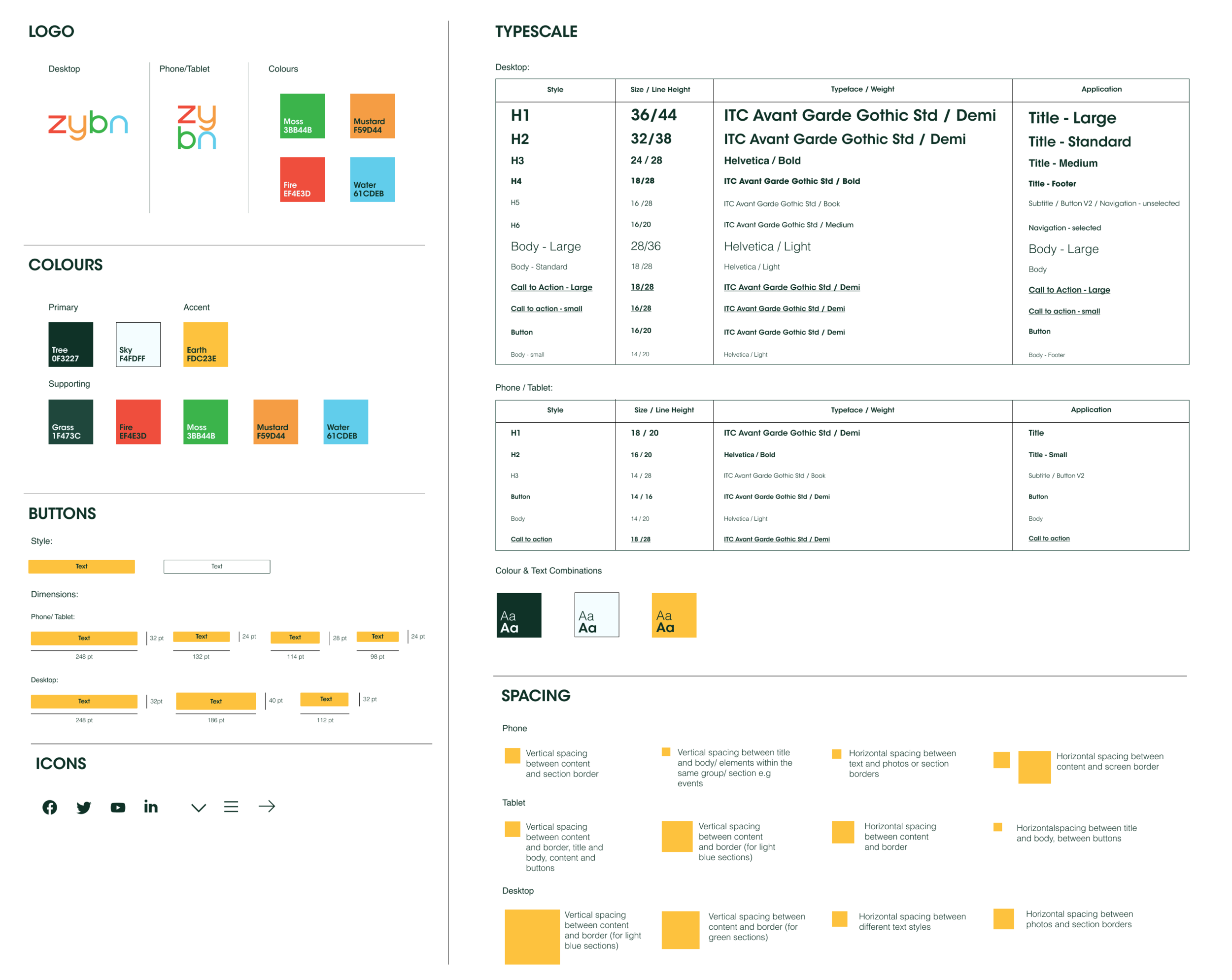
Style GUide
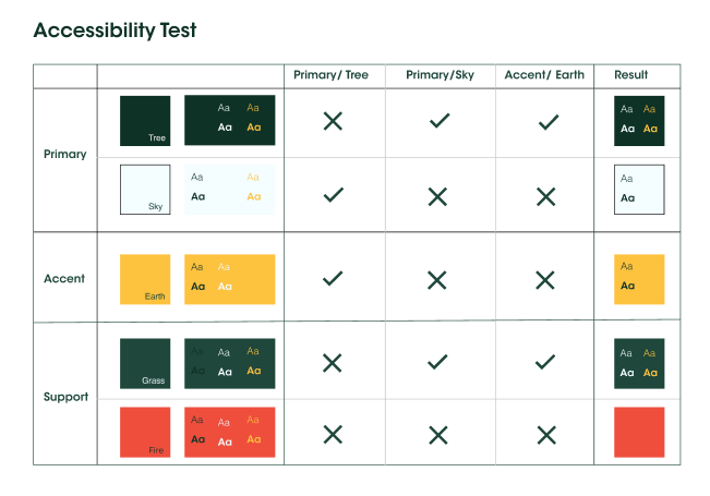
This led me to finalise ZYBN's design system. In this guide I was able to establish rules and guidelines for the brand identity I had created. This included standardisations for where to use certain colours, spacings and icons.
I was also able to finalise the use of colours as well fontstyles through conducting accessibility tests.
Take-aways
The whole design challenge was an exercise in creating balance between different visual design elements. I needed to create a harmonious and balanced brand identity. This involved refining the colour, typography and photography individually; whilst strategically applying them so that they worked together seamlessly and brought the best out in each other.
In this design journey, I learnt that being a designer is a balancing act. You need to be able to focus on the small details whilst keeping the bigger picture in mind to create a seamless user experience.