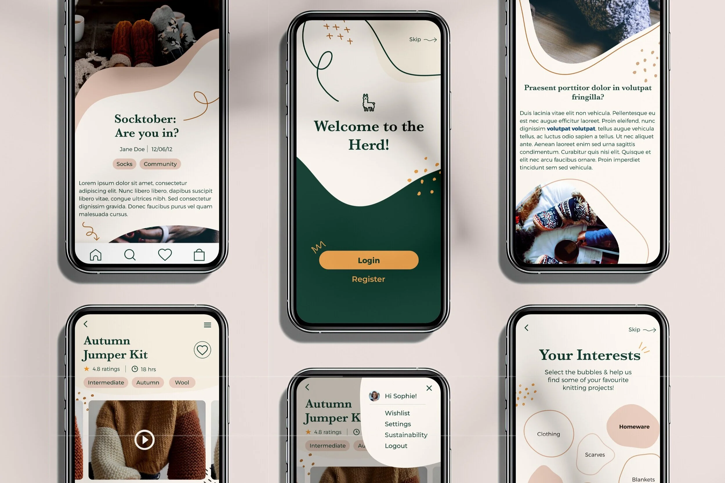

Communicating A Crypto wallet's complex security through desigN
Team of 4 | Mar 2021 | 3 weeks | Fin-tech
Role: UX/UI Designer (Contract)
Tools: Figma, Photoshop, Miro, Zoom
Gridlock allows its users to safely store and manage various types of cryptocurrency. But it's nothing like a traditional e-wallet - it's a community-based security model.
Their unique security model leverages the user's trusted network of friends and family; using them as "Guardians" that safeguard the crypto wallets. It's a pretty complex system and it was too confusing for people to use and understand. This is where we came in.
The Story
(In Short)
Gridlock asked us to turn their product and unique business idea into a mobile-first experience. This involved:

Problem
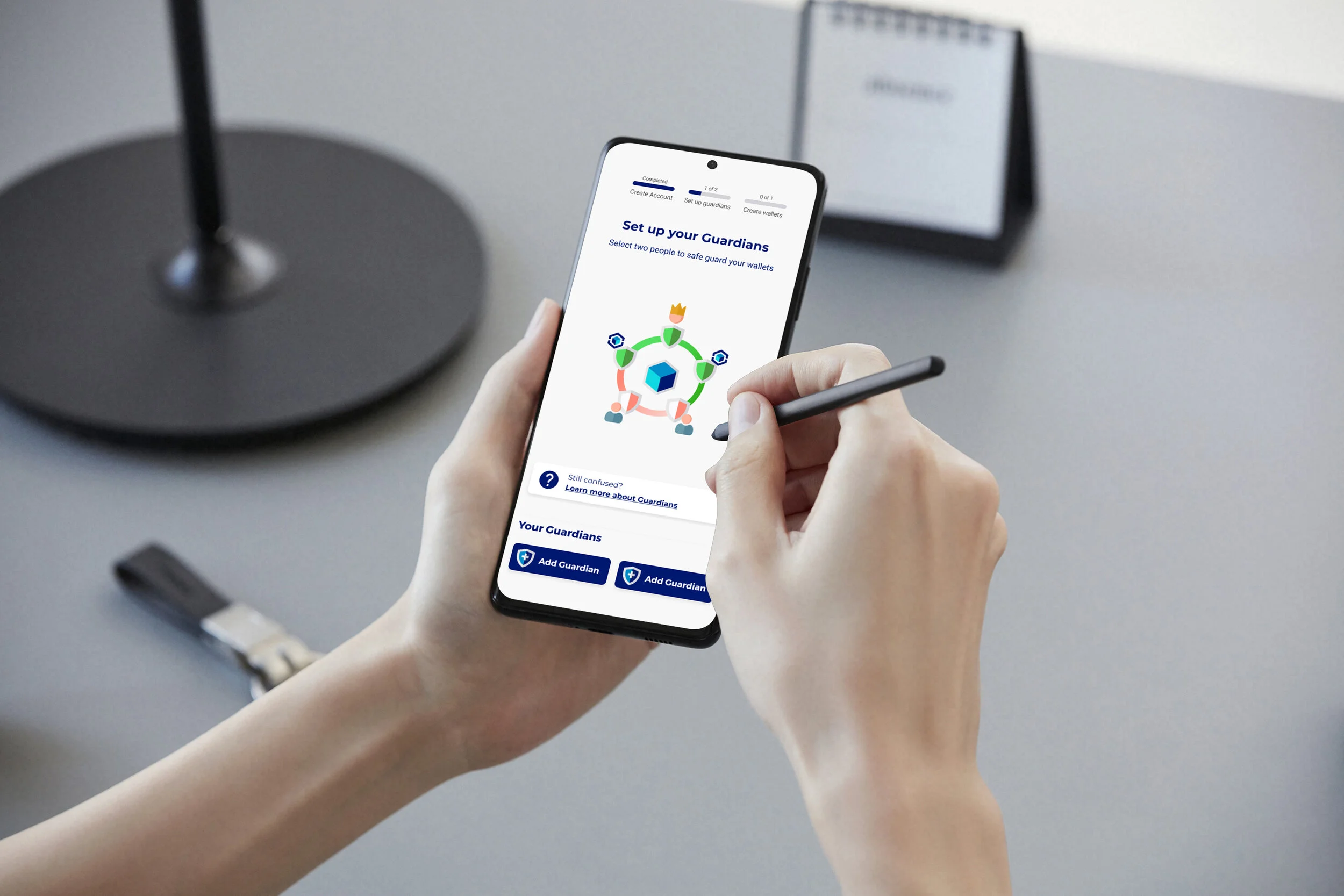
The biggest challenge we faced in this journey was ensuring Gridlock’s onboarding was as simple as possible. We needed to explain how Gridlock’s security system worked without overwhelming users, so that they could use the app.
3. Solution
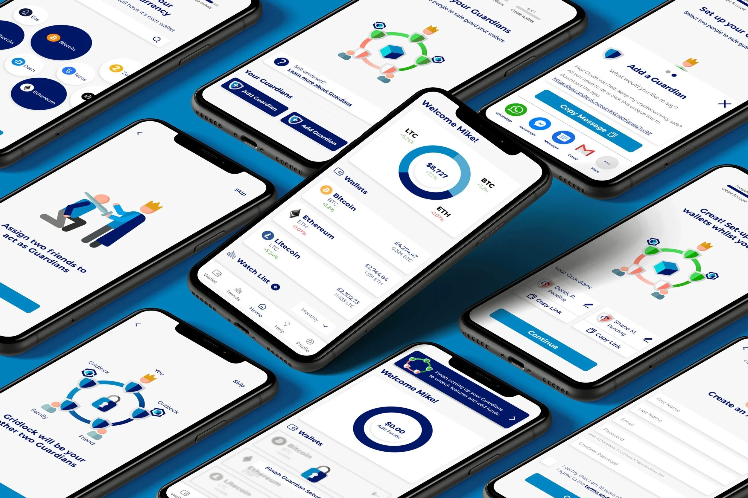
Through several rounds of usability tests and reiterations we were able to test various design solutions; we even experimented with animation. We used the user feedback to inform our designs; eventually turning a lengthy complex sign-up process into a smooth and simple one.
2. INsight
Through user surveys and tests we found that the key to ensuring a seamless onboarding was through eliminating doubt and instilling trust. Throughout the onboarding users needed to feel secure, informed and in control.
4. OUtcome
By adopting an Agile way of working, we were able to create a seamless onboarding and sign-up process that responded to the users needs and goals. Users felt informed and secure during the onboarding, whilst the sign-up process engaged and encouraged them to move forward.
Who it’s For
Derek and Shane, the company's CEO and CTO, wanted to engage users that were new to cryptocurrency. Thier product would be an opportunity to break down negative assumptions and educate people further about cryptocurrency.
In our first Client meeting, we discovered that the typical Gridlock user would be:
What we struggled with
Cryptocurrency was a industry our group was completely unfamiliar with. When we got the brief we felt out of our depth and overwhelmed by the massive learning curve.
How could we understand our clients and user's needs when we didn't even understand how cryptocurrency worked?
Even though the project was daunting, we bravely pushed ahead. In the end, our lack of knowledge and experience gave us a unique advantage as it meant that we could empathise with Gridlock's target demographic: the curious and inexperienced.
How I Helped
My understanding of graphic design allowed me to conduct an in-depth UX/UI Audit which helped us understand what the client’s vision was for Gridlock. I also helped create a set of user interview and survey questions which allowed us to gain rich insights into our user’s needs.
Throughout the project, I was able to guide my team-mates as well as clients through design specific activities. This included facilitating the design studio we did with Gridlock, as well as finalising the visual design of our product; through creating style guides and conducting accessibility tests.
What we Delivered
In the end, we delivered:
Simple, engaging and smooth onboarding and sign-up process
Intuitive and user-friendly dashboard
User research findings (from interviews and surveys)
Competitive Analysis findings
UX/UI Audit findings
High-fidelity prototype
Style guide and design system
“The design was amazing! We are eager to begin implementing the design”
— Derek Rodriguez, CEO of Gridlock
Continue reading to get the full story or
How Gridlock Works
Typically crypto-wallets are protected through only one password meaning if you lose that password you lose all your assets. Gridlock does things a little differently:
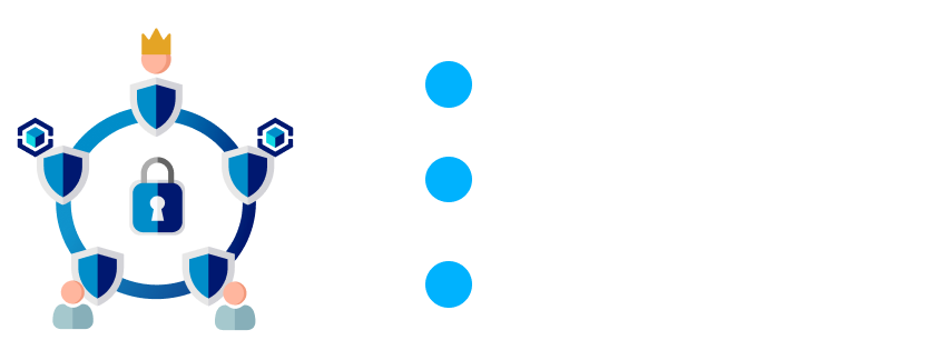
To unlock your wallet you will need three out of five passwords - this means even if one or two passwords are lost, your assets still remain secure and accessible.

How ‘Guardians’ Work
Users need to set-up their guardians before they can access the Gridlock app, meaning the sign-up process would have to include this.
Each user has a total of five guardians protecting their crypto wallets.
How do you become a Guardian?
To become a guardian, friends need to download an app keep it on their phone. The Guardians App would have no functionality for the friend.
Discover
Our biggest challenge was getting users to set-up their guardians. To create a smooth onboarding process both the user and their friends would need to understand and feel comfortable with the Guardian System. To achieve this, we needed to get a better understanding of the industry and the users.
Competitive Analysis
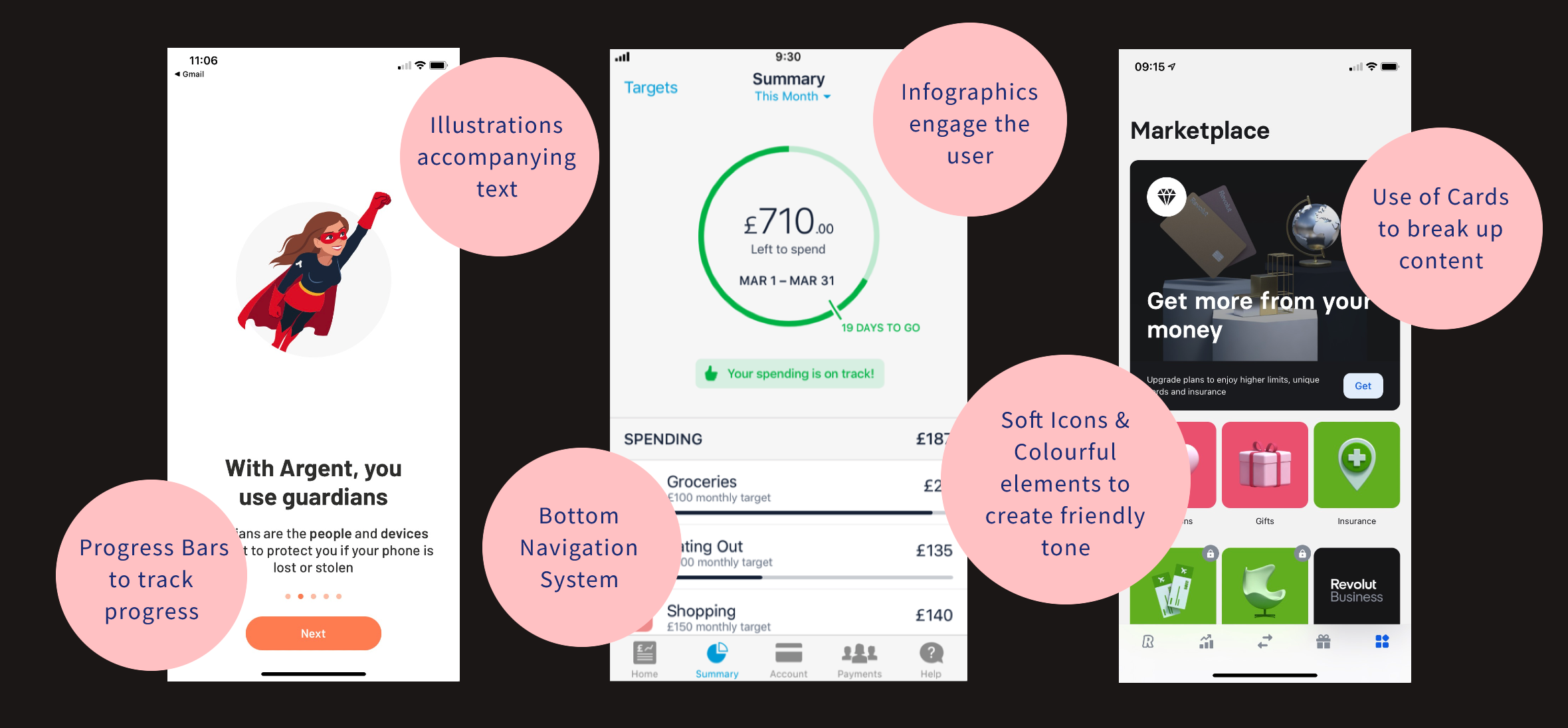
Since our team had no experience in cryptocurrency we decided to kick things off with competitive analysis. We explored various apps both within the cryptocurrency industry as well as the wider fin-tech industry.
Feature Analysis:
We also did an in-depth analysis of the onboarding, sign-up and dashboard of these apps. These were some of their best features:
Putting Gridlock on the market
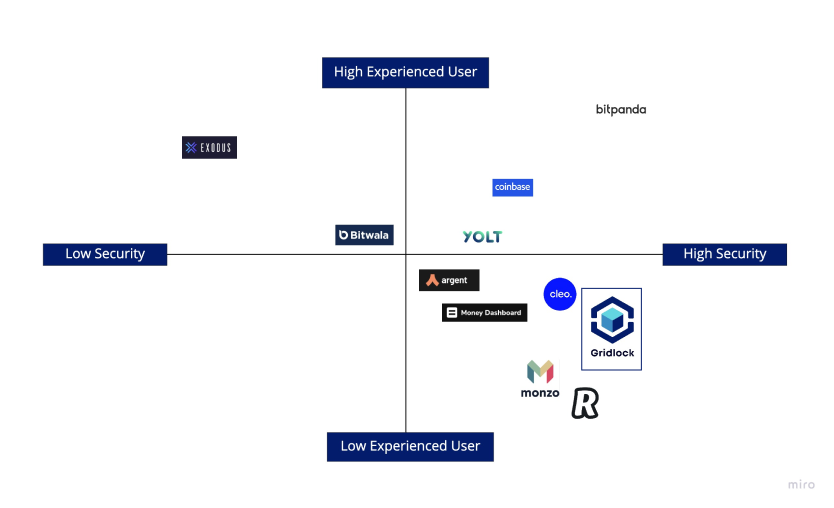
Derek and Shane wanted Gridlock to provide high-level security whilst remaining accessible to users with little experience in Cryptocurrency. This placed Gridlock amongst challenger banks such as Monzo and Revolut.
UX/UI Audit
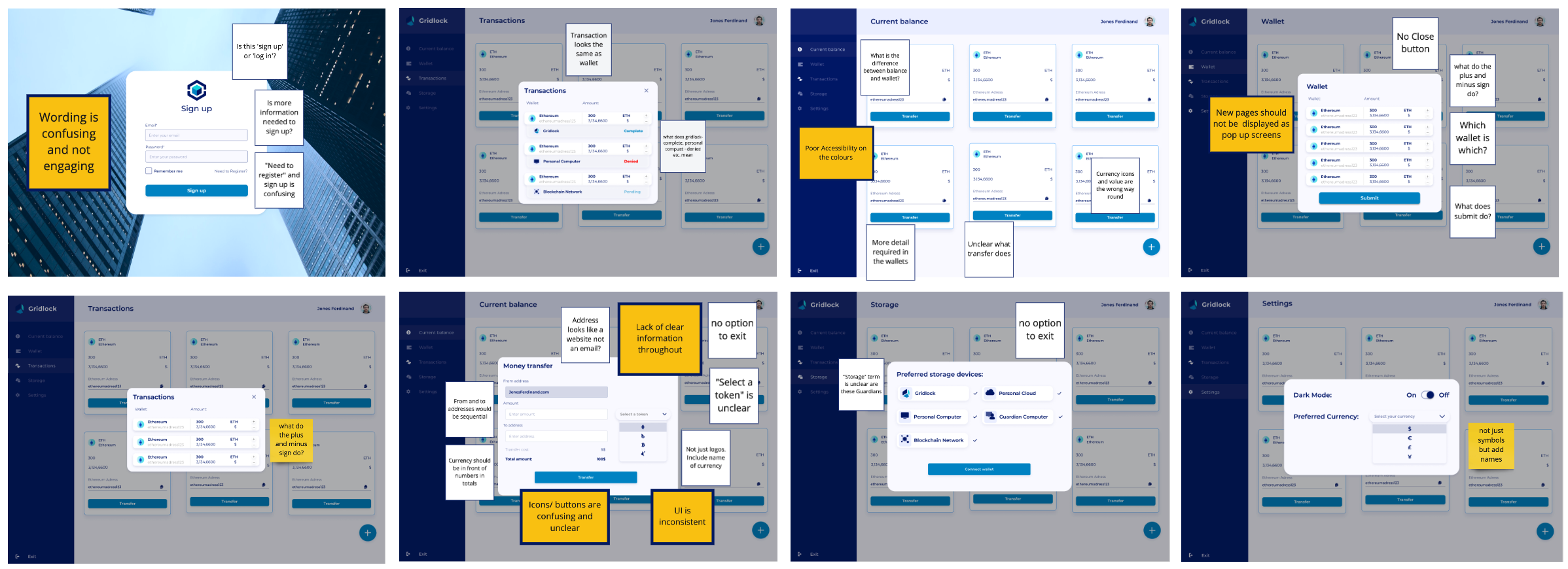
Conducting an audit of Gridlock’s old web-app gave us a sense of what Derek and Shane envisioned for Gridlock’s mobile app, in terms of visual identity and functionality. We also identified general areas of improvement, which helped us avoid making mistakes later on.
user survey & interviews
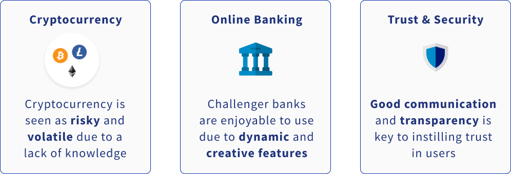
Our interviews gave us a deep insight into user's experiences around online banking, cryptocurrency, trust and security. We uncovered the following insights:
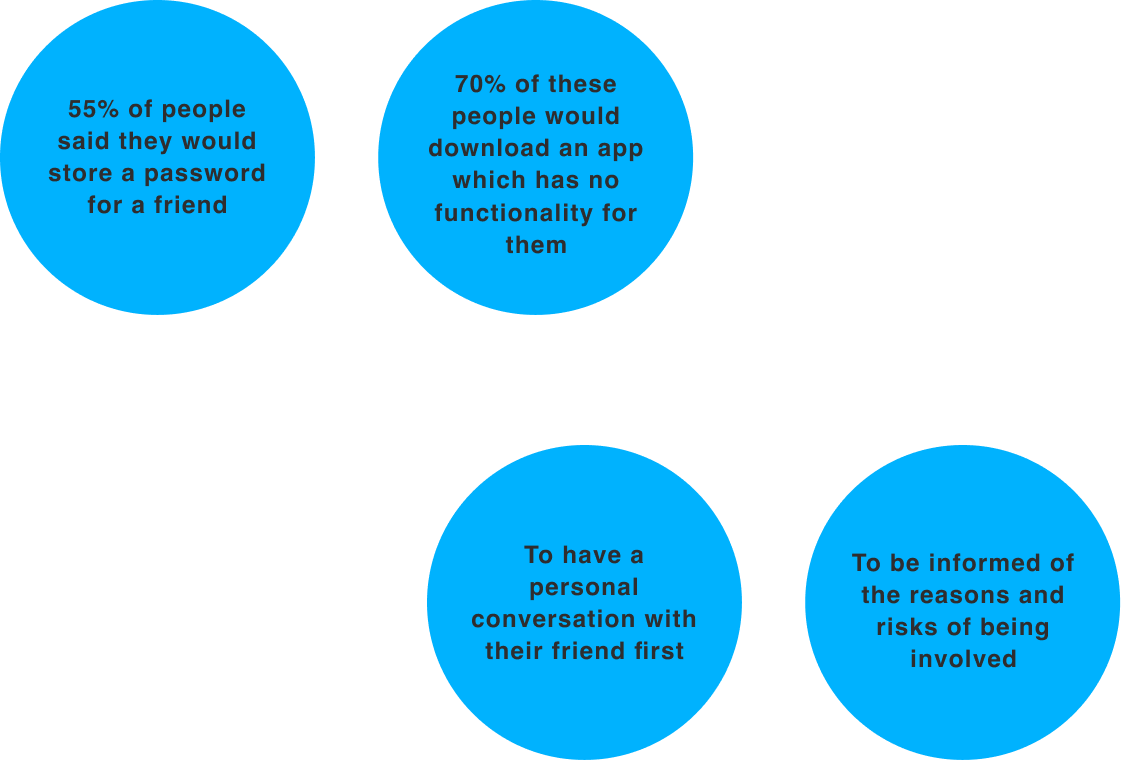
In order for friends to become guardians they would need to download an app which had no functionality for them. We assumed this would be a pretty big favour to ask a friend, however our survey proved the opposite. We found that:
Define
Affinity mapping
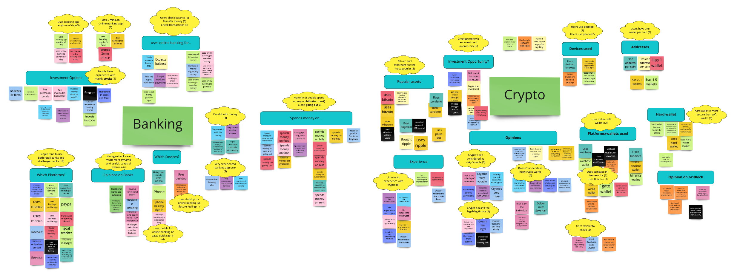
Our research had ended with us analysing our raw data through an affinity map. Our key findings were:
To create seamless guardian set-up, users and guardians needed to feel comfortable and secure. We could achieve this through clear communication and transparency
Gridlock’s company values were Security, Accessibility & Clarity
User persona & Problem Statement
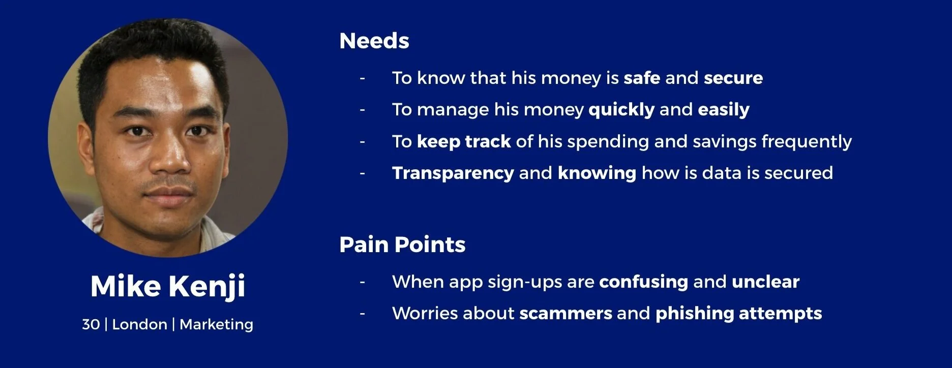
We summarised our research findings through a user persona and problem statement.
By creating a user persona, we were able to focus on one key person rather than a huge set of data moving forward.
Problem Statement:
“Mike needs to easily and quickly understand how Gridlock and Guardians work because he wants to ask his friends to be Guardians so he can use the app.”
Design Studio
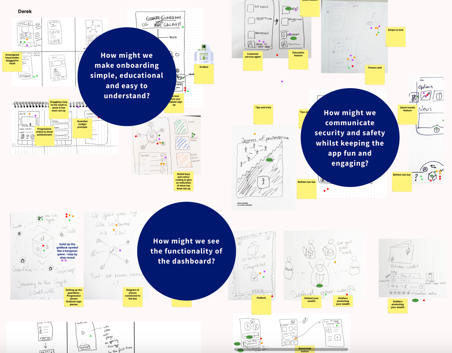
We invited the Gridlock team to join us in a set of design studios which allowed us to brainstorm ideas for the app.
I co-facilitated the design studios, which consisted of three quick fire rounds. We each drew solutions as responses to "How Might We" statements which focused on improving the user's experience.
Together with Gridlock we were able to conceptualise a range of features and align our visions into one final output.
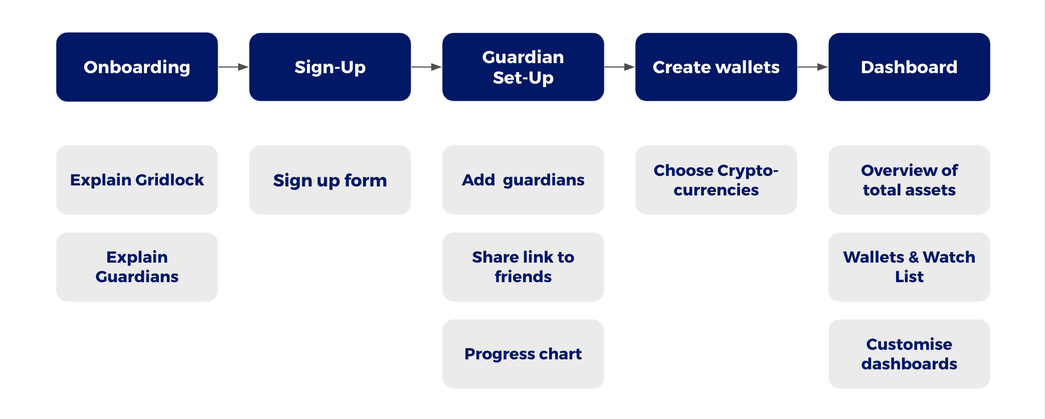
User flow
This gave us enough insight to create a user flow which acted as the skeleton of the app.
The user flow gave us an overview of the types of pages and features Mike would encounter during his onboarding and sign-up journey.
DEvelop
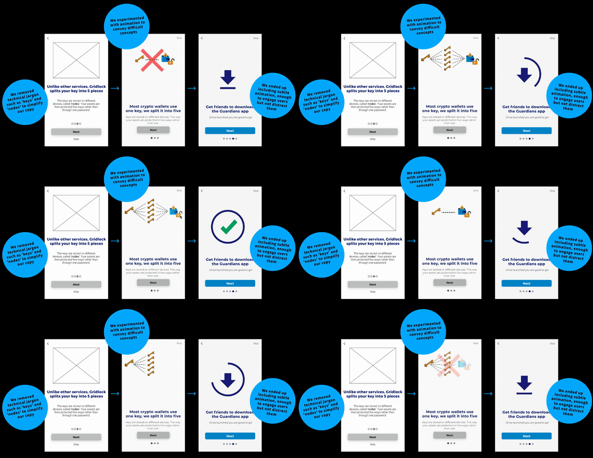
Having defined the pages of the app, we moved onto creating rough sketches of the wireframes and testing our solutions through several rounds of usability tests. We used the user feedback to reiterate our designs, evolving the design from lo-fidelity to hi-fidelity with each round of testing.
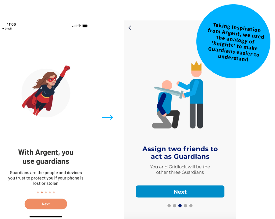
Making guardians easier to understand
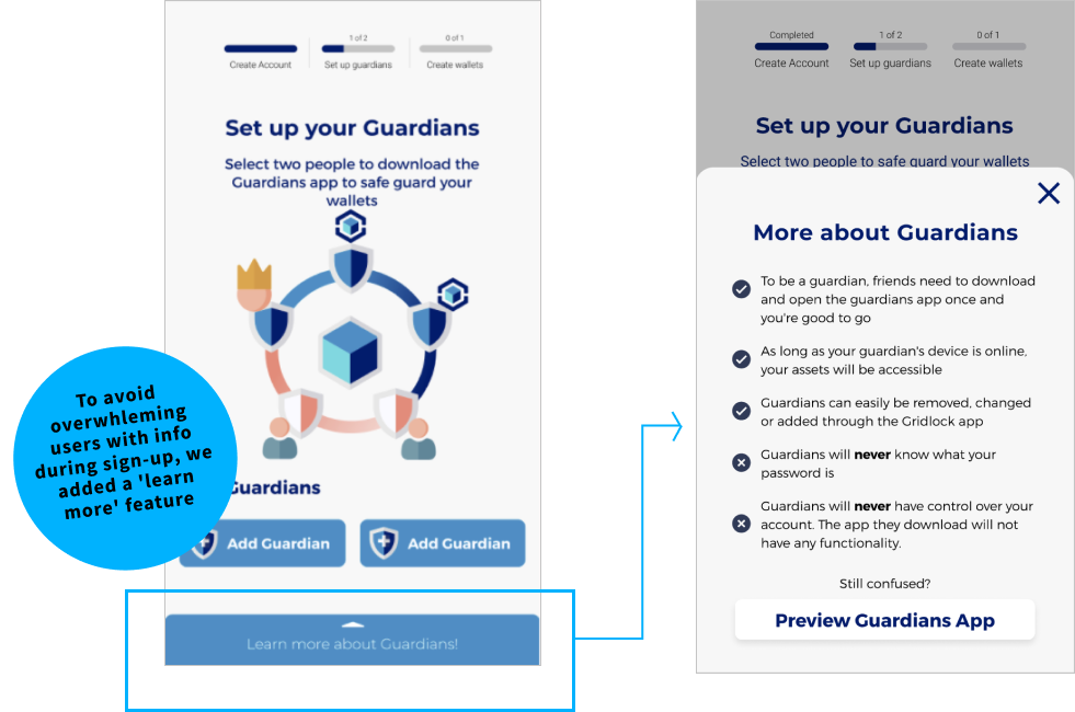
For a smooth onboarding users needed to feel informed whilst not being overwhelmed by information.
This meant condensing a lot of information regarding Gridlock and "Guardians" into a very small amount of content across a limited number of pages.
As a result, we tested various forms of content to try and explain how Gridlock worked as simply as possible. The key to resolving this was achieving the right balance between image and text.
DEliver
Visual Design
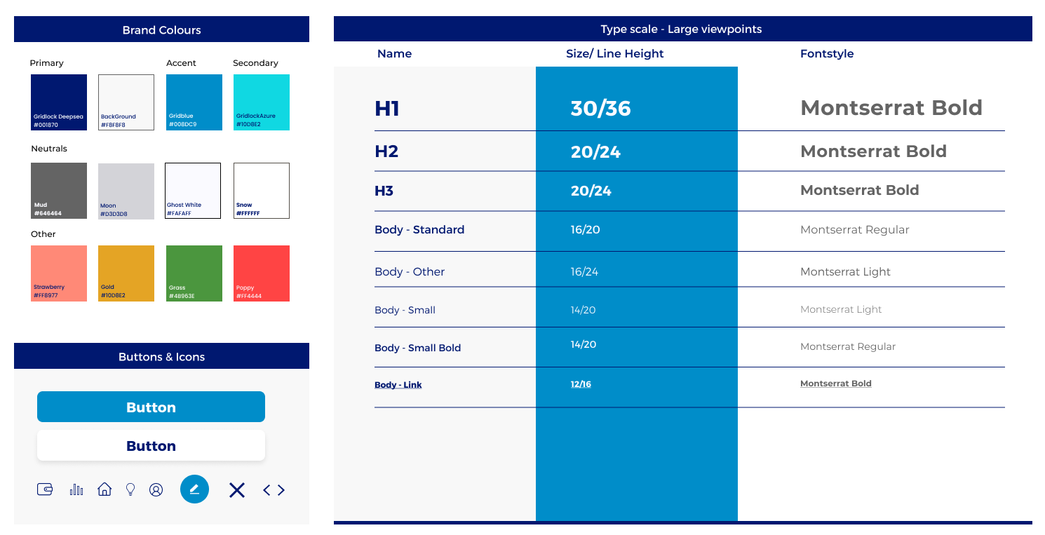
The UX/UI Audit of Gridlock's web app as well as our analysis of competitor's features helped inform our decisions when it came to building a design system.
We derived most of the colours and text styles from Gridlock's logo and web app, and adjusted these to make them more accessible and user-friendly. We did this through conducting accessibility tests on various colour combinations and narrowing down the text style to one font type.
In conclusion
This project wasn't easy or straight-forward. At times, it felt like we were facing design challenges that no other UX designer had encountered, but this pushed us to be experimental and creative in unexpected ways; encouraging us to grow as designers.
Our efforts and amazing team dynamic didn't go unnoticed, it shined through in our final client presentation and end-product. We had confirmation of this when the clients themselves loved our design and looked forward to using it for future developments.
What i’ve learnt
You have to be able to justify every decision you make as a designer. After making a few initial mistakes, we were able to avoid going down rabbit-holes by letting our research guide us. By the end, every aspect of our product was backed up by data and rock-solid.
Being part of a team that bonds over difficulties and supports each other through challenges, rather than finding a reason to argue, is like winning the team lottery.
