
Casting Networks
UX Overhaul
Redefining how actors discover and book roles in Film and TV
September 2024 | 3 months | Entertainment Industry
Role: Lead UX/UI Designer (Contract)
Tools: Figma, FigJam, HotJar
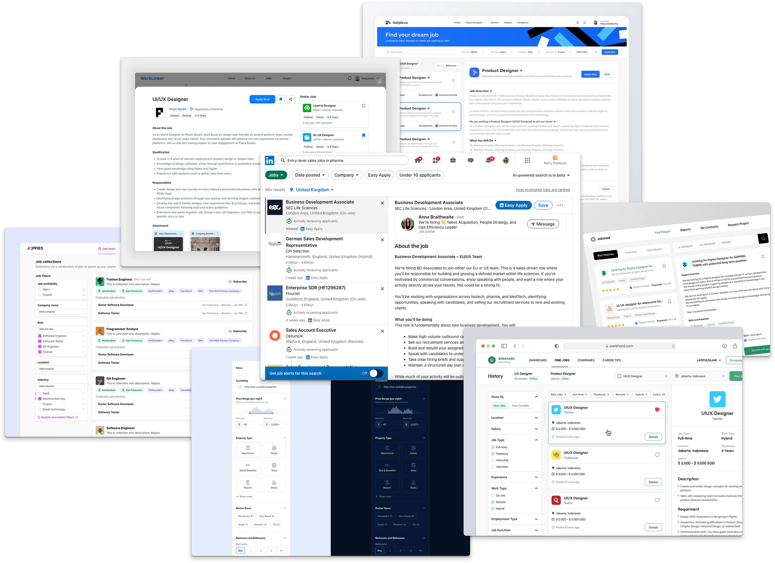
Who is Casting Networks?
Casting Networks is a leading US-based casting platform, part of the Talent Systems suite, connecting actors, models, and performers with casting professionals across film, television, commercials, and digital media.
Performers can create detailed profiles, submit self-tapes, and apply for thousands of roles, while casting directors can post projects, request media, and manage auditions efficiently. The B2B2C SaaS platform supports over a million auditions annually, serving both emerging and established talent worldwide.
Project Brief
The initial project brief was vague, with broad goals to improve the performer experience—Casting Networks’ highest-value users, as they drove revenue through their subscriptions. It was therefore critical to deliver a seamless, user-focused experience that met their needs.
I collaborated with a product and engineering team based in the US throughout this project, interpreting high-level objectives into actionable UX improvements.
Midway, the requirements shifted unexpectedly, requiring exploration of third-party React libraries (Chakra, MUI, Material.IO) to provide a quick, cost-effective solution while maintaining design quality.
Key Goals
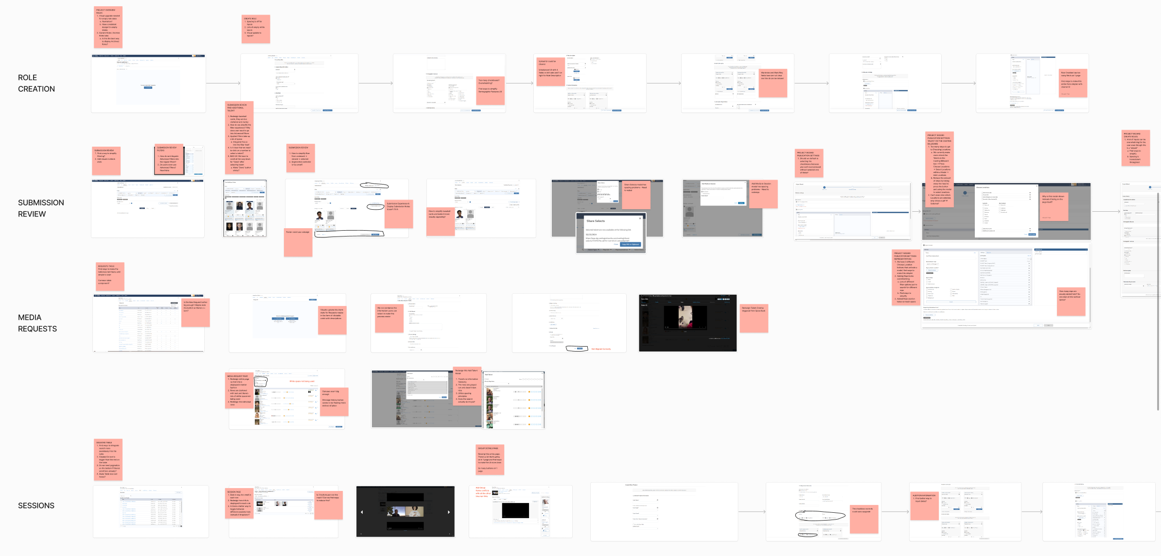
UX Audit & Research
To understand the platform’s pain points, I conducted a full UX audit, including:
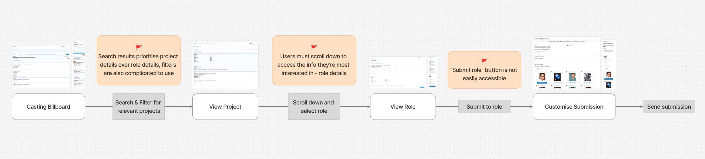
I also researched best-in-class job-seeking apps to inform design patterns for complex filtering systems to get a better understanding on how to consolidate Casting Network’s unorganised filtering system.
Leveraging Data
It was also at this point I began setting up data tracking events on HotJar that didn’t exist before. These included trackers to record how much time users spent submitting for jobs as well as time spent between first clicking on a job page and clicking “submit application” button/ average number of jobs users submitted per month/ Average number of job searches users conducted per month.
Post-launch, we observed a 43% increase in job searches on the platform, as well as a 27% increase in search session length, indicating that users were engaging more effectively with the redesigned search and filtering system
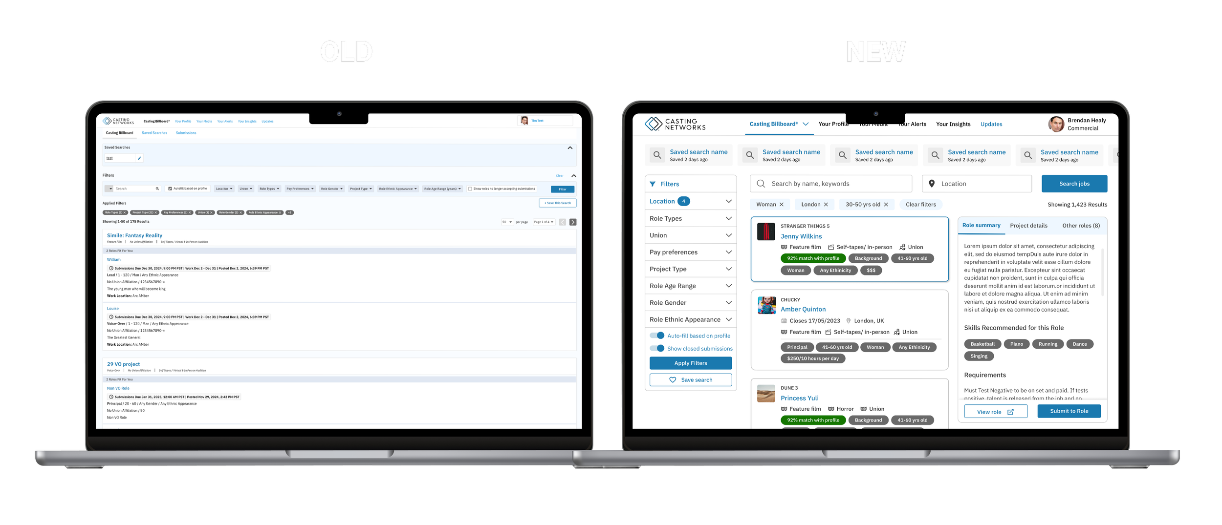
Redesigning the experience
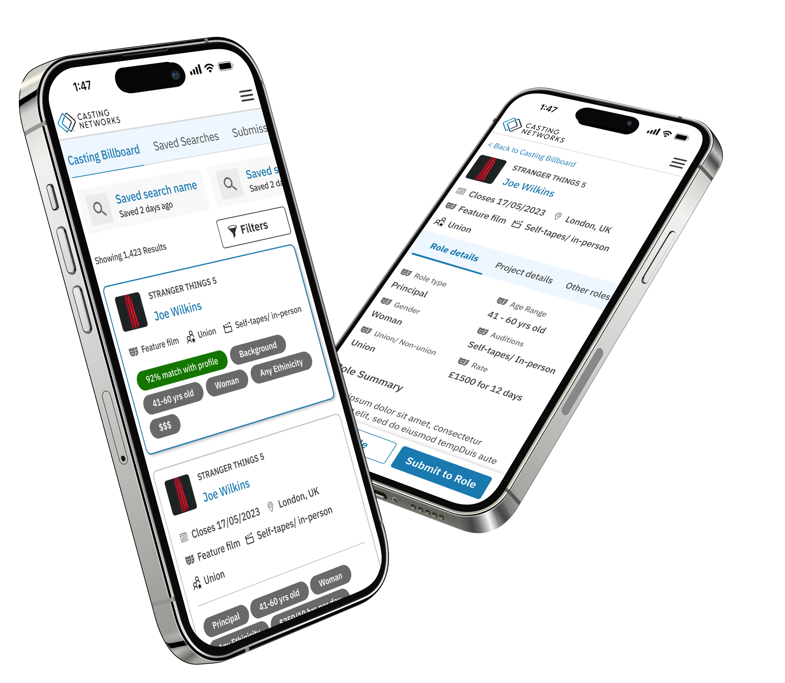
Finding and applying for roles can be stressful for performers. My goal was to make the experience smooth, efficient, and enjoyable across mobile and desktop. I achieved this by:
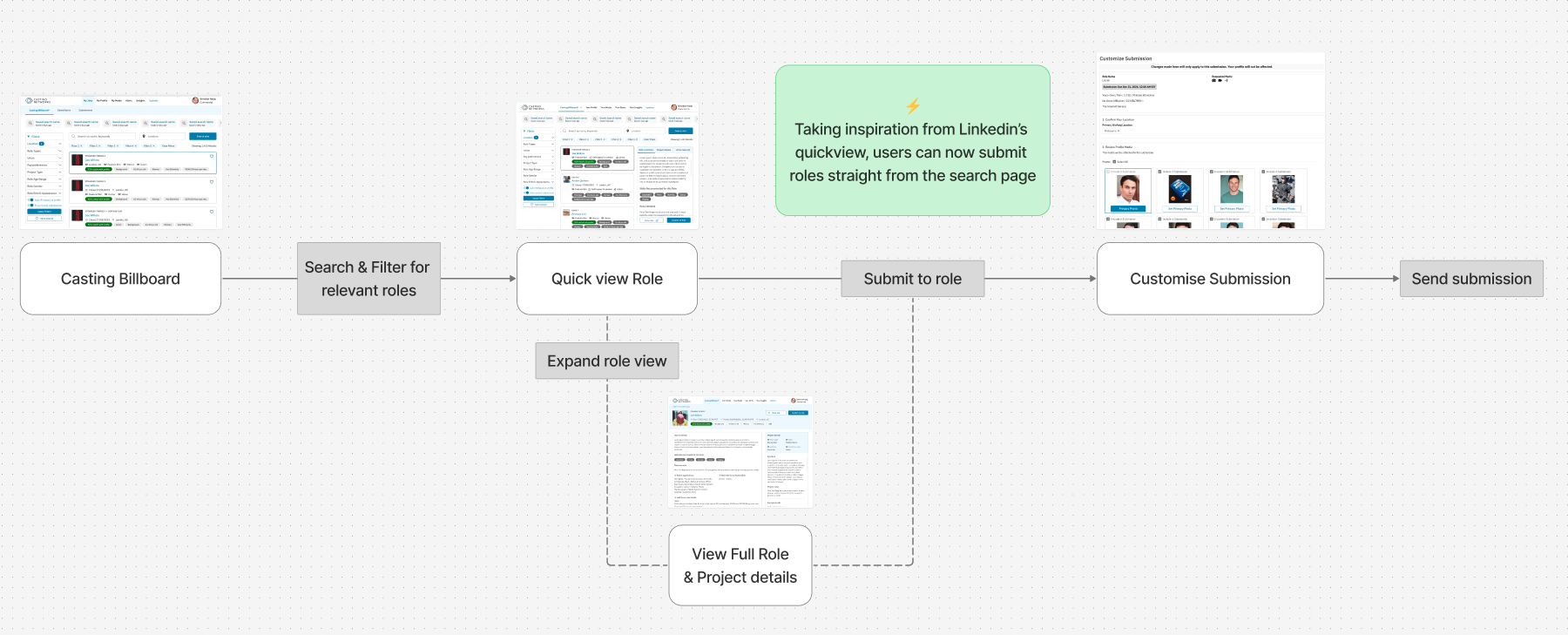
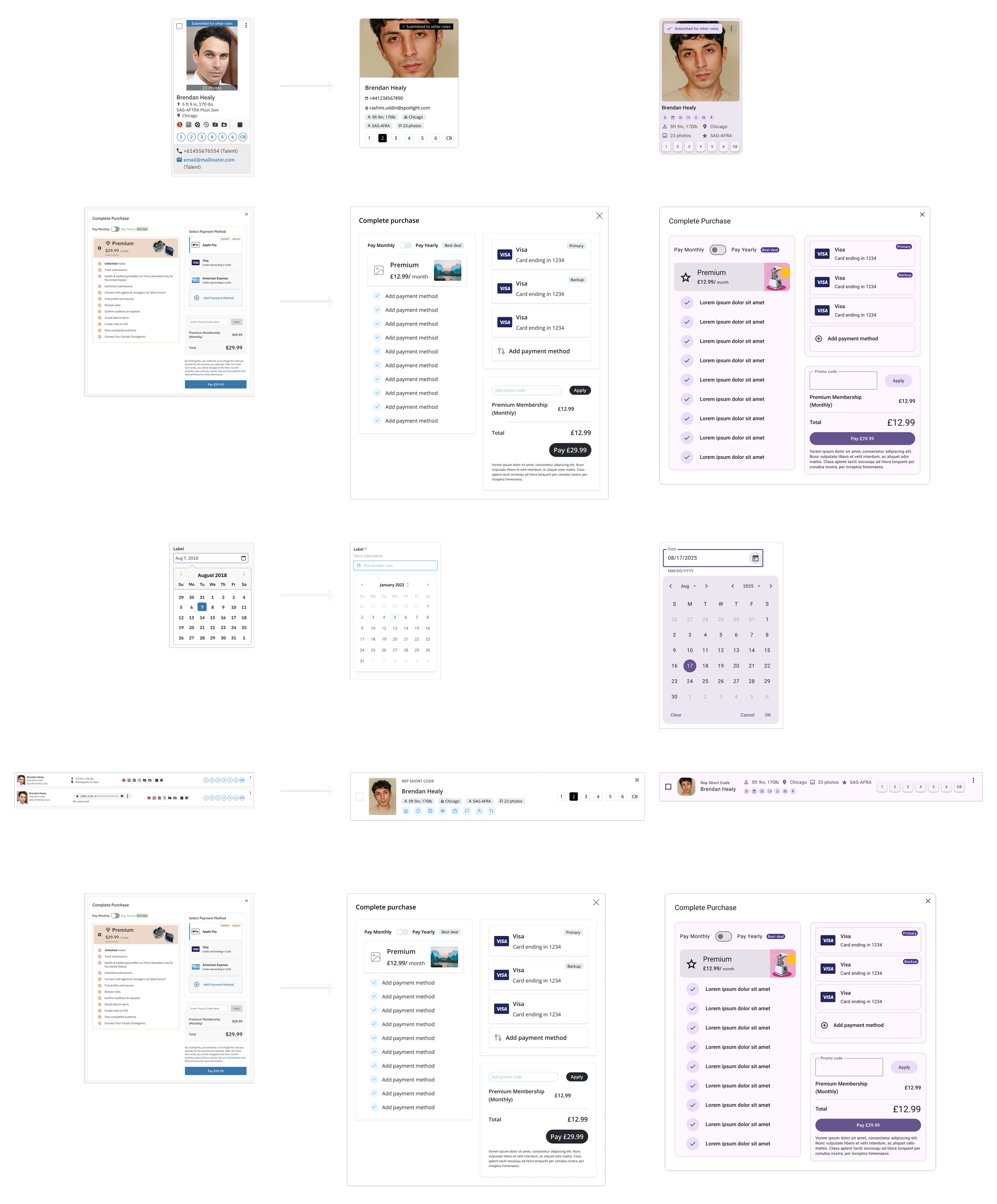
Analysing existing user flows and friction points and restructuring them to streamline the submission process.

Creating low-fidelity wireframes for initial feedback and rapid iteration - at this stage I began having early conversation with engineers to ensure the UX improvements I was considering would be feasible to be built and to pin point an constraints I would need to consider/ work around.
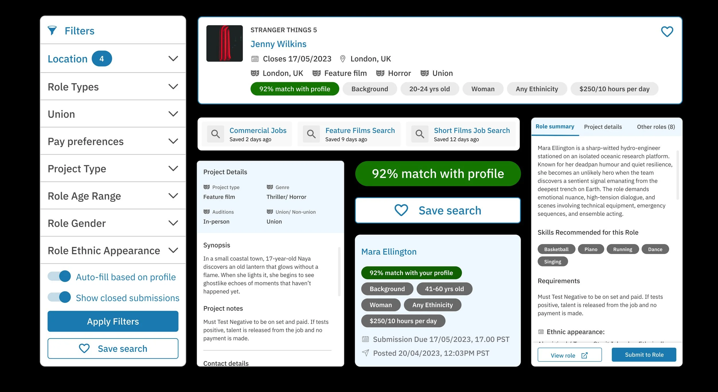
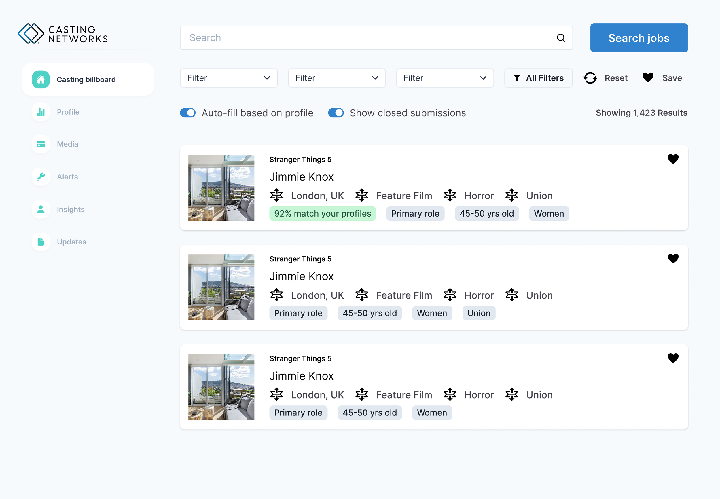
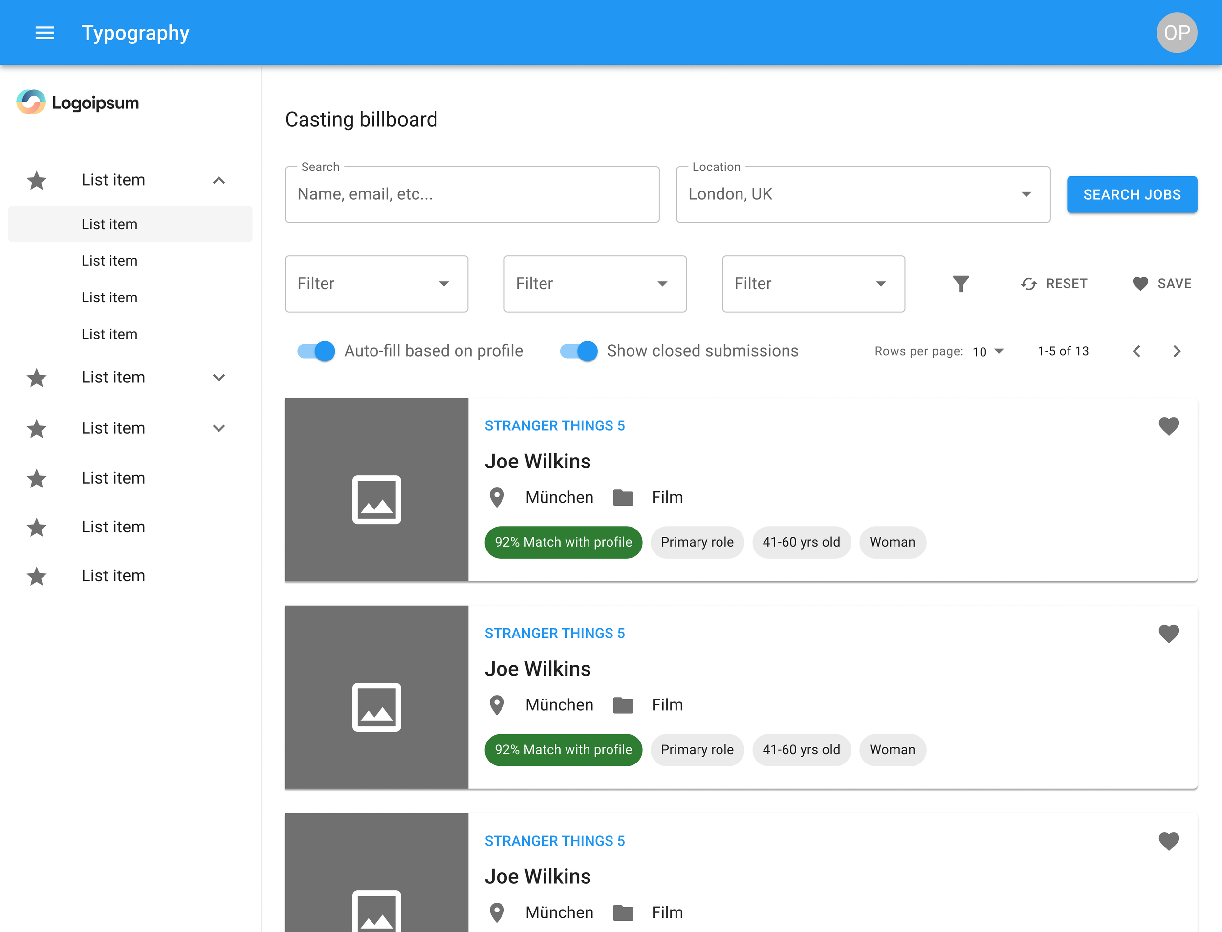
Experimenting with layouts and compositions to display filters, saved searches, and detailed job info without overwhelming users.
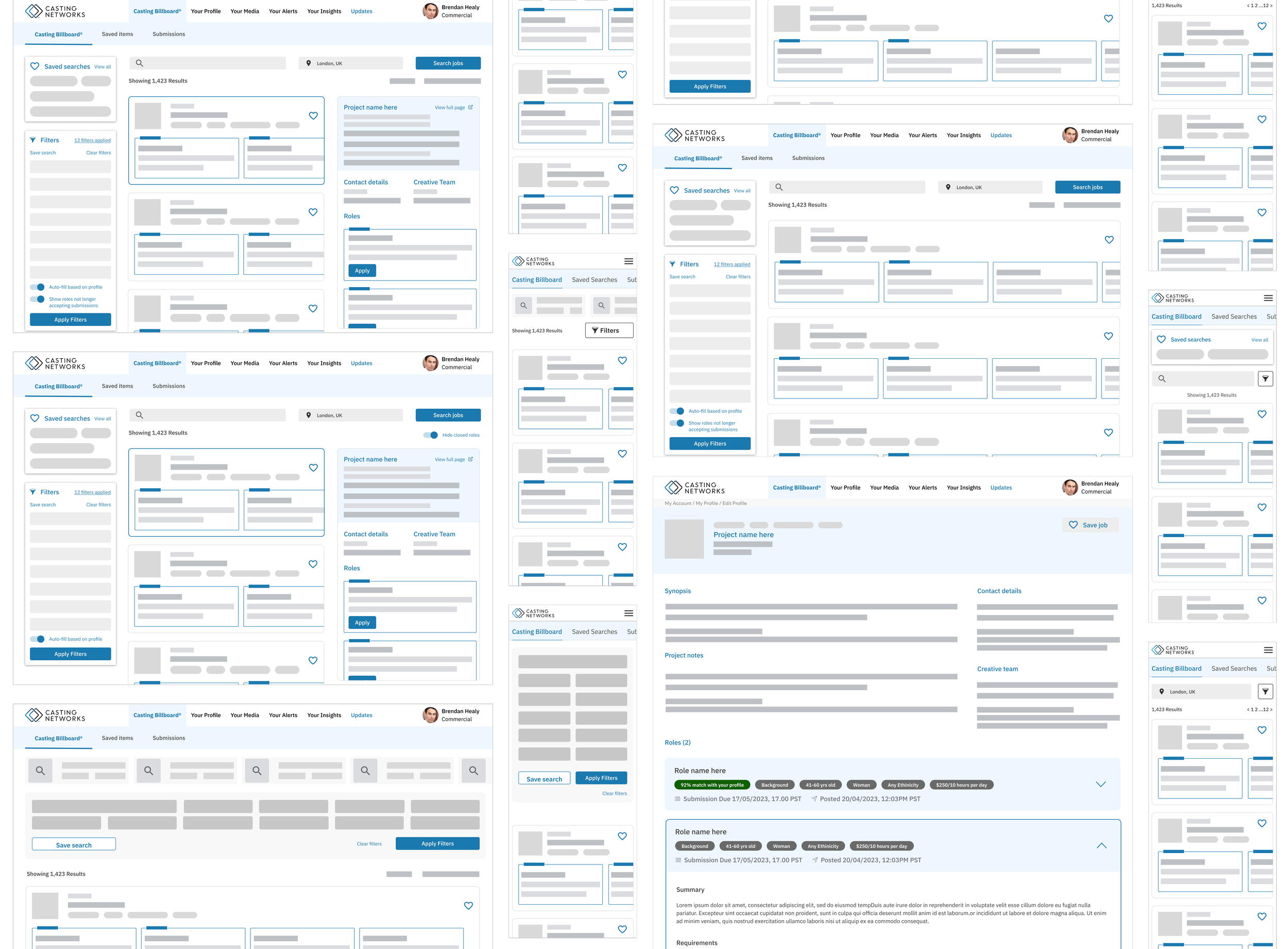
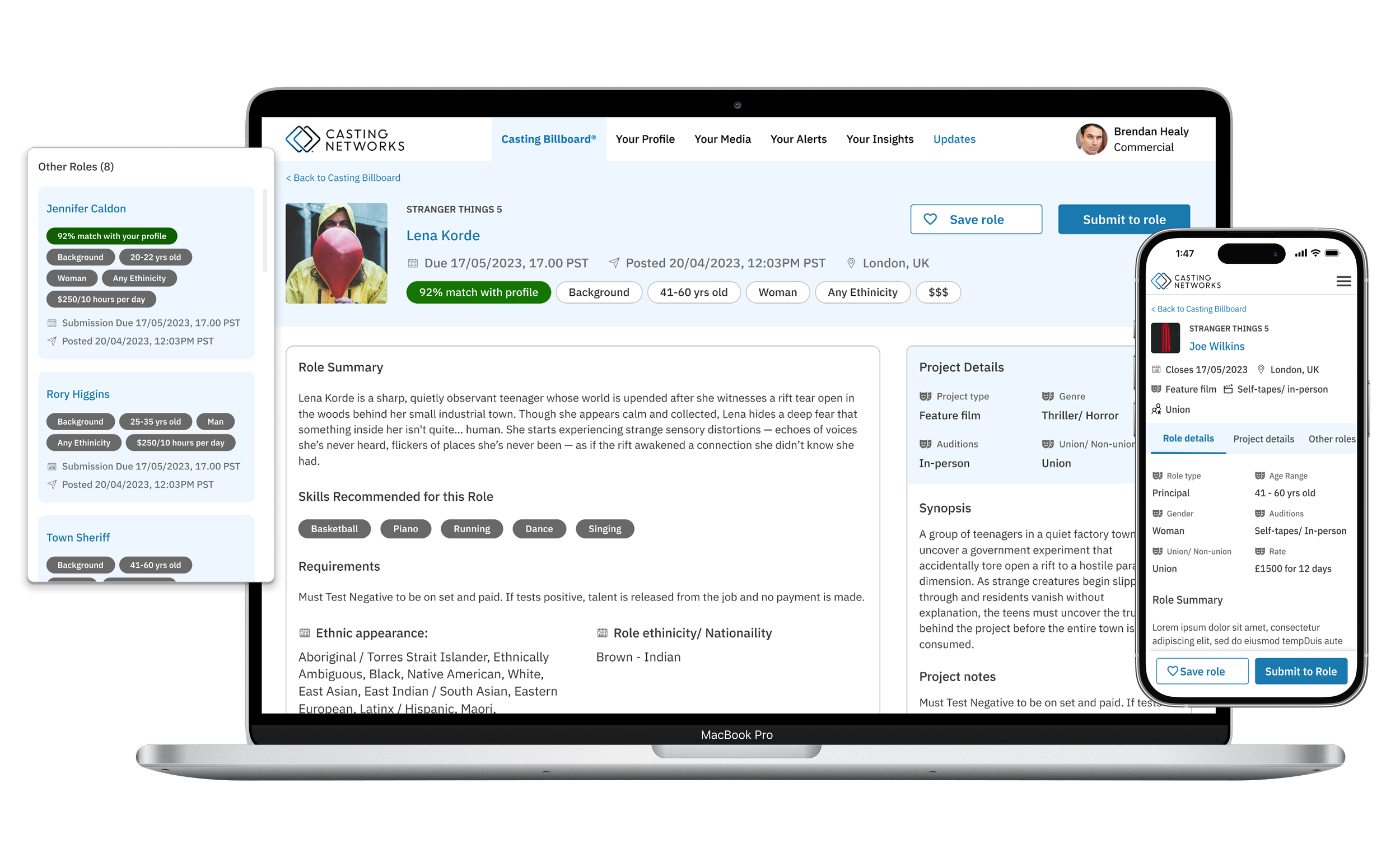
We introduced features like persistent left-hand filters and an ai-powered “% match with profile” that allowed users to guage which roles they were strong candidates for, to increase confidence in applications and engagement within the platform.
Additionally, it was important to ensure the mobile experience was prioritised to allow actors to easily apply for jobs whilst on the move. We hypothesized that this would further increase engagement as well as allow them to respond to job offers and media requests quickly and effectively.
Within the first month of the launch, we observed a 31% increase in applications submitted, highlighting the effectiveness of the redesign
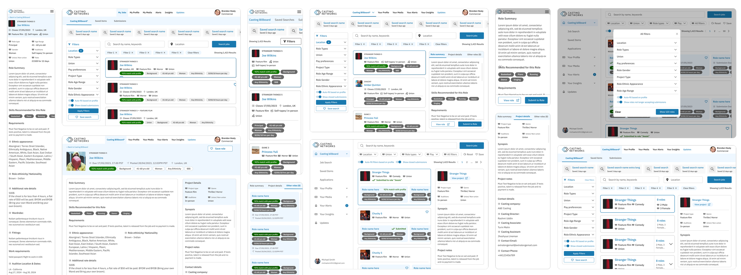
Dialling it Back
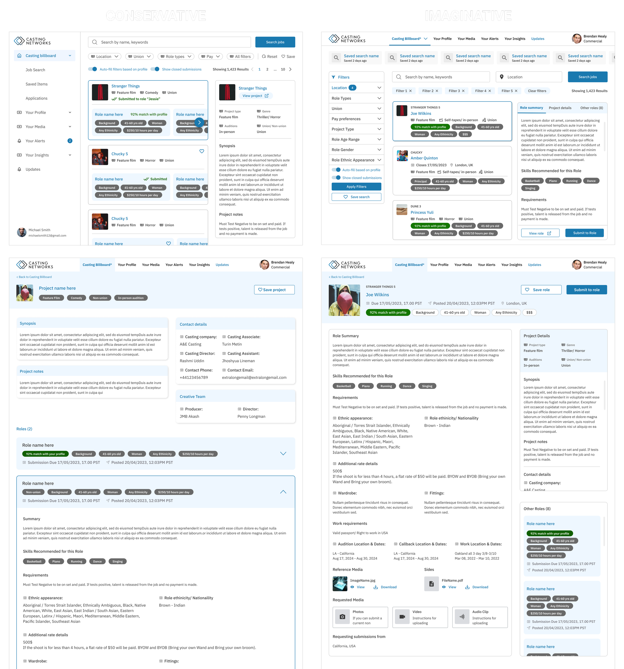
Although restructuring the user flow was the most ideal outcome to achieve the best user experience (performers can get to the info they require faster), my fellow product manager who I was closely collaborating with was worried about the amount of resource it would take to completely restructure both the UI and the user flow in this way. And so we decided to present two different approaches to the business - one that is more imaginative and one that is more conservative solution.
Adapting Mid-Project
Midway through the project, key stakeholders proposed a restructure of all product-specific design systems across the software suite into a single, unified design system to improve component maintenance, design consistency, and resource efficiency. While a thoughtful solution, such a drastic change to design and product development cycle required careful evaluation before implementation.
I quickly collaborated with engineers and the global design team to gather insights and began conducting in-depth research on suitable React libraries.
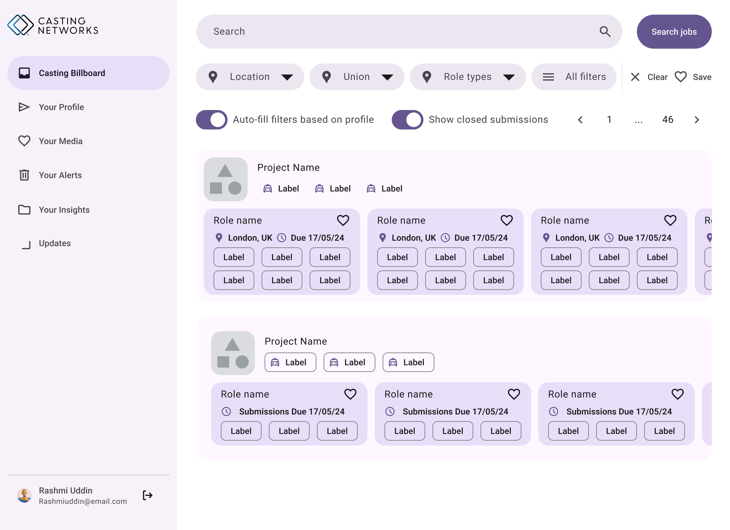
I created a comparison table based on business, engineering, and design requirements—for example: engineers prioritised frequent updates and documentation, designers wanted component customisability, and the business focused on performance and runtime.
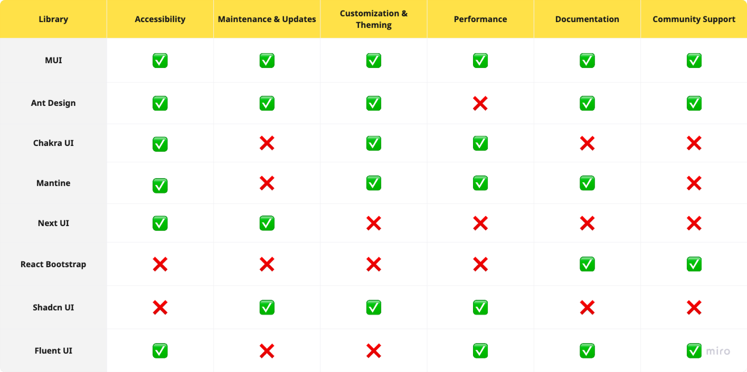
After narrowing down to the top five libraries, I reskinned the most complex components in our design system as well as one of our most important pages, the Casting Billboard (through which users search and find jobs), to test feasibility for the trickiest parts of the product. I documented all findings in a clear, concise format, enabling the CPO to present the proposal confidently to stakeholders and move forward with a holistic, maintainable solution.
Collaboration & DeliverY
Outcomes & Impact