Designing a new 121 tuition feature for Skillshare
Team of 4 | Feb 2021 | 2 weeks | E-learning
Role: UX Designer, Visual Design Lead, Workshop facilitator
Tools: Figma, Photoshop, Miro, Zoom
"Since 2000, the market growth rate for e-Learning has been 900%"
- UK & Global Virtual learning statistics 2020
Skillshare is a subscription based learning platform which offers its users pre-recorded online classes, allowing users to learn new skills at their own pace through following videos.
Many people have used the recent Covid pandemic and its lockdowns to focus on both personal and professional growth. As a result, Skillshare saw an opportunity to expand their market and grow as a learning platform to include a virtual interactive 121 tutoring experience. This how we helped.
The Story
(In short)
problem
Our team was challenged with designing and implementing a new feature whereby Skillshare users can get 121 tutoring.
Insight
Through competitive analysis & user research we found that our feature needed to be a personalised and on-demand service and be fully integrated into the existing site, to optimise user conversion rate.
Solution
Through usability testing we were able to create highly-polished design which matched Skillshare’s existing visual identity; providing users with a seamless all-in-one tutoring experience.
THE BRIEF
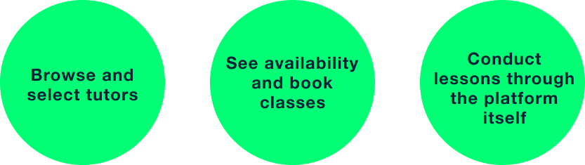
The feature would allow users to:
Who it’s for
Rather than target a whole new user base, we decided to focus on Skillshare’s existing user base of professional up-skillers, to ensure maximum user conversion rate. In doing so, we turned Skillshare into a completely unique e-learning experience. With the new feature, users had the freedom to learn at their own pace through online videos as well as get a personalised experience through 121 tutoring.
What We struggled with
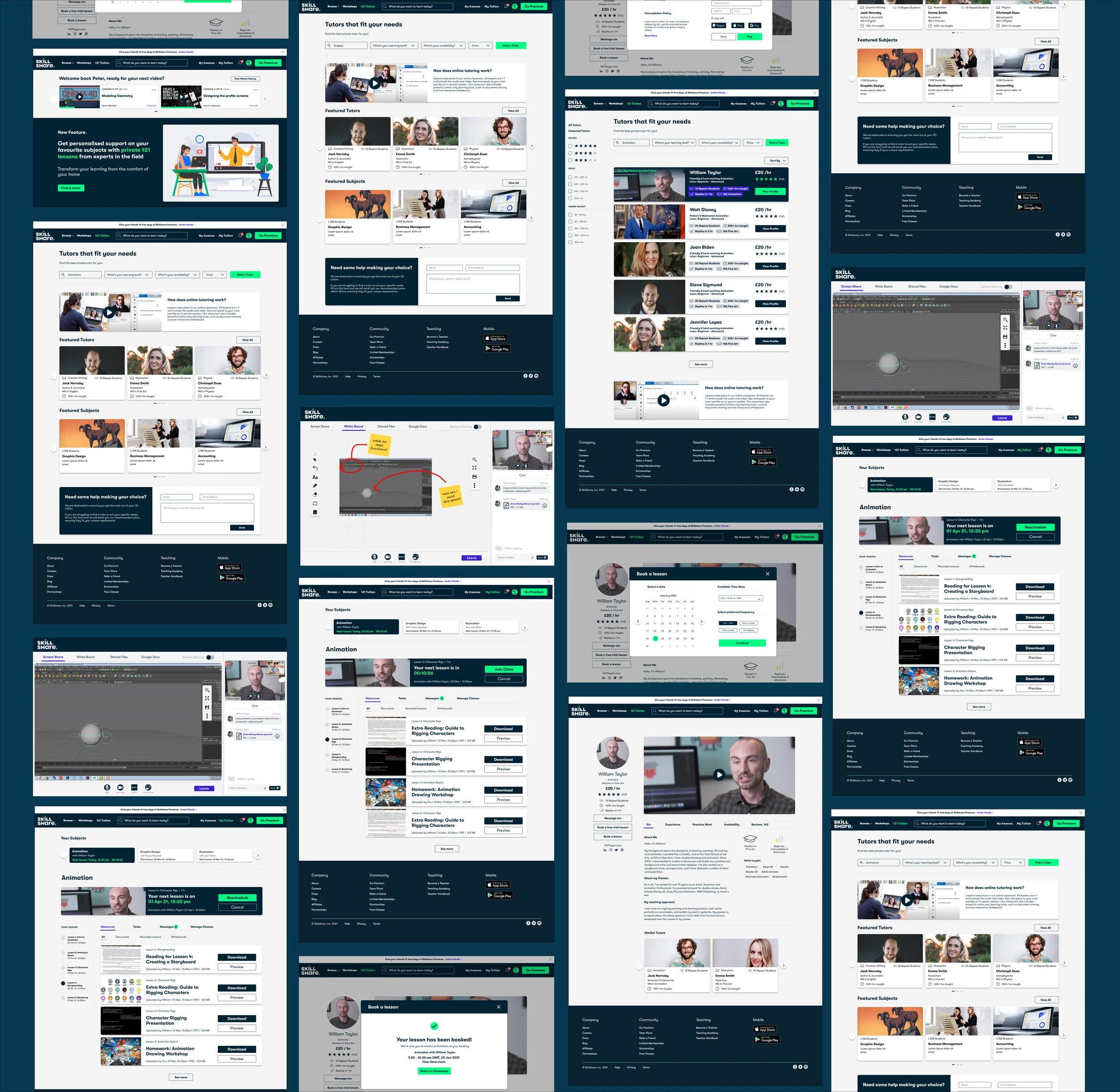
Our design journey involved creating complicated web-pages and features that the existing Skillshare platform did not have. Such pages included the interactive online classroom as well as the ‘My 121 tuition’ page which provided users with resources, homework and information about their 121 tuition.
Since we didn’t have example references to work from, we initially struggled to create smooth and simple design solutions; our designs were too messy and confusing. Eventually, through consistent rounds of usability tests and design studios we were able to reiterate and improve our designs from the user feedback. Our UI audit of the existing Skillshare platform helped us refine the features, allowing us to communicate our solutions in much clearer way.
How I helped
Coming from a design background, I had an understanding of visual design and experience in using design studios as a way to brainstorm ideas. This came in handy when my other team-mates needed guidance and advice during the design exercises, as I was able to facilitate the design studios and take the lead as the UI & Visual designer in this project.
By taking the lead during the design process, I was able to ensure our vision of the new Skillshare came into realisation through a highly polished design which integrated all the features we had defined during the development stage.
What we Delivered
Fully integrated 121 tuition feature
Seamless tutor search and booking experience
Interactive online classroom and resources page
User research findings (from interviews and surveys)
Competitive Analysis findings
UI Audit findings
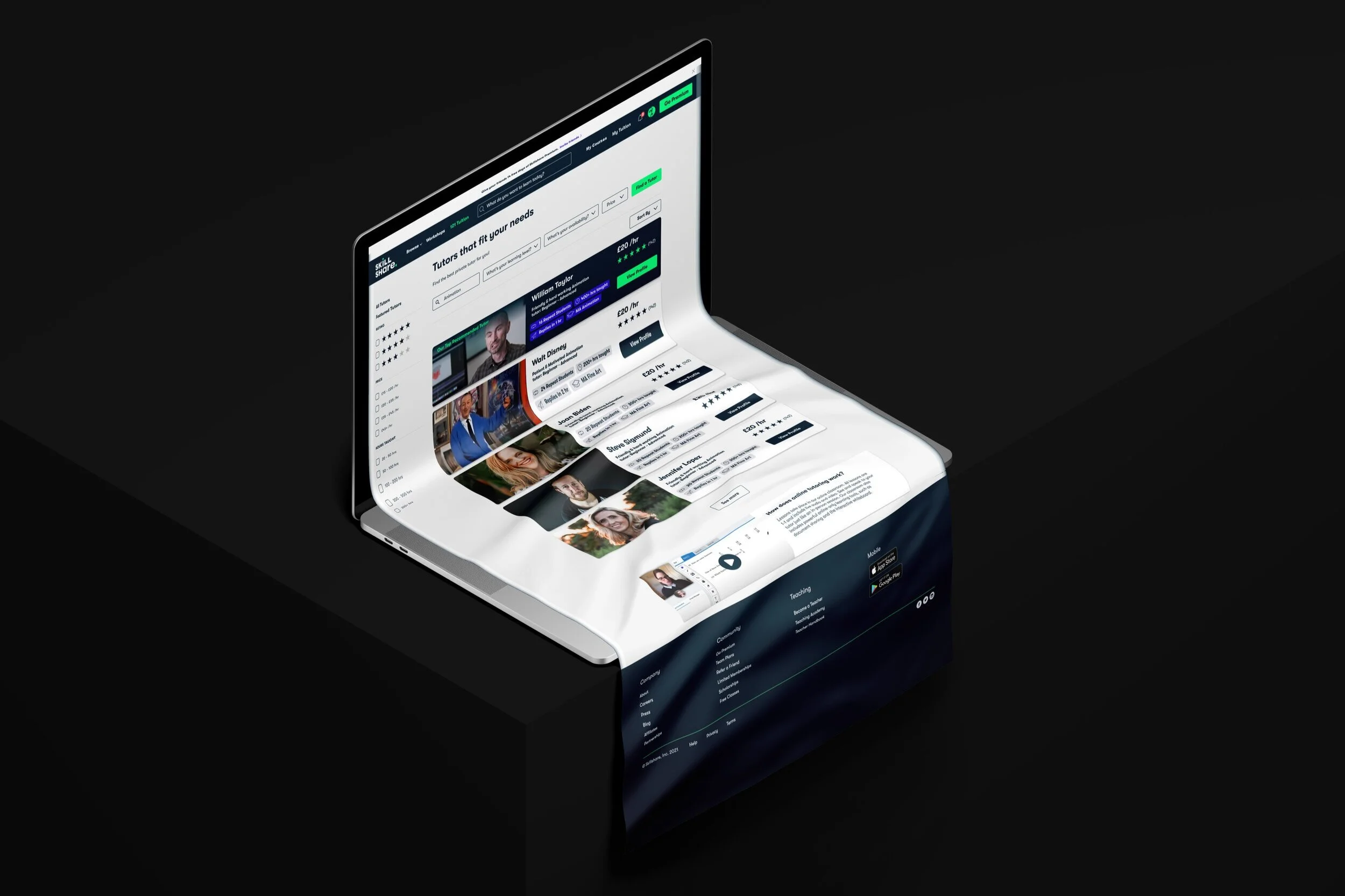
High-fidelity prototype
Style guide and design system
Continue reading to get the full story or
Discover
We began our design process by gathering data through conducting user surveys, user interviews as well as competitive analysis and analysing the results through affinity mapping. Our research allowed us to discover and define our target users attitudes and experiences on e-learning.
Gathering
quantitative data
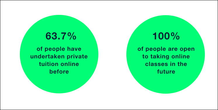
Based on Skillshare's current content, we gathered their existing user base consisted of professional up-skillers. Naturally, we surveyed a range of professional workers (aged 25–35), and found that:
Gathering
qualitative data
Through conducting user interviews we were able to gain further insights into our target user's general attitudes and thoughts towards online learning and 121 tuition. We uncovered key insights such as:
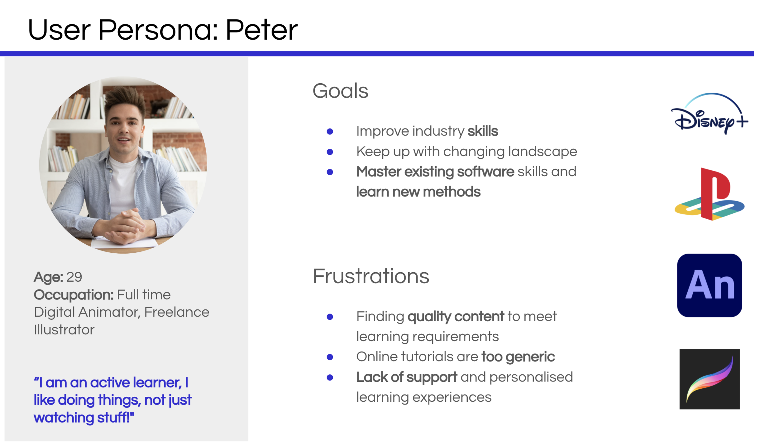
Define
User persona
To ensure our research findings were at the core of our product, we summarised the insights through a user persona. This allowed us to focus on the important needs, goals and expectations of a large group of users through one person, Peter.
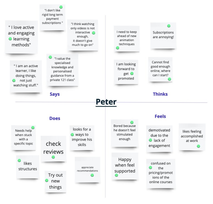
Empathy Mapping
Creating an effective solution requires understanding the true problem and the person who is experiencing it. We needed to "get inside the heads" of our users, as a result, we created an empathy map. The exercise helped us consider things from the user's perspective along with his goals and challenges.
problem statement
Peter needs a personalised way to overcome his specific animation problems because the current online videos are not customised to his unique learning needs.
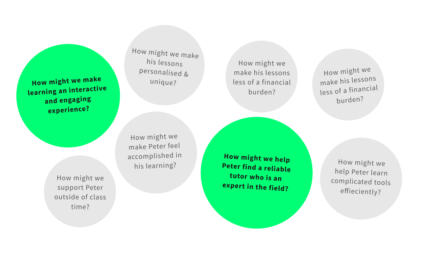
Design studio
Having defined the problem, it was now time to find a solution. As a group, we defined our design problems through a set of "How might we" statements. This helped stimulate innovation and the growth of ideas within our group as it guided us towards key problem areas.
Out of the many 'How might we' statements we found the two which most clearly framed our design challenges.
We then explored the different ways we could resolve the "how might we" statements through a design studio consisting of rapid sketching sessions. Having come from a design background, I was able to guide my team members as I facilitated the exercise.
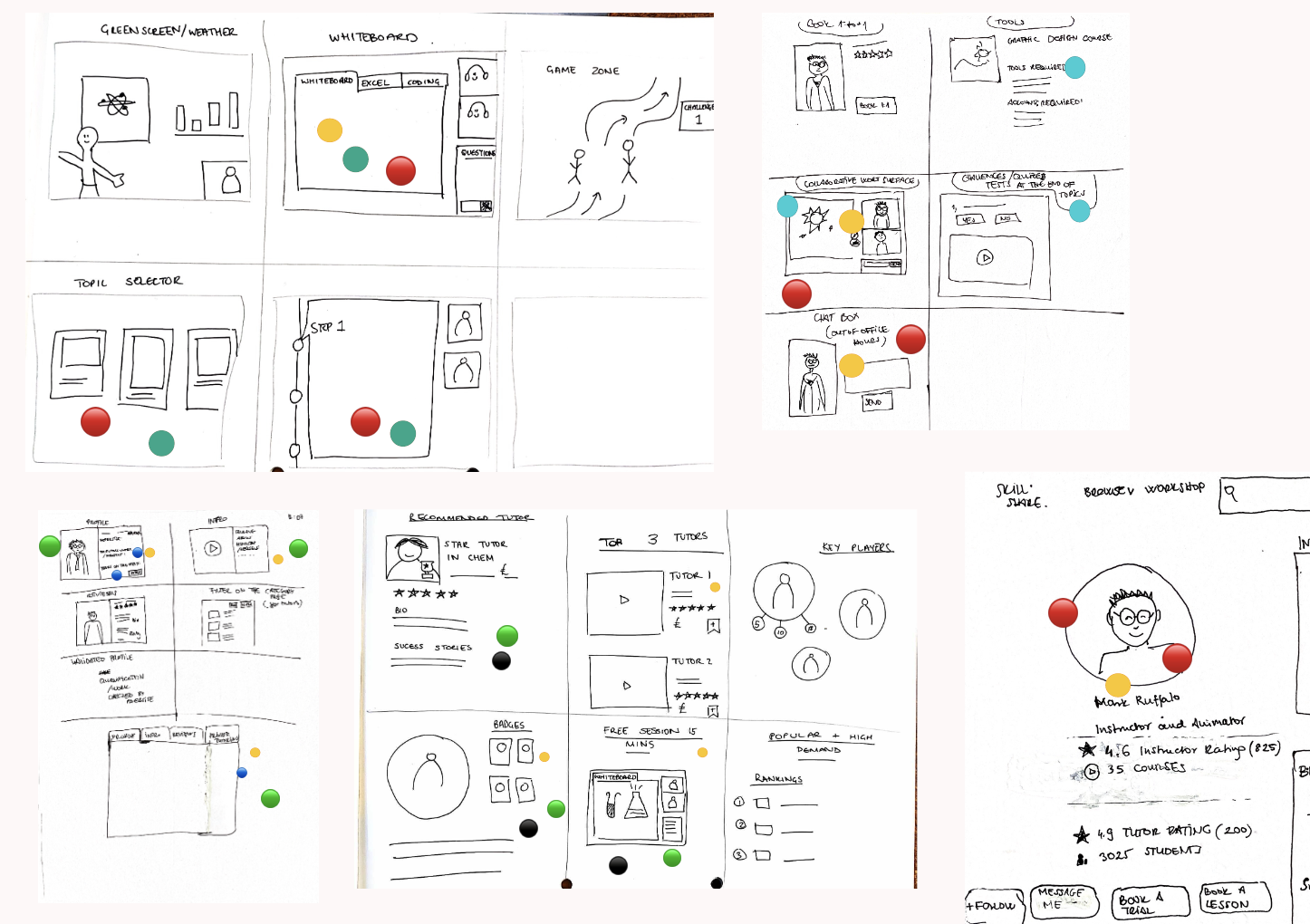
After presenting our sketch solutions to each other, we narrowed down our ideas using a dot-voting system.
Feature prioritisation
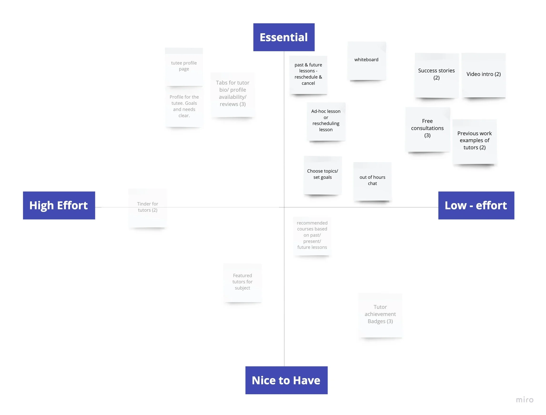
Having identified our strongest ideas and features, we analysed how feasible they were by mapping them on a feature prioritisation grid. We needed to use our time efficiently, since the project was only 2 weeks long.
We decided to focus on developing the features that were essential and low-effort for our MVP.
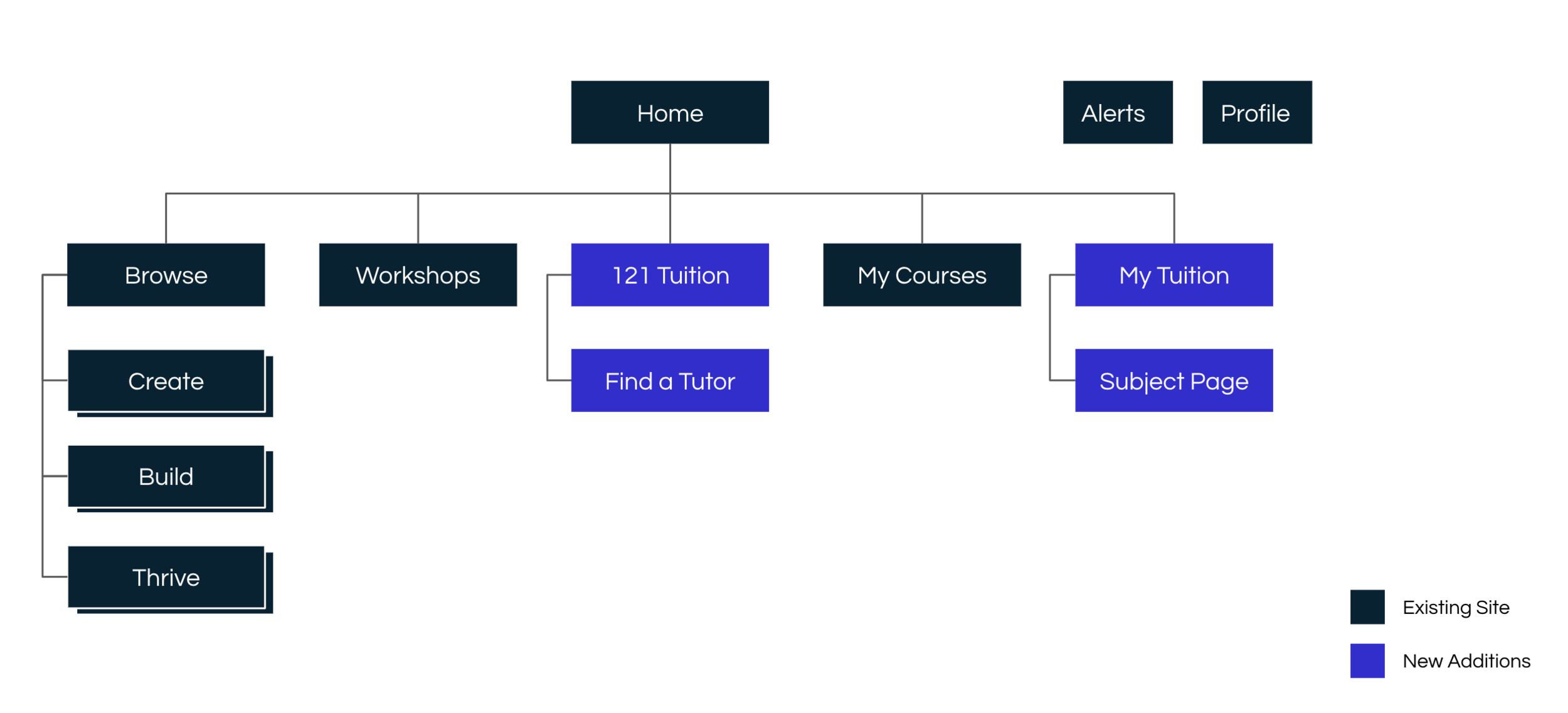
Site map
Creating a site map enabled us to see how our feature could be integrated.
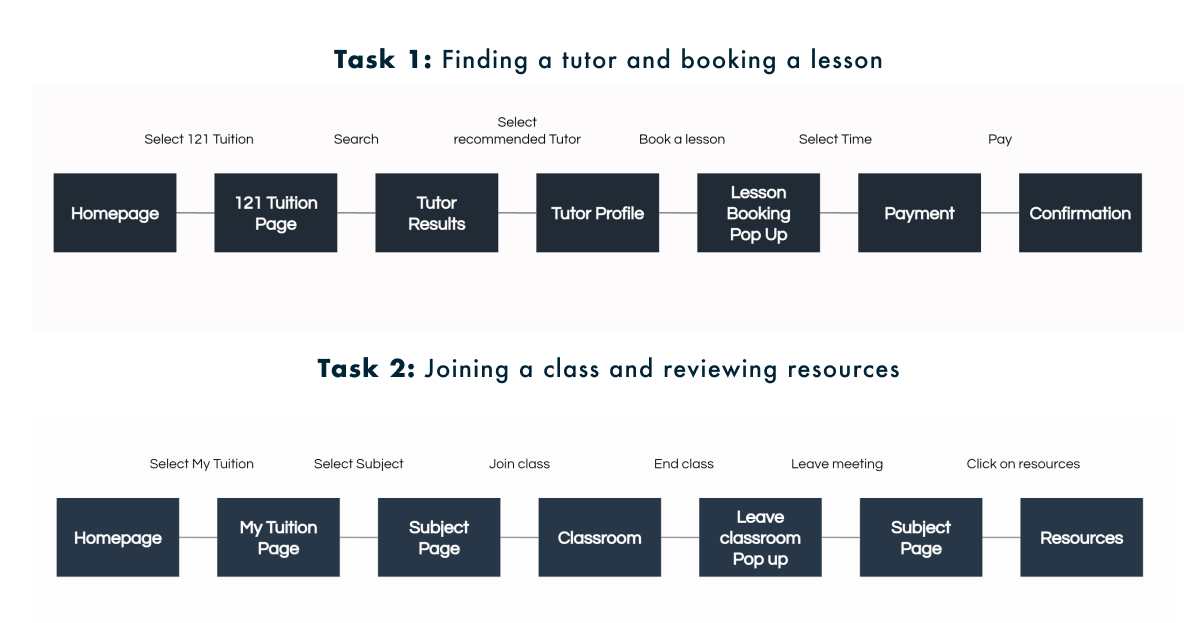
User Flow
This led us to create user flows which explored Peter's journey through the site and his interaction with the new features, as he completes two tasks.
Develop
The user flow provided us with insight into the kinds of pages our user would typically encounter and the actions they would need to take. This led us to create sketches of wireframes and in turn create our first low-fidelity prototype, which we tested & reiterated through several usability tests and design cycles.
Usability test findings
We synthesised our user test findings by placing post-it notes across each wireframe. This made it easy to spot which areas of the page needed the most improvement.
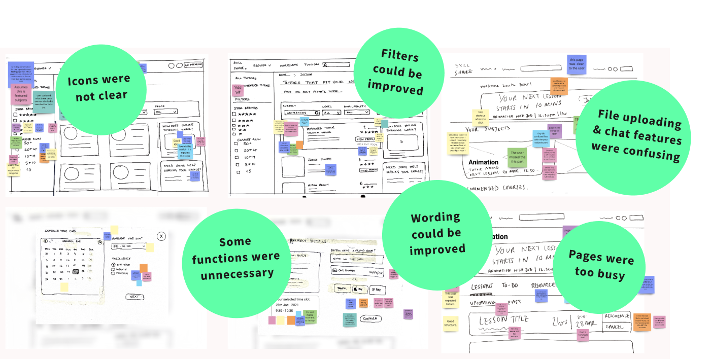
Reiterating the design
The consistent rounds of testing provided us with continous feedback, which allowed us to quickly reiterate and improve our designs. Eventually, we were able to refine the overall structure and content of our pages and begin thinking about our visual design.
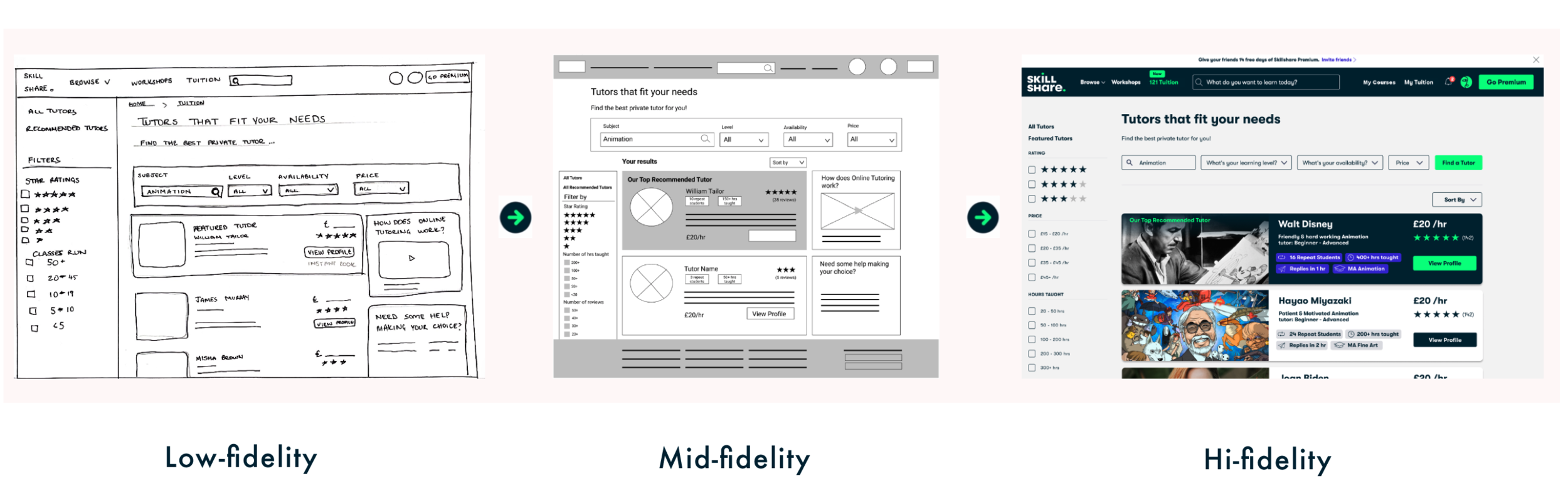
Deliver
We wanted our users to have seamless experience when they used our new 121 tuition feature. Having an integrated feature meant our design needed to match Skillshare's existing brand identity.
Visual Design
As the visual design lead in the project, it was my responsibility to ensure our prototype followed Skillshare's existing visual language.
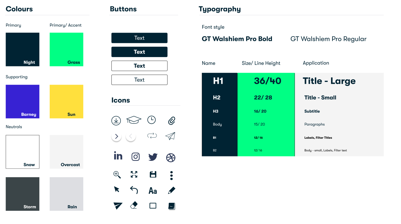
Skillshare didn't have a design system available to the public, as a result I had to conduct an in-depth UI audit of their existing site; to gain a better understanding.
UI Audit
Skillshare uses their visual style to encourage and support curious creatives to grow, discover and change. The visual style is used strategically to ensure Skillshare's beliefs are represented throughout the site.
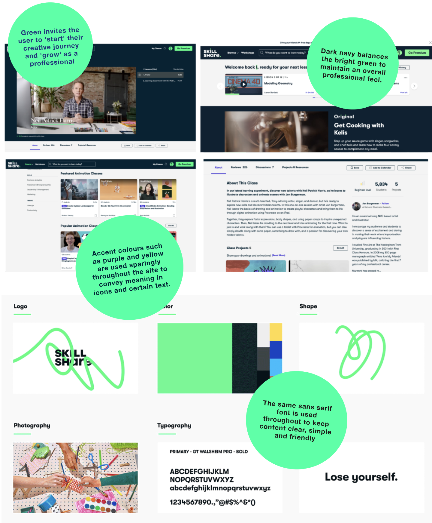
Style Guide
By conducting a UI audit, I was able to create my own version of the style guide.
As the UI designer, it was important for me to not just replicate the existing style but understand how the brand's beliefs and values influenced and determined their visual identity. My understanding of their creative process allowed me to create a final design which fully integrated with the existing site to create a seamless experience for the end user.
Take-aways:
Trust and communication are at the core of any successful project.
As a group, we initially struggled to use our time efficiently and divide up the work, but after a team retrospective our trust in each other grew. This helped us collaborate faster as we continued to face different challenges.
Working within a team pushed me to be a better communicator and team player and gave me the invaluable opportunity to learn from others. As a UX designer it is important to not only empathise with the end user but also your team mates!