Sourcewhale
Dashboard Re-design
Creating a unified analytics dashboard that empowers recruiters with clarity, speed, and actionable insights
Jan 2024 | Recruitment
Role: Lead Product Designer, Visual Design Lead
Tools: Figma, FigJam
Project Overview
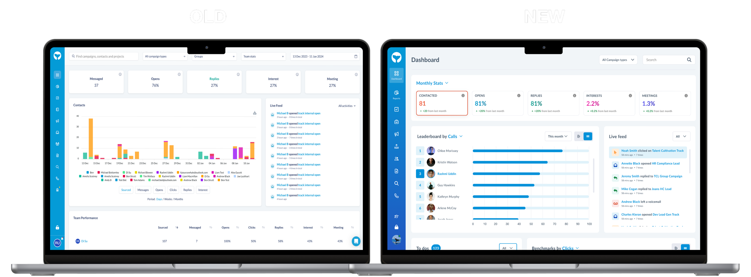
SourceWhale is a recruitment engagement platform used by agencies to track outreach, performance, and daily activity. The original dashboard—built primarily by engineers—provided functionality but lacked clarity, usability, and visual cohesion.
I redesigned the dashboard to create a unified analytics experience that gives recruiters instant access to key insights and helps them make faster, data-driven decisions.
The problem
User research and a UX audit highlighted several issues:
Users ignored the dashboard because it felt overwhelming

Information hierarchy was unclear and difficult to scan
Recruiters struggled to uncover meaningful insights
Visual design was inconsistent due to lack of a design system
The dashboard wasn’t supporting daily workflow or decision-making
Overall, the dashboard delivered data — but not understanding.
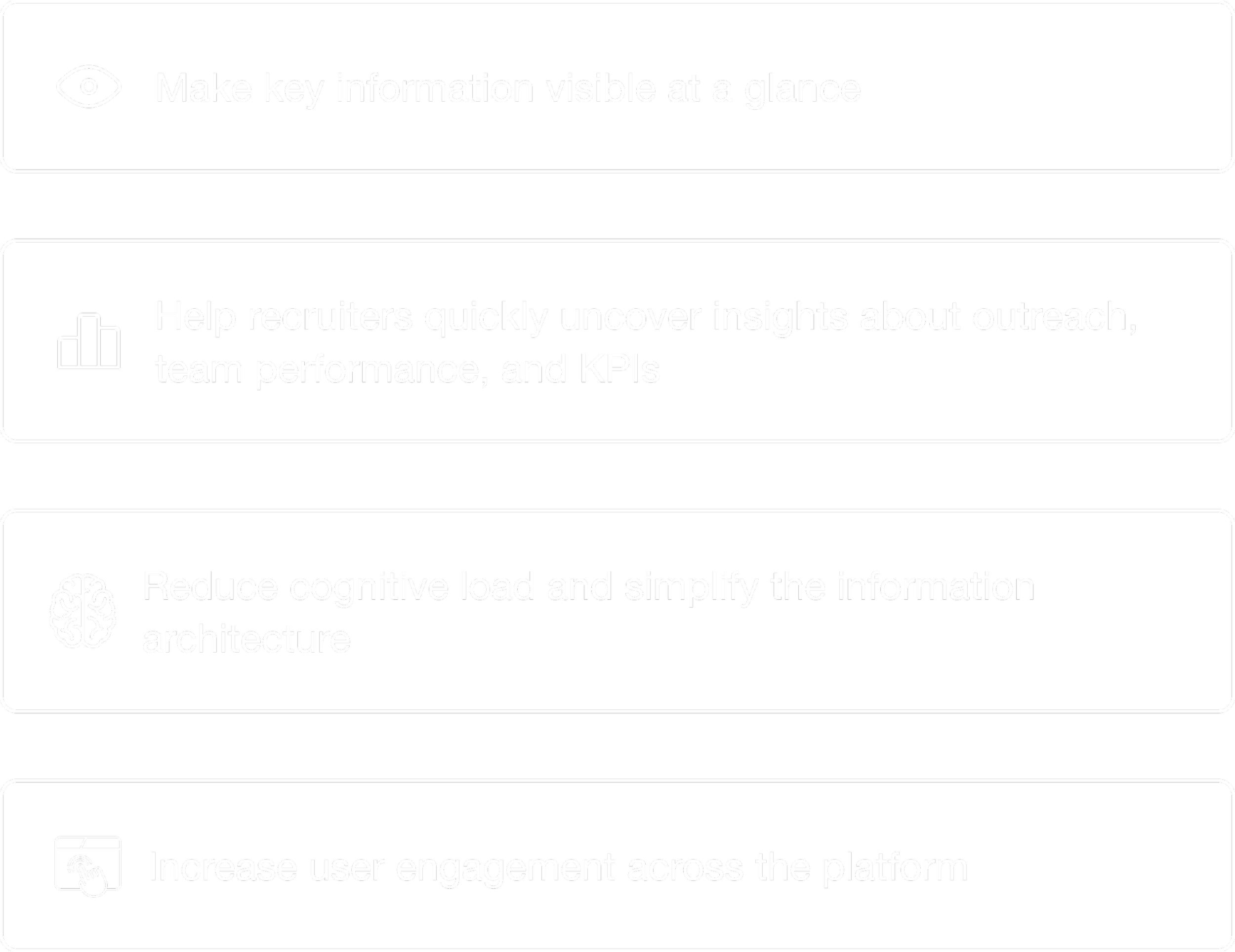
Project Goals
As a result, the redesign needed to:
Research & Discovery
Redesigning the dashboard meant first understanding why users weren’t engaging with it. To build that picture, I combined UX audits, interviews, and competitive analysis. Together, these methods helped reveal not just what was broken — but what recruiters actually needed from their data.
UX Audit
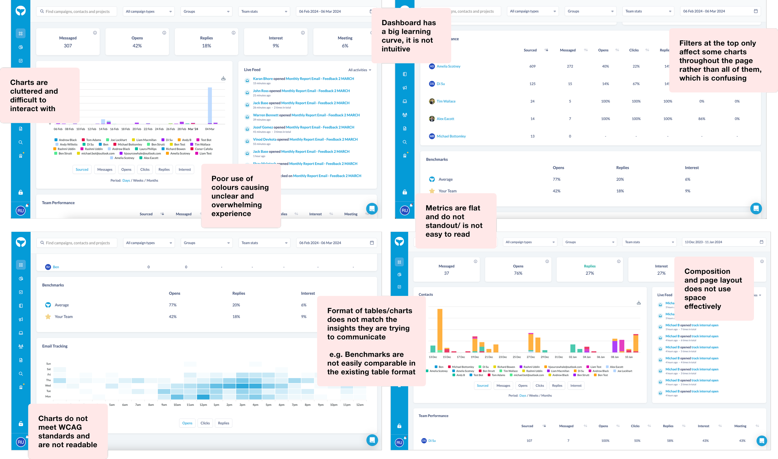
I began by examining the existing dashboard to see it through a user’s eyes. Very quickly, patterns emerged. The interface wasn’t just cluttered — it lacked a clear hierarchy, making it difficult for recruiters to understand what to focus on.
Key issues surfaced around:
Data grouping and information architecture
Layout and spacing
Chart readability
This created the foundation for what needed rethinking.
Visual consistency and accessibility
Navigation and interaction flow
Next, I spoke with both new and experienced recruiters to understand how they approached their workday. These conversations gave clarity into their mental models and expectations.
User Interviews
I focused on uncovering:

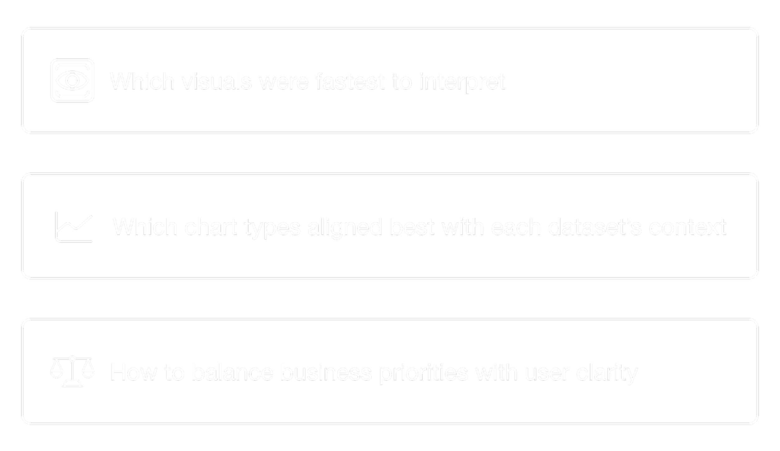
What they look for first thing in the morning
Which KPIs they rely on the most
Where confusion or friction typically occurs
How they currently interpret performance or progress
These insights helped define what “useful at a glance” actually meant for real users.
Competitive Benchmarking
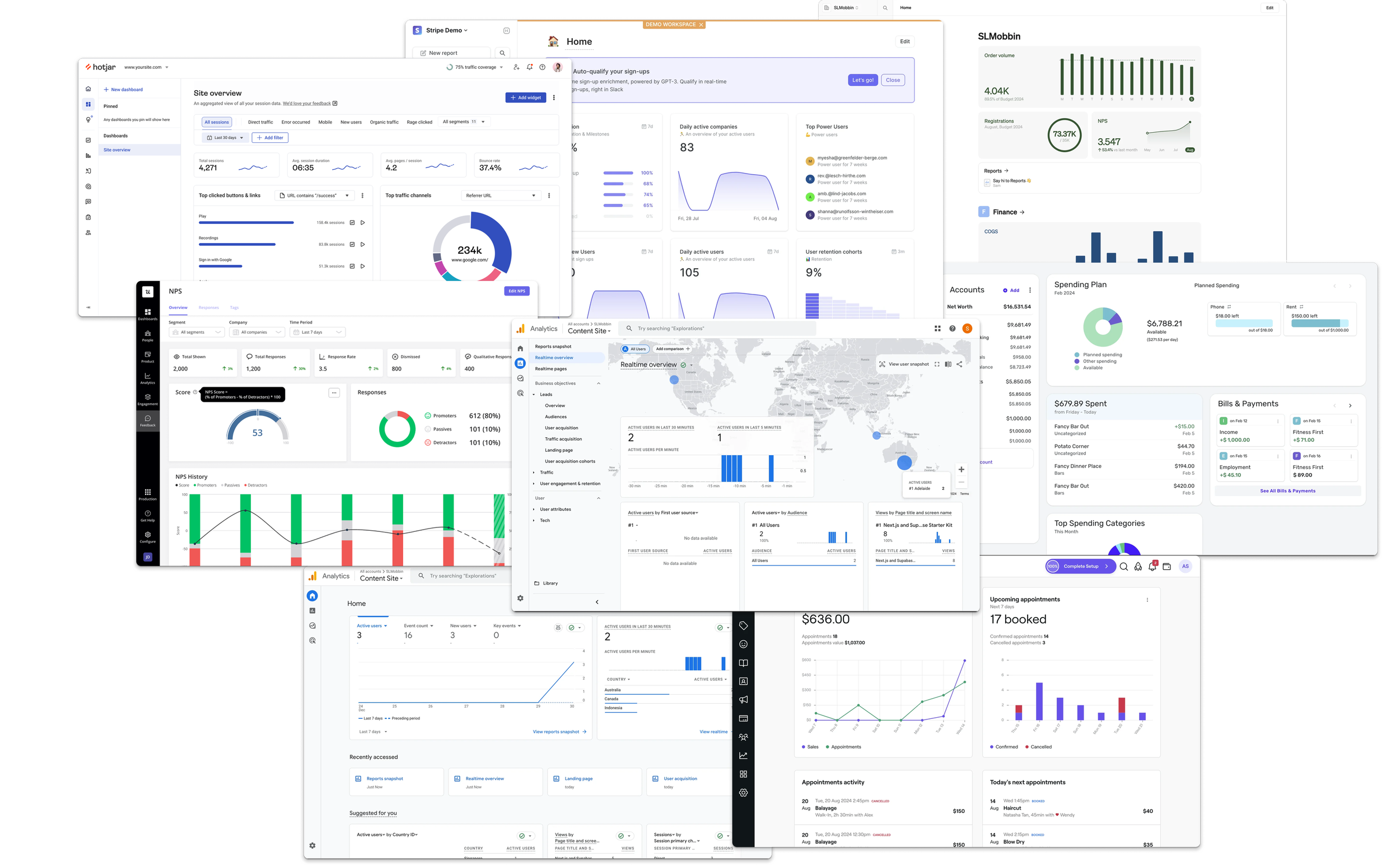
To expand the perspective, I analysed data-heavy platforms such as Heap, Google Analytics, HotJar, and fin-tech products like Stripe. While the user bases were different, the design challenges were similar in presenting complex information quickly and clearly.
This research highlighted best-practice patterns in:
Trend analysis and time-based comparisons
Chart selection and visual storytelling
Filtering and segmentation
Dashboard composition
Information hierarchy
What an effective “snapshot” view should look like
It also showed the creative range of possibilities for visualising data in ways that feel intuitive rather than technical and overwhelming.
After launching, we saw a 67% reduction in support tickets regarding the dashboard
From Research to Strategy
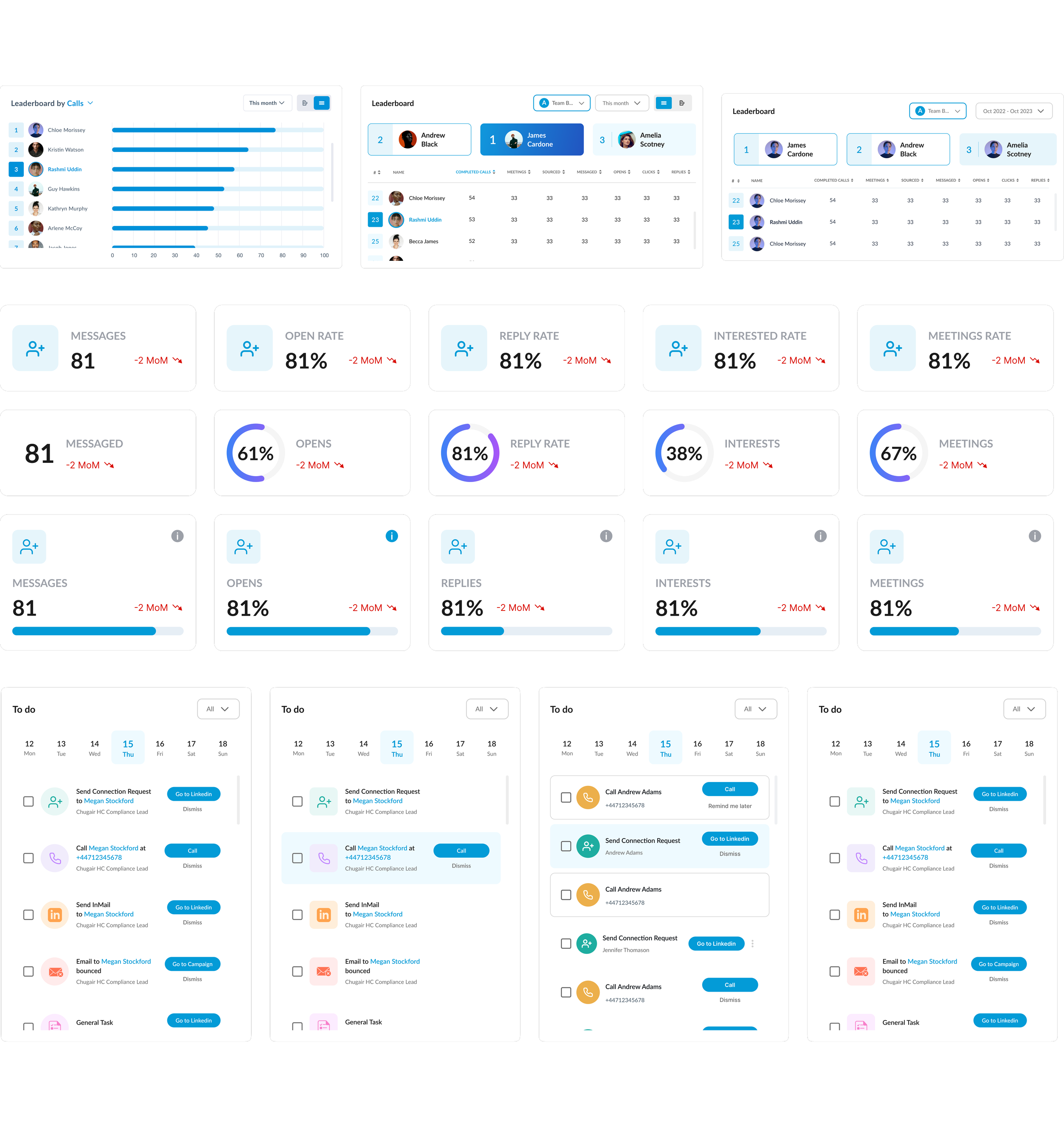
Bringing all these insights together made it clear that each dataset needed a tailored visual approach. I explored multiple chart types — bar charts, line graphs, tables, and hybrid formats — prototyping variations and testing them with users and stakeholders.
This process allowed me to determine:
Through iterative testing and close collaboration with the business, we arrived at a visual strategy that made data more meaningful, recognisable, and actionable.
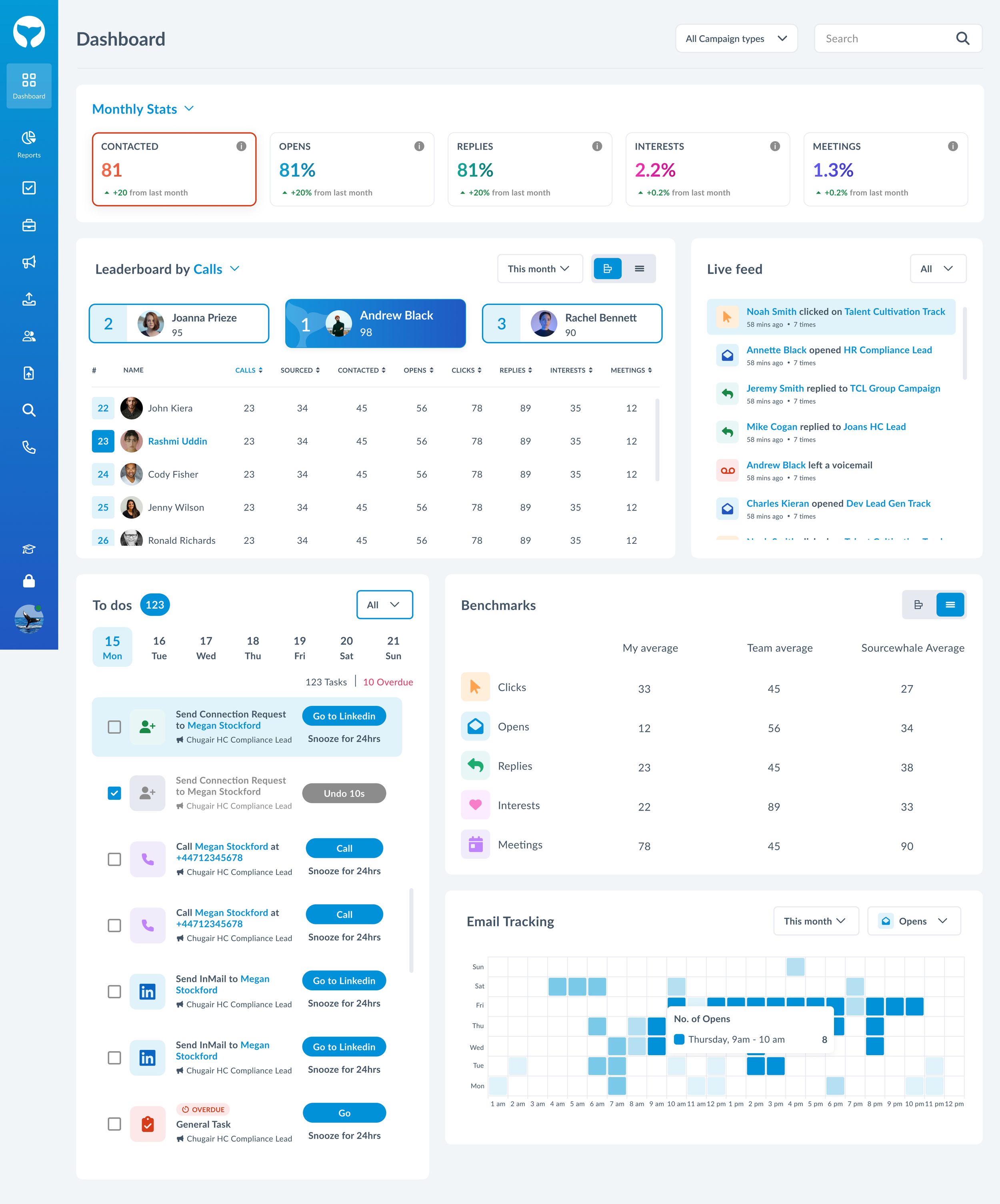
2 in 1 charts
After testing a range of chart options with users and stakeholders, we noticed that preferences varied depending on the dataset and even the user’s day-to-day needs. There wasn’t a single visualisation that consistently worked best for everyone. This highlighted that, beyond clarity, flexibility was equally important.
To address this, I introduced a simple but effective solution: a toggle that allows users to switch between different chart formats. This gives users the freedom to choose the view that best supports their workflow in the moment.
Using data trackers on heap, we observed a +53% increase in dashboard engagement within the first month
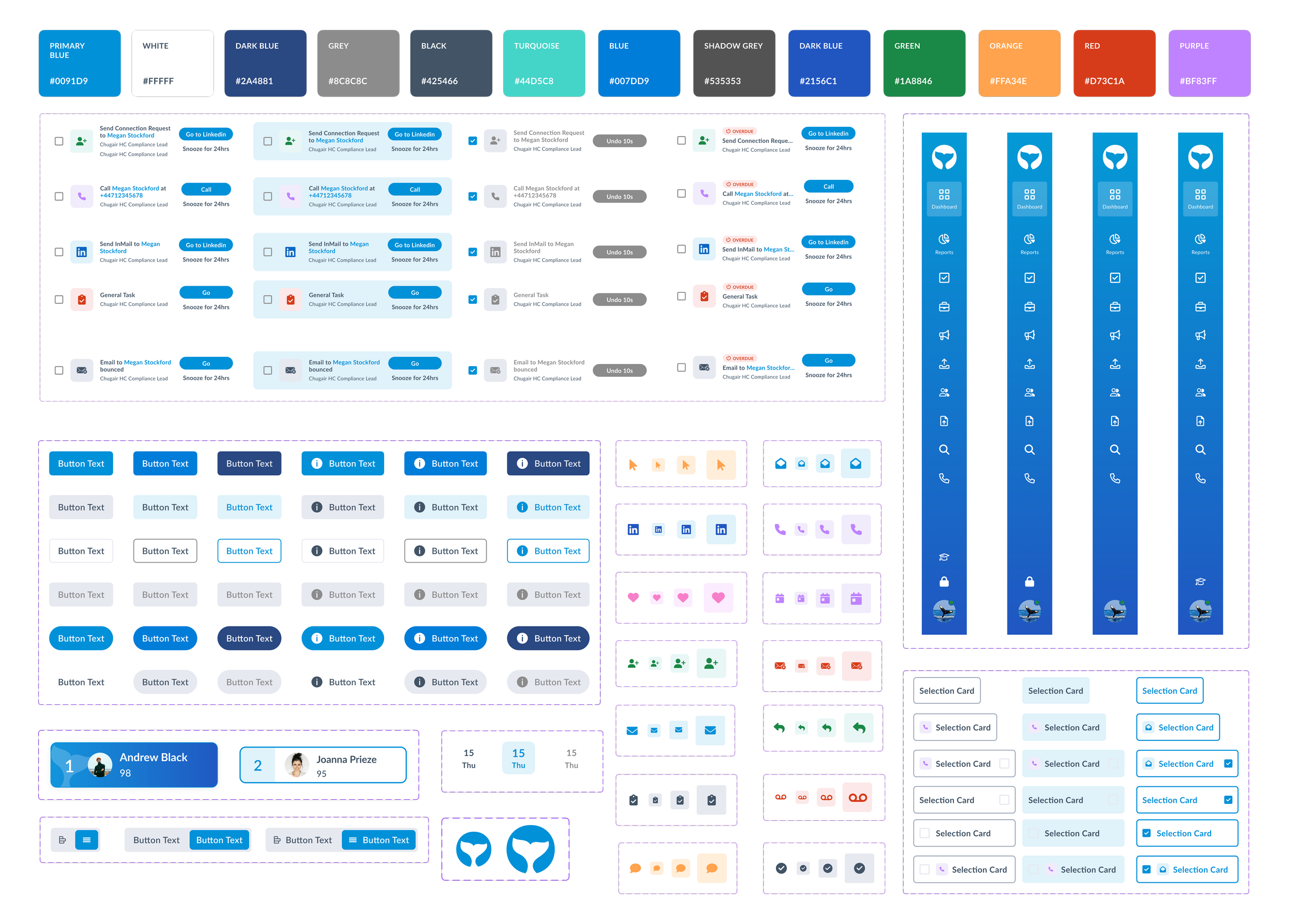
Creating a design system
SourceWhale previously had no formal design system. The dashboard redesign became a catalyst to introduce one.
I built a foundational system that included:

Colour palette optimised for accessibility and data legibility
Typography scale and usage guidelines
Spacing and layout grid
Interactive components (cards, filters, tables, tooltips, tabs)
This not only improved consistency across the dashboard but also enabled scalable product development going forward, as it was later adopted across the entire platform.
Reusable data visualisation elements
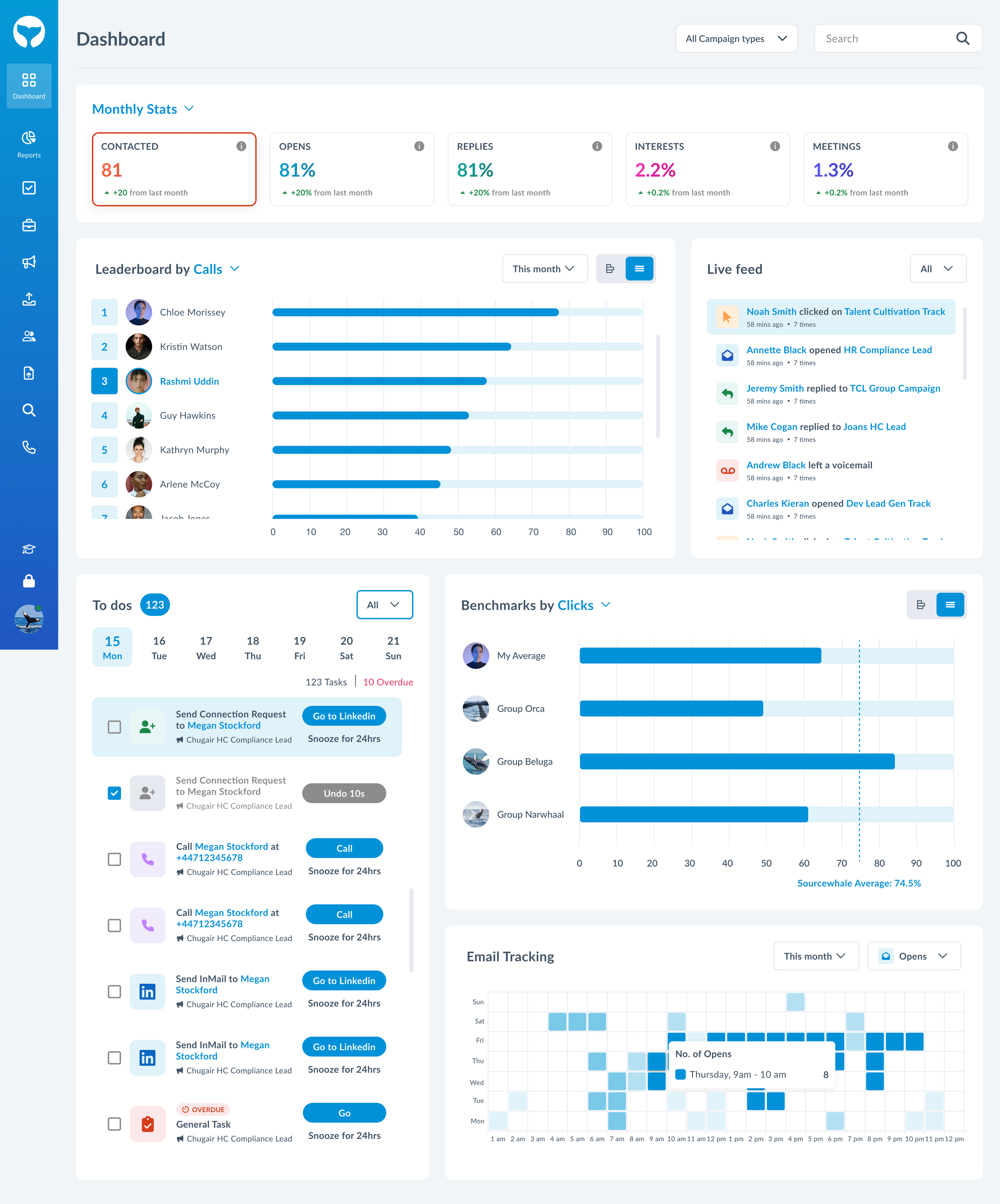
The final design
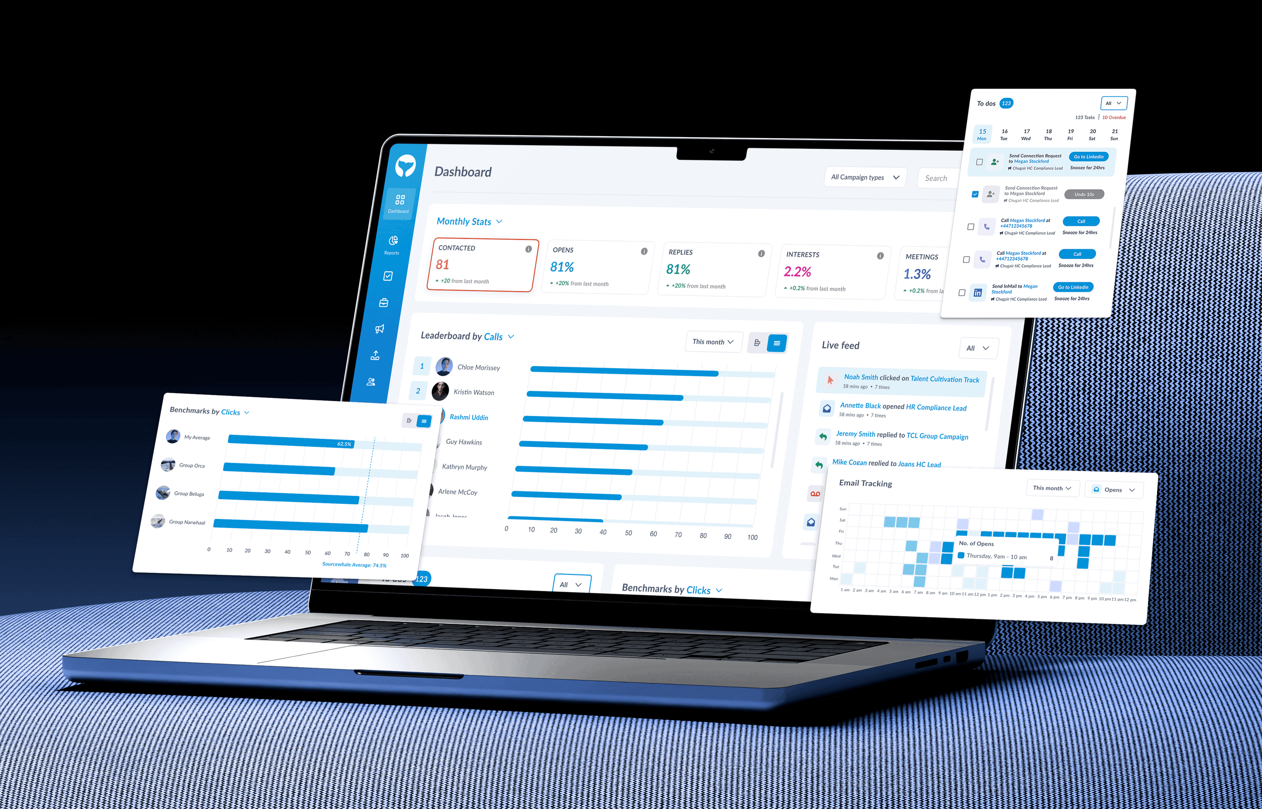
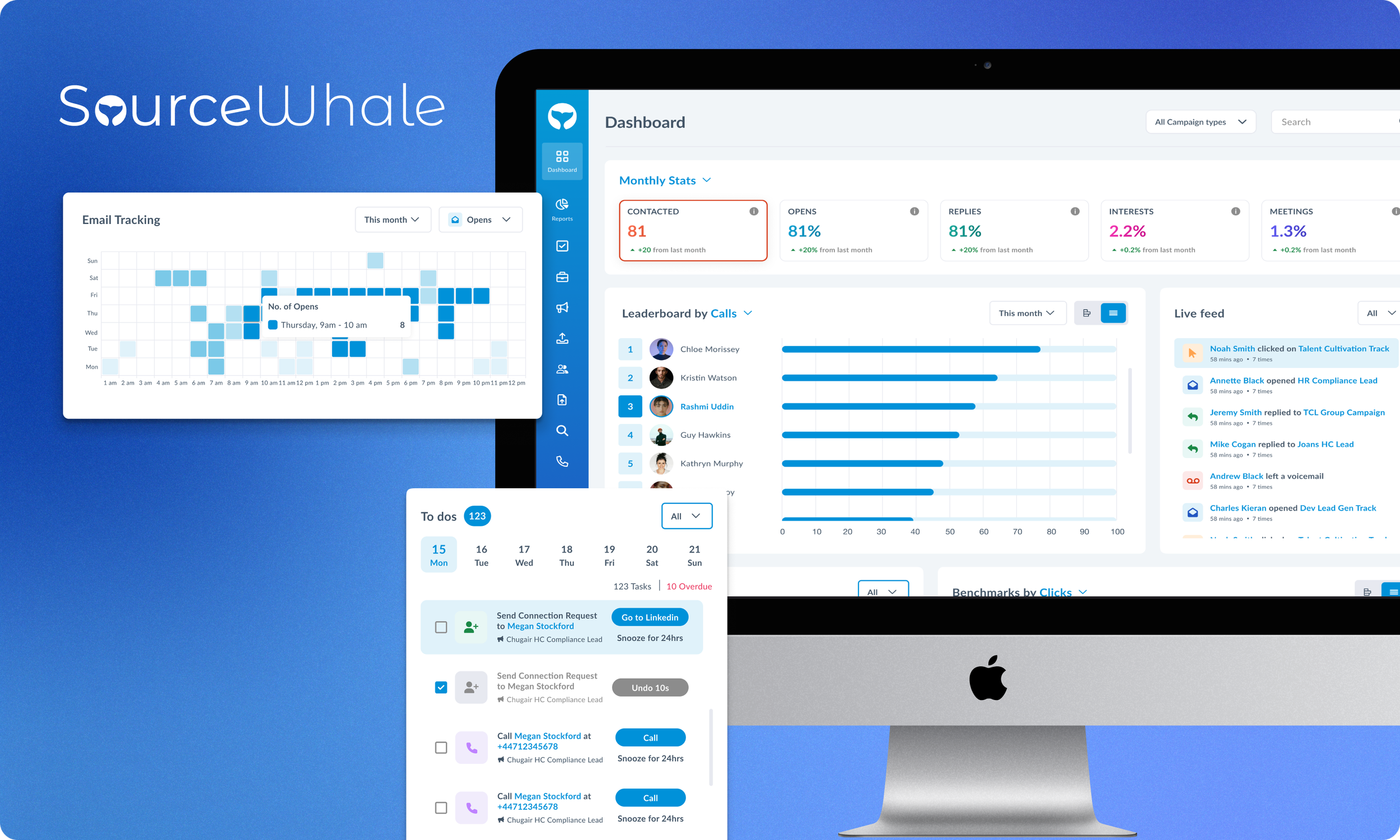
The redesigned dashboard shifts from being a static collection of data to a dynamic hub recruiters can interact with and rely on throughout their day. The first thing users now see are clean KPI cards that instantly highlight what matters most, removing the guesswork that previously slowed them down.
As they scroll, data unfolds in a structured, intuitive way — charts tell a story, sections naturally guide attention, and insights feel within reach rather than buried. Each chart now has its own dedicated date filter, giving users the flexibility to explore datasets across different time periods without losing clarity or context. For more advanced workflows, recruiters can also switch between multiple campaign views and even access other team members’ dashboards, enabling quick comparisons across individual, team, and company-wide performance.
The interface has a renewed sense of clarity and rhythm, thanks to consistent spacing, refined typography, and colour choices that improve both aesthetics and accessibility. By bringing all essential tools, controls, and insights into one unified space, the dashboard now supports faster decisions, deeper understanding, and a smoother daily workflow.