
Redefining the way the creative industry works through design
Oct 2021 - Sept 2023 | Fashion & Creative Industry
Role: Product Designer (Permanent)
Tools: Figma, Photoshop, Miro, Zoom, After Effects, Principle
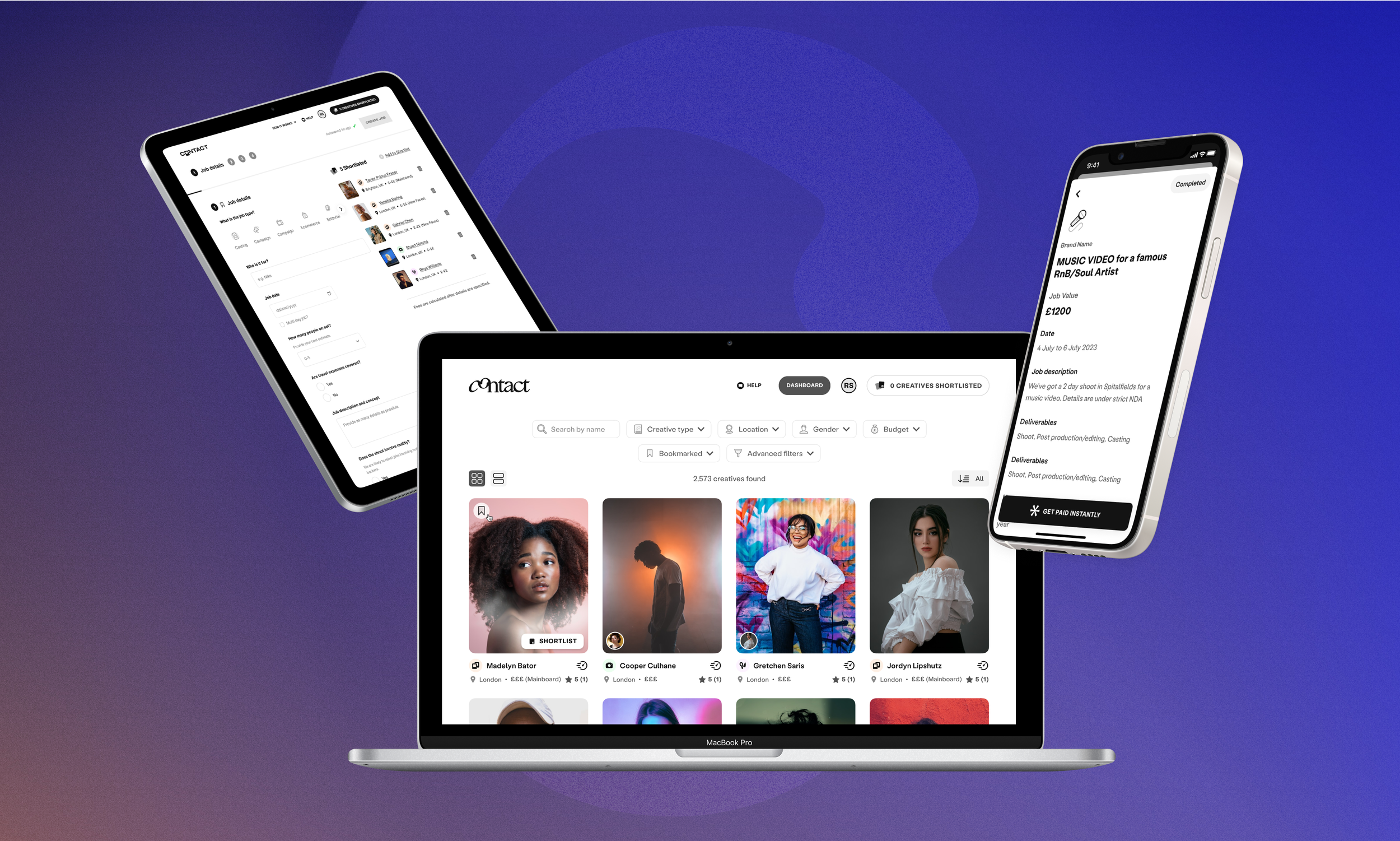
Contact is B2B & B2C platform for brands and agencies to seamlessly discover, book, and pay creative talent such as models, photographers, hair & makeup artists and influencers.
Through their native iOS app, Contact also allows creatives to take control of their career, by providing high-end tools for job management and portfolio curation.
Trusted by over 1,500+ brands, including Vogue, Balenciaga, Vivienne Westwood, Nike, Converse and many more. Contact provides a full-stack solution for brands, agencies and creatives to manage creative jobs such as photoshoots, run-way shows and music videos.
My role
As the lead designer in my team, I worked on refining existing flows within the Contact platform as well as introducing new high-impact features for all their key users across the board (i.e brands, agencies and creatives). In doing so, we were able to reach ambitious business goals and meet user needs and demand. These included, but were not limited to:
My Approach
During my time at Contact, I collaborated with engineers, product managers and stakeholders, leading cross-departmental workshops to ideate solutions and create high-end wireframes and prototypes.
I also led many research and discovery projects, involving user interviews, usability tests, competitive analysis and design workshops — all of which gave me a in-depth understanding of our business goals as well as user needs.

So when it came to designing solutions, I was able to mock-up a range of highly polished designs from seemingly vague design briefs, making the ideas of our stakeholders and users come to life without their need for much explanation.
I would often create multiple solutions for the same problem, always going beyond the brief to push the product further. I would then lead product meetings, presenting the different solutions to the wider team to encourage discussions. Some designs would prioritise build-time & effort over design quality, and vice versa — this was particularly crucial for a start-up, as dev resources were low, and as a team we would need to balance efficiency over quality to meet sprint goals.
A solution that prioritises build efficiency: reusing components in the existing codebase to ensure low build effort for devs
VS
A solution that prioritises build quality and user experience: proposing new features and components that bring delight
A few highlights from my time at contact
Re-designed the Create a job flow:
Re-designed the primary user flow within the platform: the way in which bookers can discover and book talent and create a job, making it more intuitive, enjoyable and flexible.
Launched new features along the way,
such as multi-vertical bookings — allowing bookers to book multiple disciplines for the same job, as well as re-submitting cancelled/ rejected jobs.
In the end we created an experience that was easy to navigate and well structured, with an experience similar to e-commerce to instill a sense of familiarity.
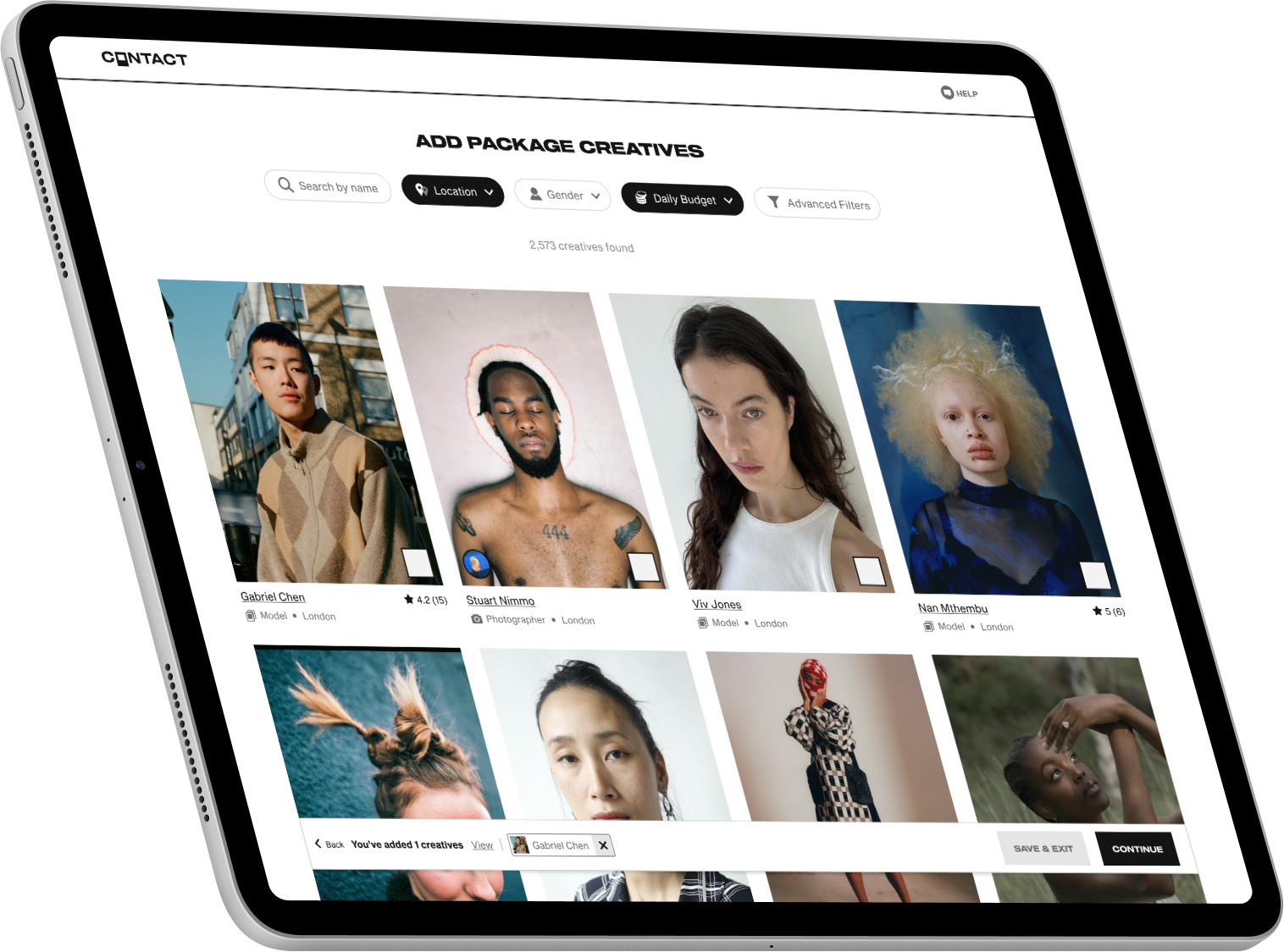
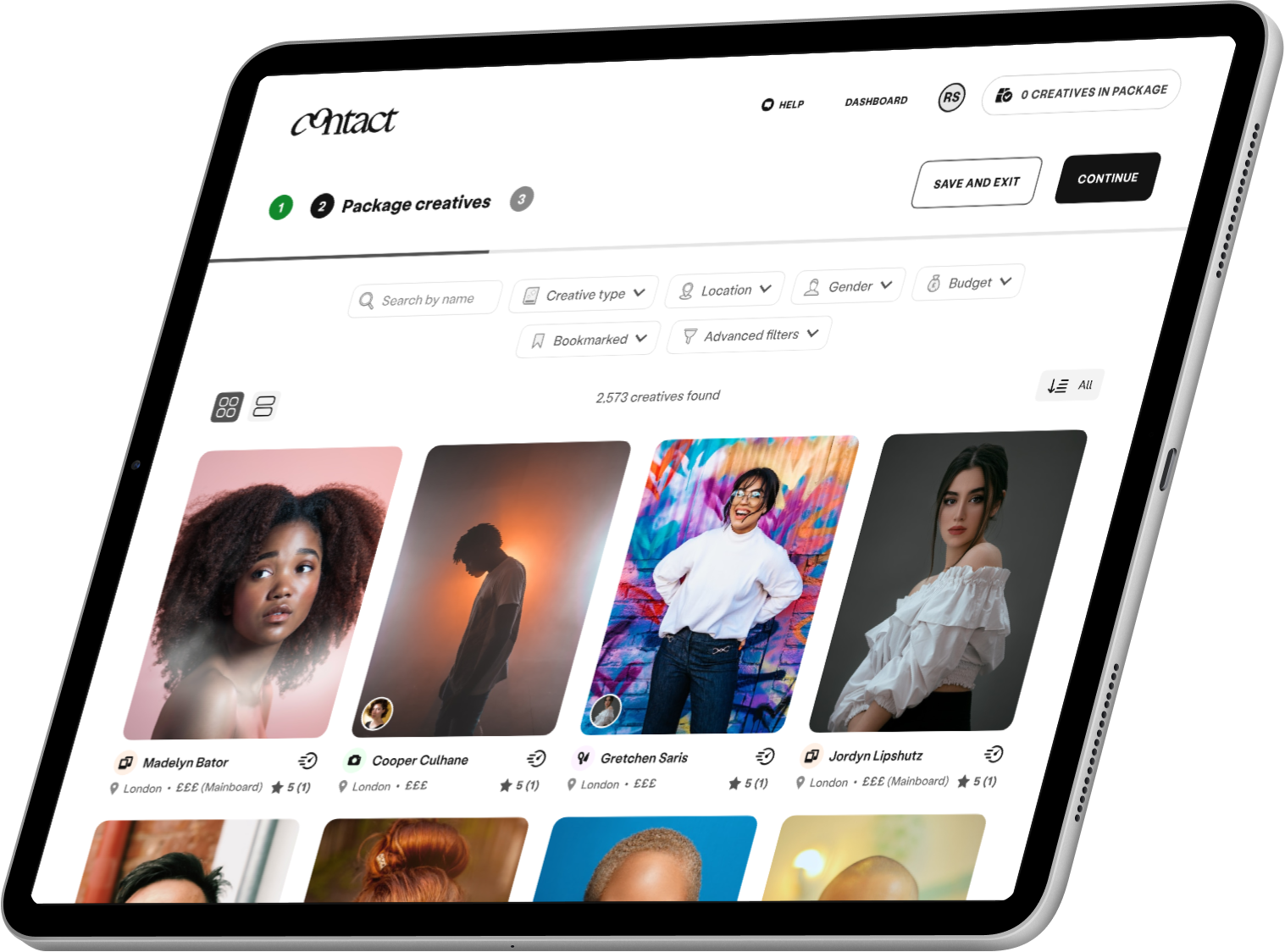
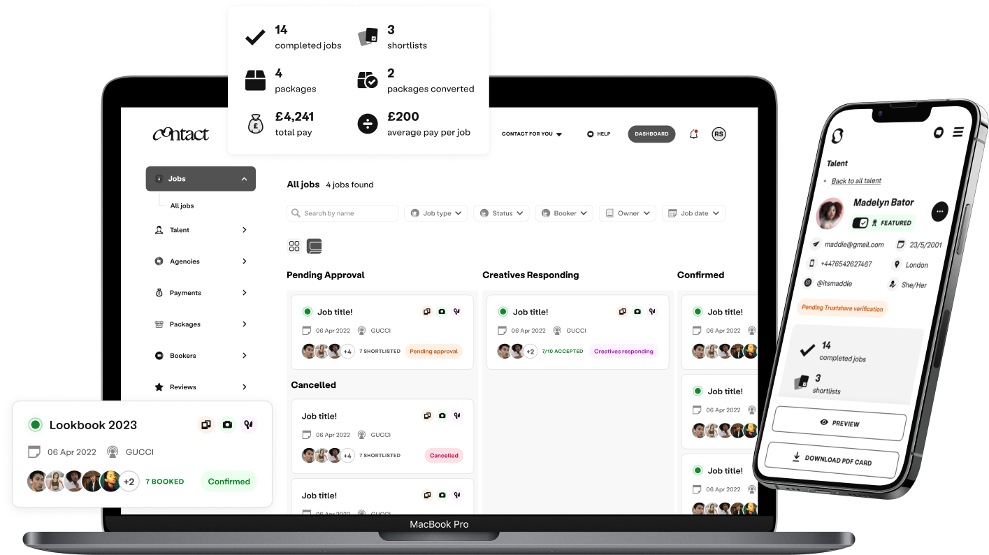
Designed and launched booker dashboard and bookmark creatives:
Led the design and launch of a new booker dashboard — creating new components and re-designing the flow so that bookers could get an overview of all current jobs, talent and stats. Easy to navigate and use, I realigned their tools all into one place allowing them to manage their work flow efficiently.
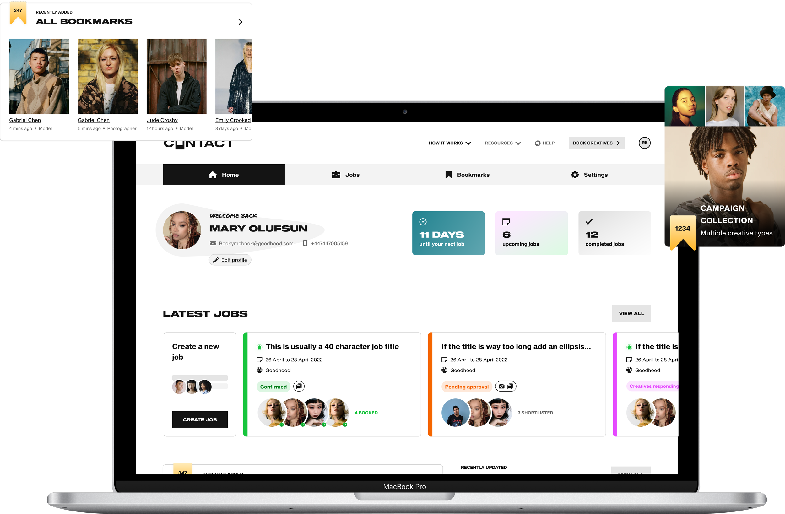
Designed a new Bookmark Creatives feature, a way in which bookers can favourite talent and group them into collections, similar to saving posts on instagram or boards on pinterest.
Both of these features were highly anticipated by our users and upon launch was a major success as it increased booker retention rates, and reduced friction.
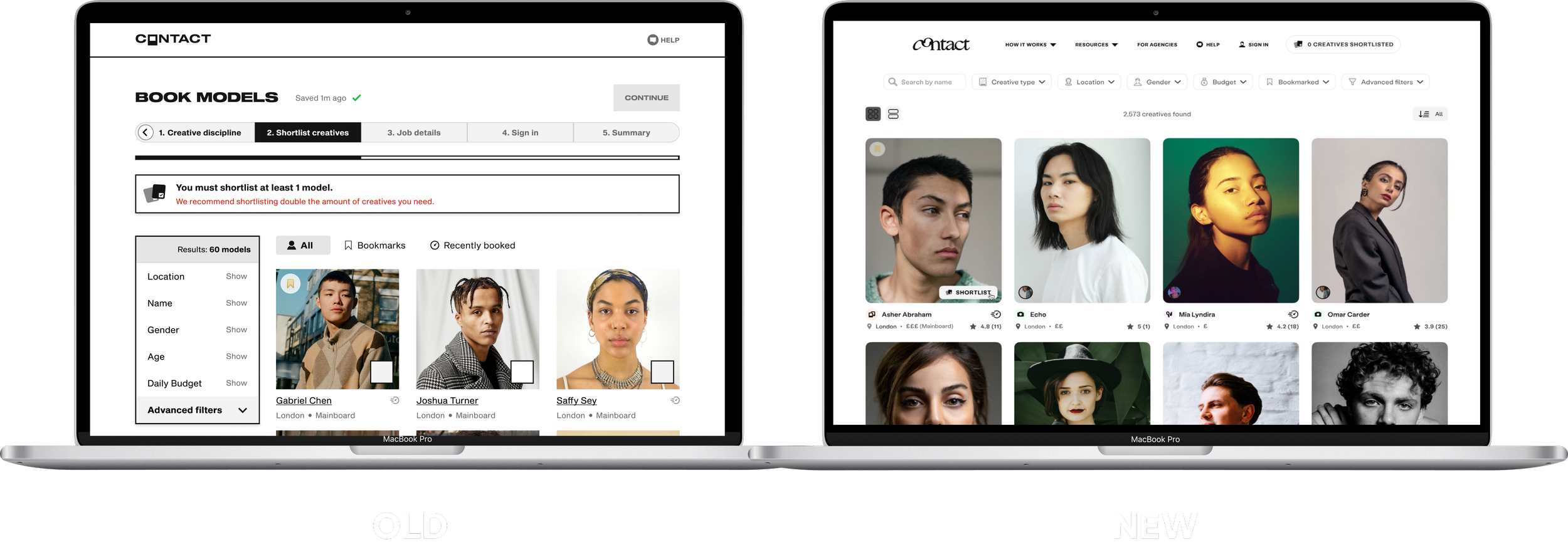
Re-designed the Agency experience:

OLD
NEW
At the beginning of Q3 2022, one of our key business OKRs was to onboard at least 15 Agencies onto the platform. To achieve this, we set out to launch a range of new features and tools for agencies whilst making significant improvements to the existing agency experience.
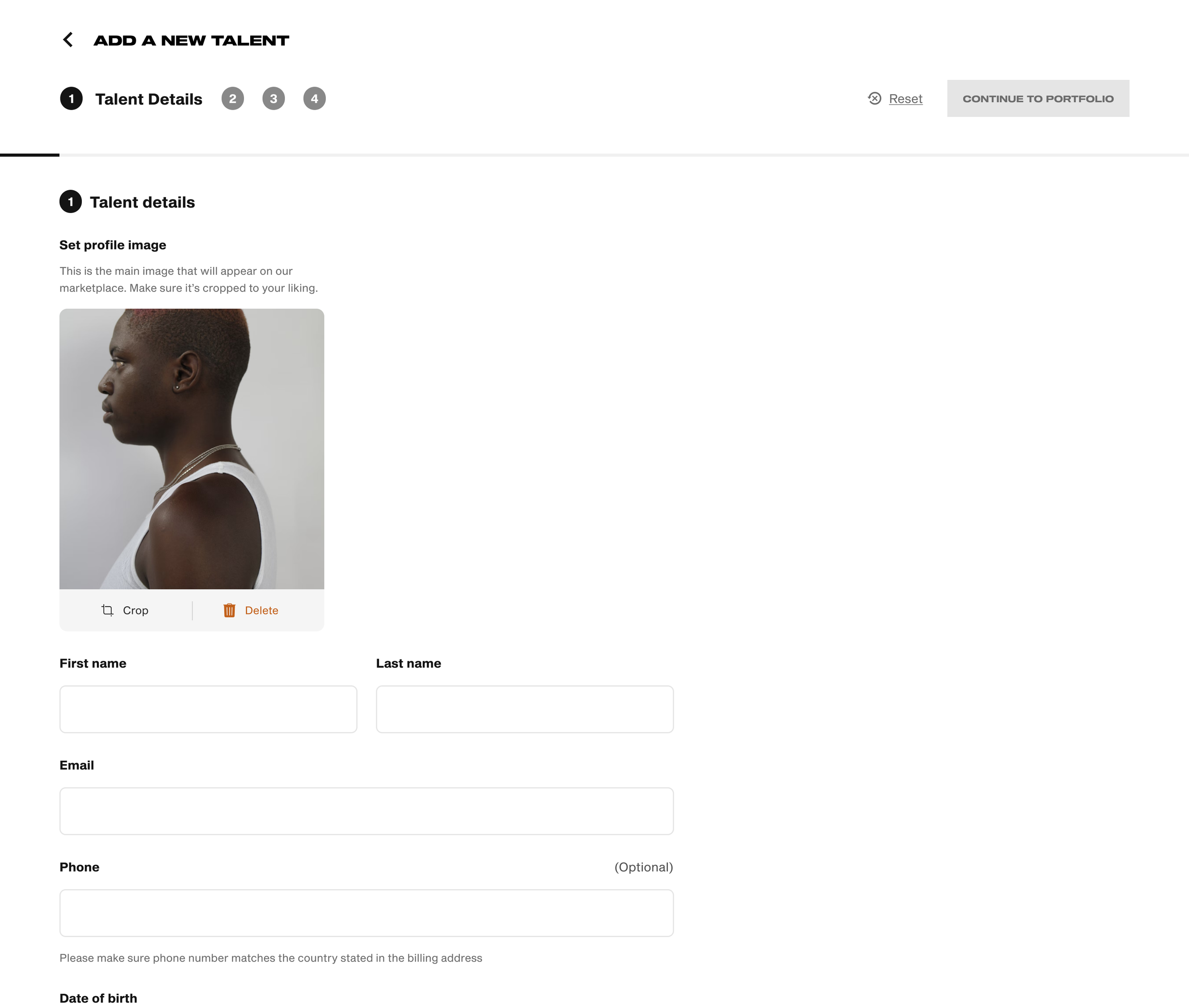
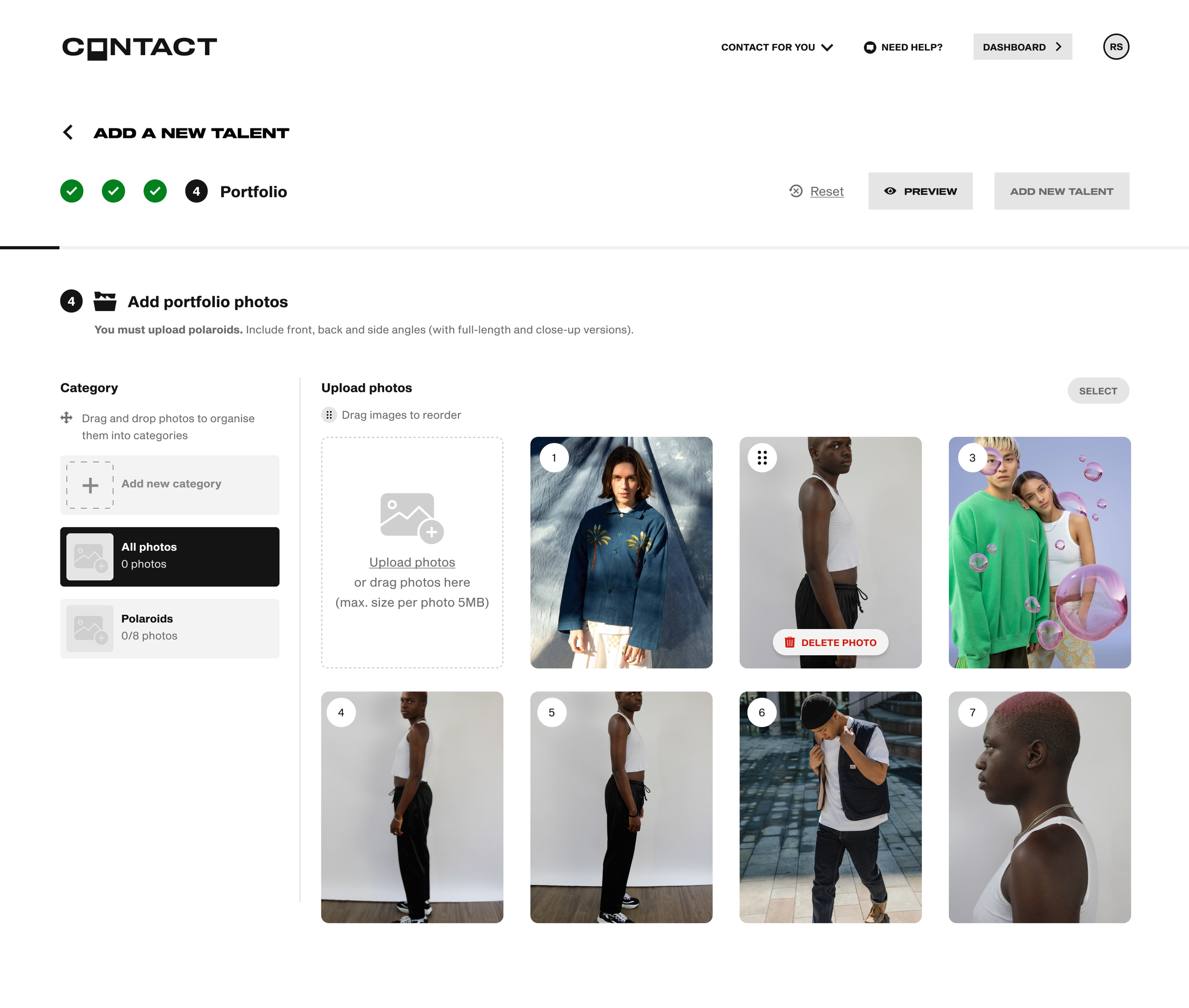
This involved designing tools and solutions for agencies, allowing them to easily add new talent to their roster, manage and curate portfolios, create bespoke packages for clients as well as a new a public profile page through which agencies and their talent could get discovered by clients.
Utilising Principle and After effects, I then created a launch video for the Marketing team, to aid in the promotion of the new agency experience. Click play to check it out!
By the end of the quarter, the redesigns and features I had designed led to a massive uptake, with almost 20 new agencies joining the platform.
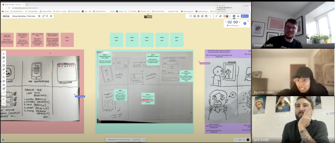
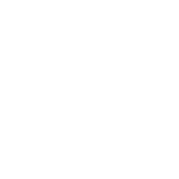
Led a Research and Discovery Project:
Solely led an in-depth research project, lasting 2 months, which consisted of user interviews, collating data around key issues users were facing when using the product through affinity mapping, user profiles and problem statements.
This resulted in a design workshop with key stakeholders to ideate solutions as well as an extensive research document detailing key pain points and user needs.
After the project had concluded we were left with an extensive backlog of design briefs and features, which we feature prioritised; ready to be implemented in upcoming sprints.
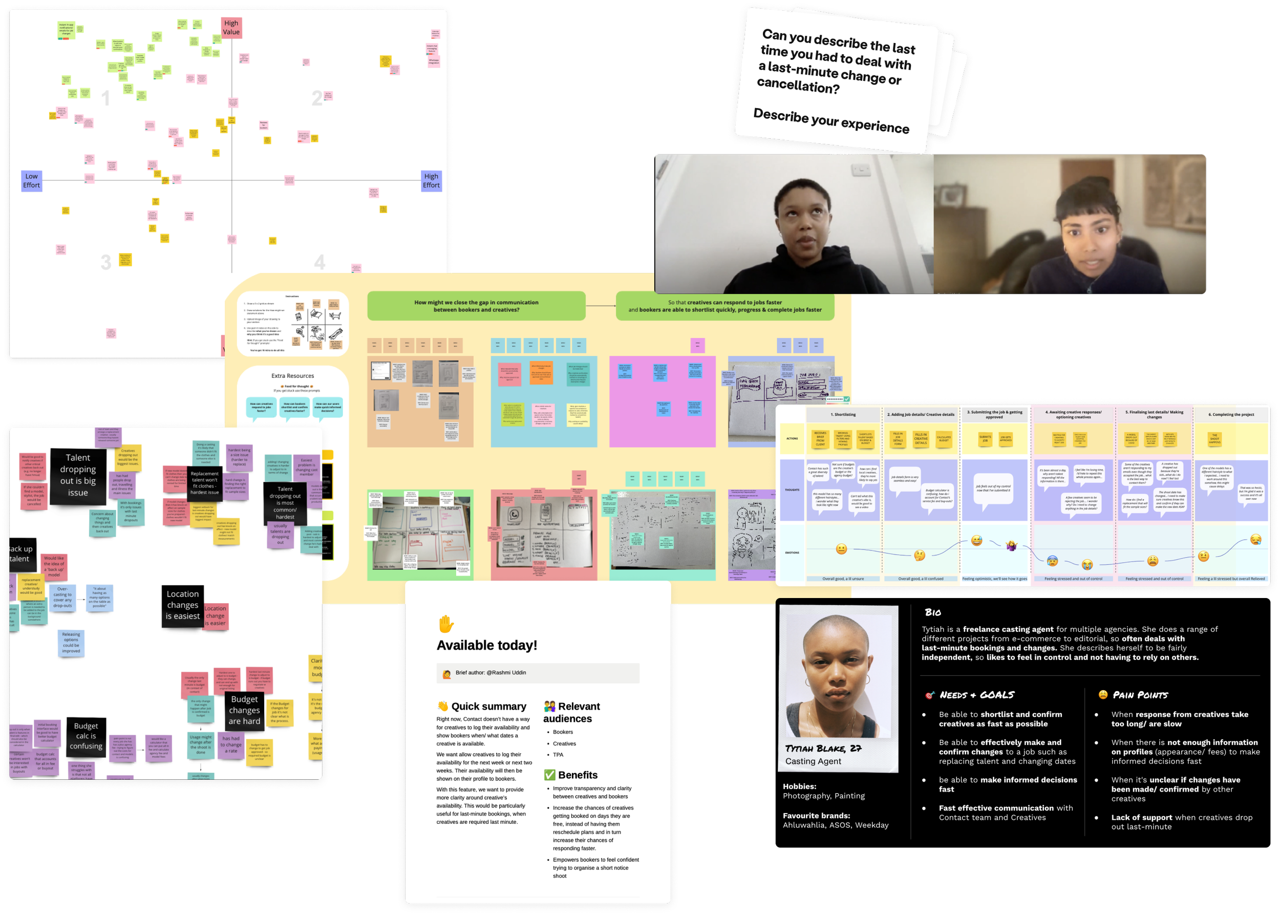
The research led to significant improvements to the products through the launch of features such as push notifications to alert users of changes to jobs as well as an in-platform messaging system, to improve communication and transparency across user groups.
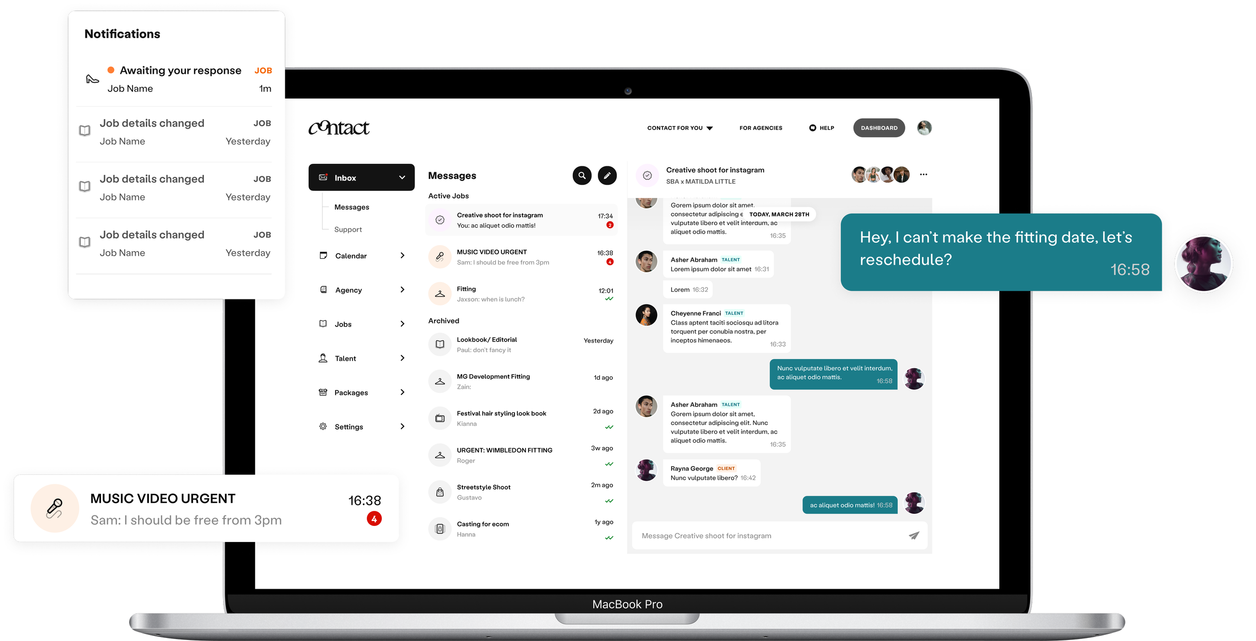
Created design systems and supported in the Company rebrand
Created design systems for pitch decks, as well as marketing assets. And supported a full company re-brand and assisted in the creation of a full design system which aligned with business objectives
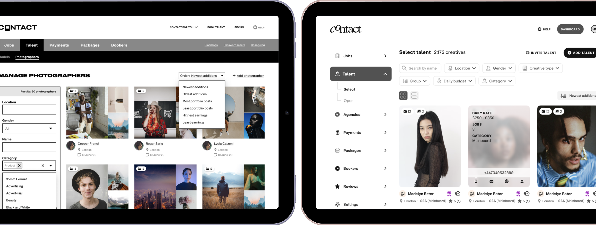
Redesigned Contact’s internal admin flows and dashboard
As part of the rebrand, I redesigned and restructured the internal dashboard for our internal operations team. We first redesigned the internal dashboards and then updated the public-facing dashboards (Booker and Agent dashboards). The internal dashboard was used as a low-stakes testing ground before launching the tools to the public. And so, it was important to get the designs right as it was the first step in creating a consistent user experience for all our users.

To get a deeper understanding of our operations team and their experience of using our current system, I interviewed them about their general workflow and observed them whilst they performed certain tasks; getting them to express their thoughts as they used the internal tools.
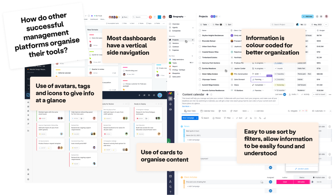
After that, I examined popular management platforms like Asana, Trello, Shortcut, and Monday. By analysing their dashboards and features, I identified industry trends and common design patterns, getting a deep insight into how management tools could be designs intutively.
I led various usability test sessions and review sessions with the operations team and reiterated the wireframes along the way. This resulted in a unified dashboard that housed all our tools in one place. Our operations team could easily find what they were looking for in a concise dashboard with intuitive flows, and the new design language ensured a consistent experience throughout. Shipping more efficient designs reduced friction, and directly improved the speed at which the team worked to deliver a high-quality service for our clients.