THE HAPPY LLAMA
DESIGNING A KNITTING APP’S UI AND BRAND IDENTITY
Individual | Jan 2021 | 3 weeks | E-commerce
Role: UI & Product Designer (Concept)
Tools: Figma, Photoshop, Miro, Zoom
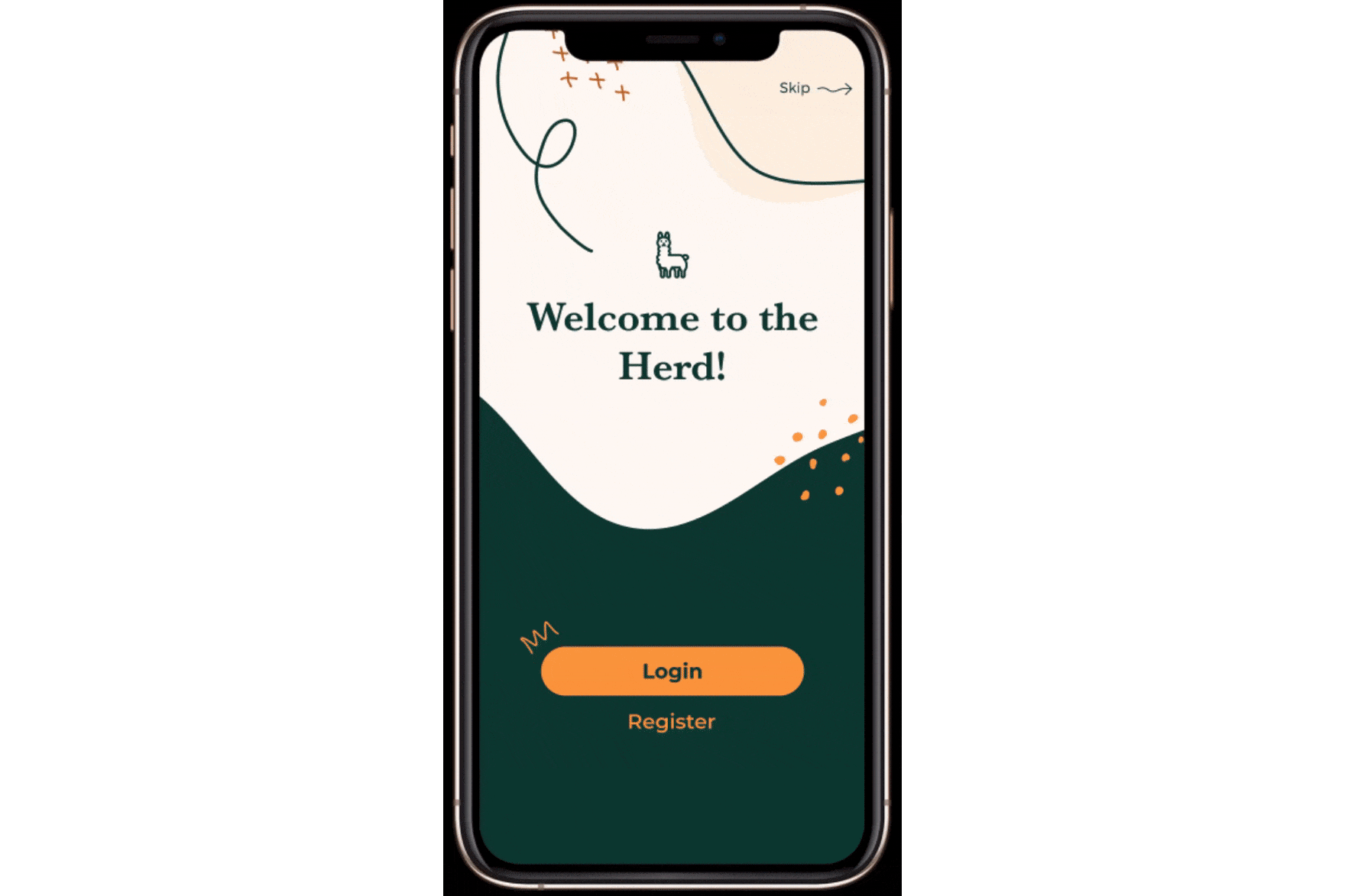
In this week-long conceptual UI design project, I designed an app for The Happy Llama; ensuring the brand's values and mission were clearly communicated.
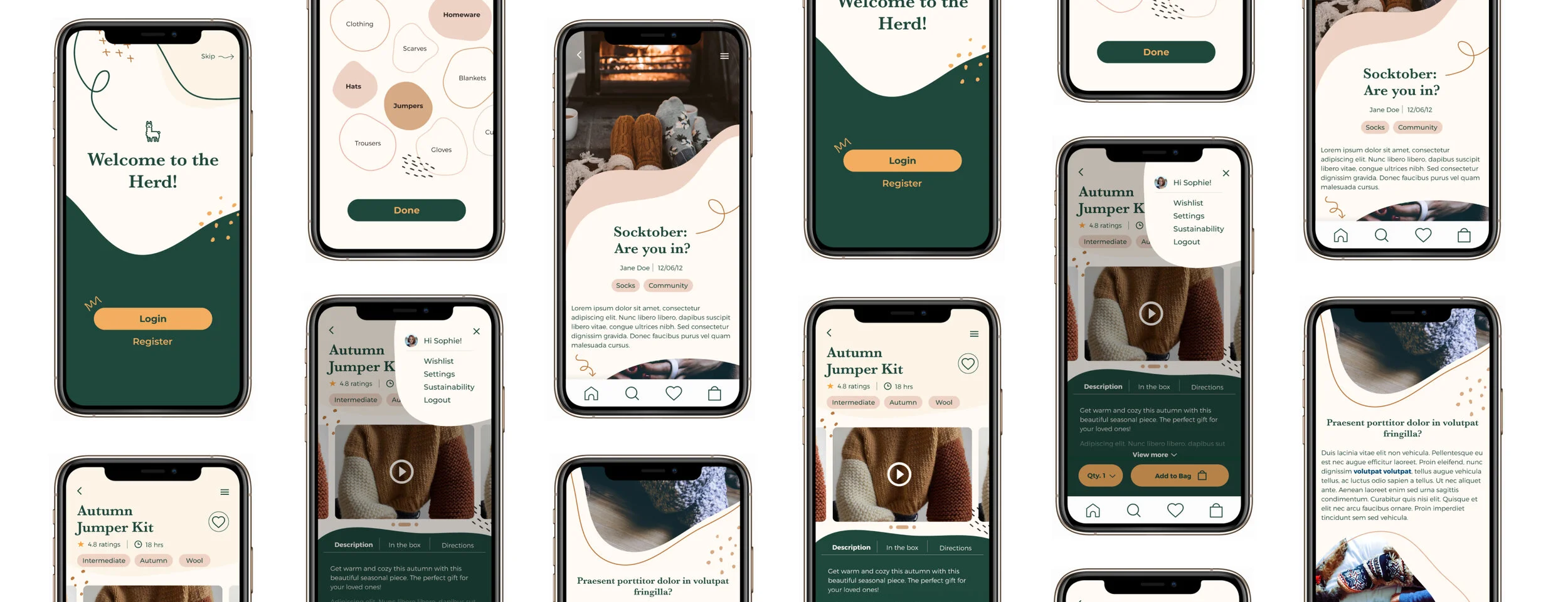
The Happy Llama is a subscription service tailored towards knitting enthusiasts as well as beginners. Their key goal was to create an app which allowed users to get knitting project kits (consisting of yarn, needles etc.) delivered to their door. The app would also provide support along their journey towards completing each project through detailed instructions and video tutorials.
The Story
(in Short)
The brief
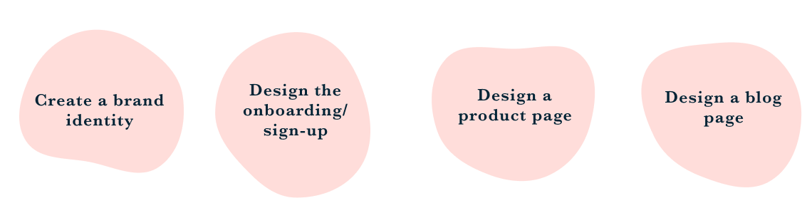
As the UI & Product Designer, I was tasked with the following:
how I helped
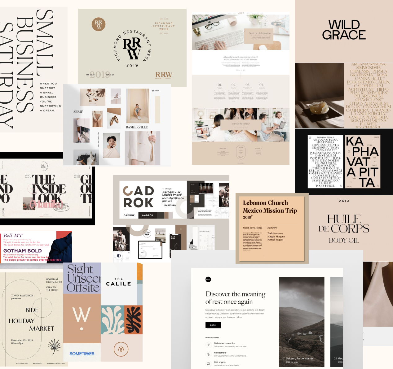
I was able to create a strong digital brand framework and personality through conducting various design exercises which helped me define the brand’s values and goals. I then used these key words as a basis to create a set of mood-boards which explored key visual design elements such as typography, illustration, colour and composition. By drawing from existing references, I was able to understand how The Happy Llama’s brand values could be expressed and, in turn, envision a clear and coherent visual language for the app.
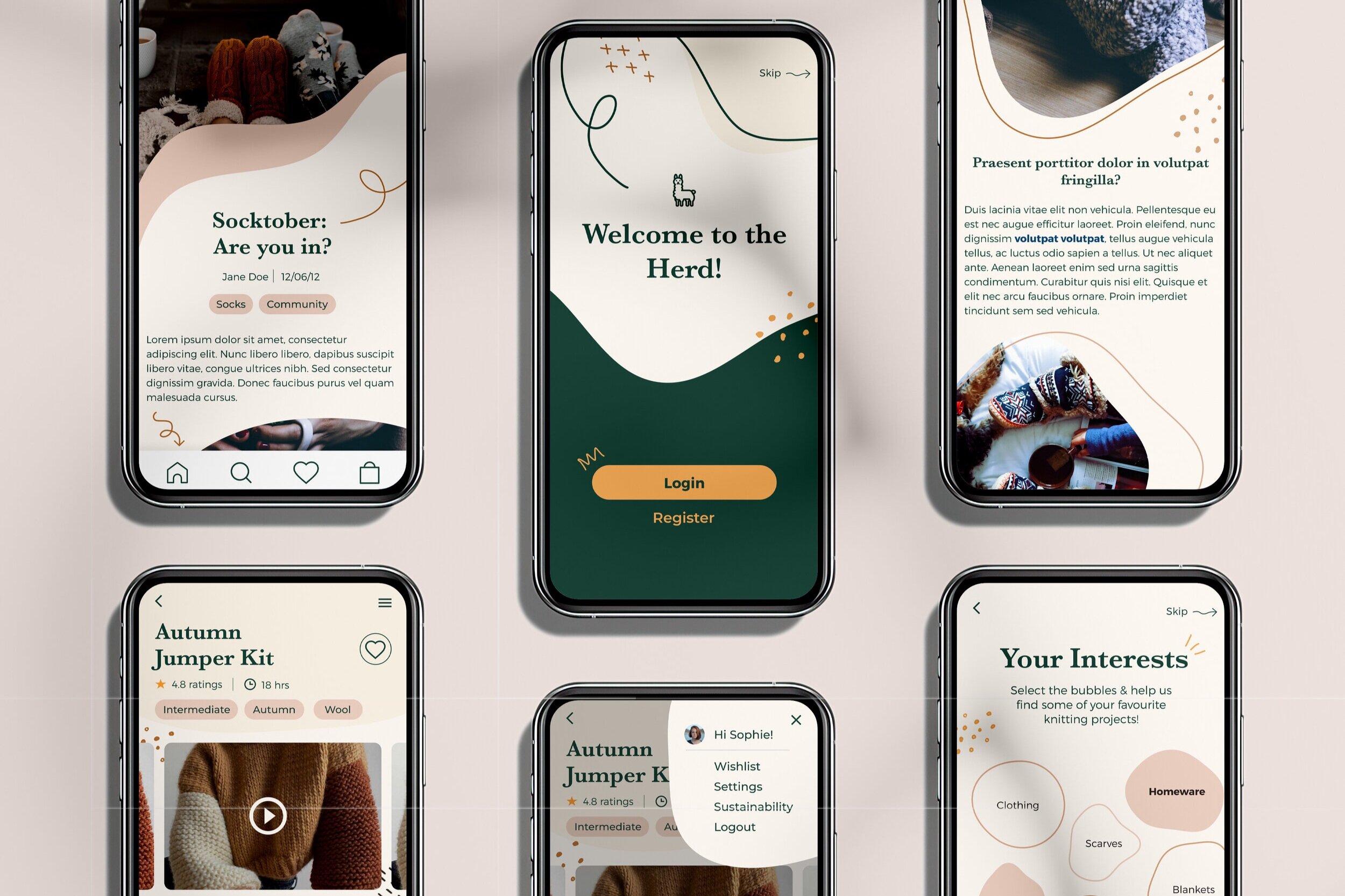
What i Delivered
Engaging onboarding and sign-up experience
Detailed visual identity and branding
Clear and organised product page and blog page
Continue reading to get the full story or
Discovering the brand personality
In this conceptual design project, I had the creative freedom to define who The Happy Llama was and create their brand personality from scratch. To create a distinct design and a solid brand personality framework, I needed to first understand who The Happy Llama was and what their core values were.
Brainstorming Ideas
To kick things off, I completed a word association exercise. This allowed me to discover and define key words which best described the company's personality. The app was for a knitting company and so I began noting down all the possible objects and qualities that came to mind when thinking about the word "knitting". This eventually led to a mind-map full of various ideas that could be part of The Happy Llama's personality.
Brand Values
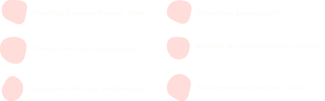
Through the word association exercise and mind-map, I was able to define the brand’s values through a few conclusive words which best describe The Happy Llama.
Setting limits
To ensure my design remained focused and aligned with the brand's values, it was important for me to not only define who the company was but also who they weren't.
As a brand, The Happy Llama was:
Who is THe Happy Llama?
These exercises helped me discover and define who The Happy Llama was.
I envisioned The Happy Llama app to be an opportunity to redefine knitting. Rather than it being an outdated craft for an older generation, The Happy Llama would allow users to create trendy fashion-forward pieces that are made from sustainable eco-friendly wool, which would be provided in the kit.
Who is it for?
The app would be for the crafty young millennial (16 -25 y/o), who’s also conscious of their carbon footprint.
Defining the Brand
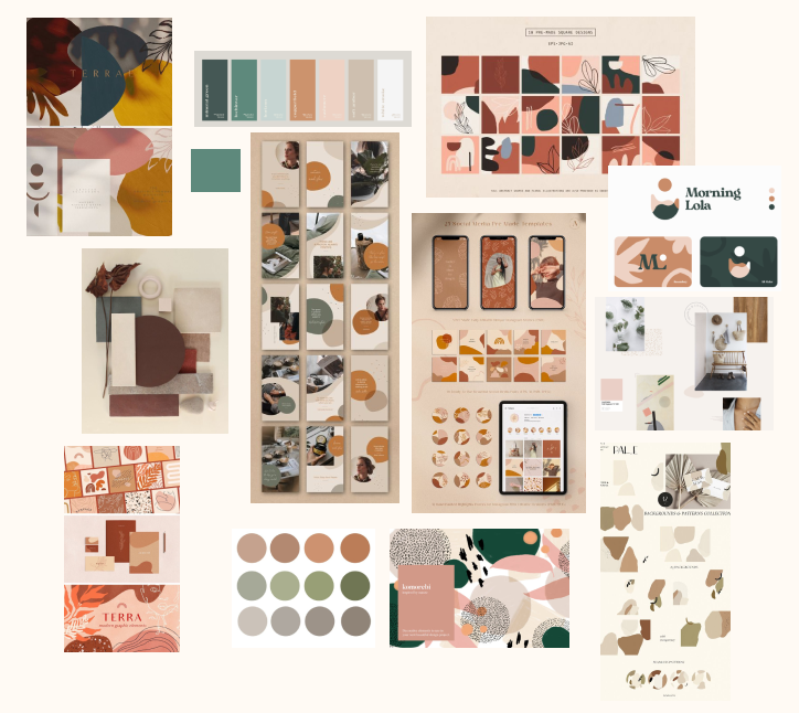
Having set the limitations for the brand, I went onto explore the ways in which the brand could communicate its values and personality through key design elements such as colour, illustration, composition and typography.
Colour
The illustrations created a restful and calming atmosphere, not just through their organic shapes and patterns but also through their warm earthy colours. Both the shapes and colours worked holistically to create an overall relaxing tone.
Style
Warm
Neutral
Earth tones
Hints of Green
Why?
Warm colours such as brown, neutral and earthy tones create a calming and relaxing atmosphere
Balancing the lighter tones with dark green will remind the user of the brand’s values of being environmental and sustainable
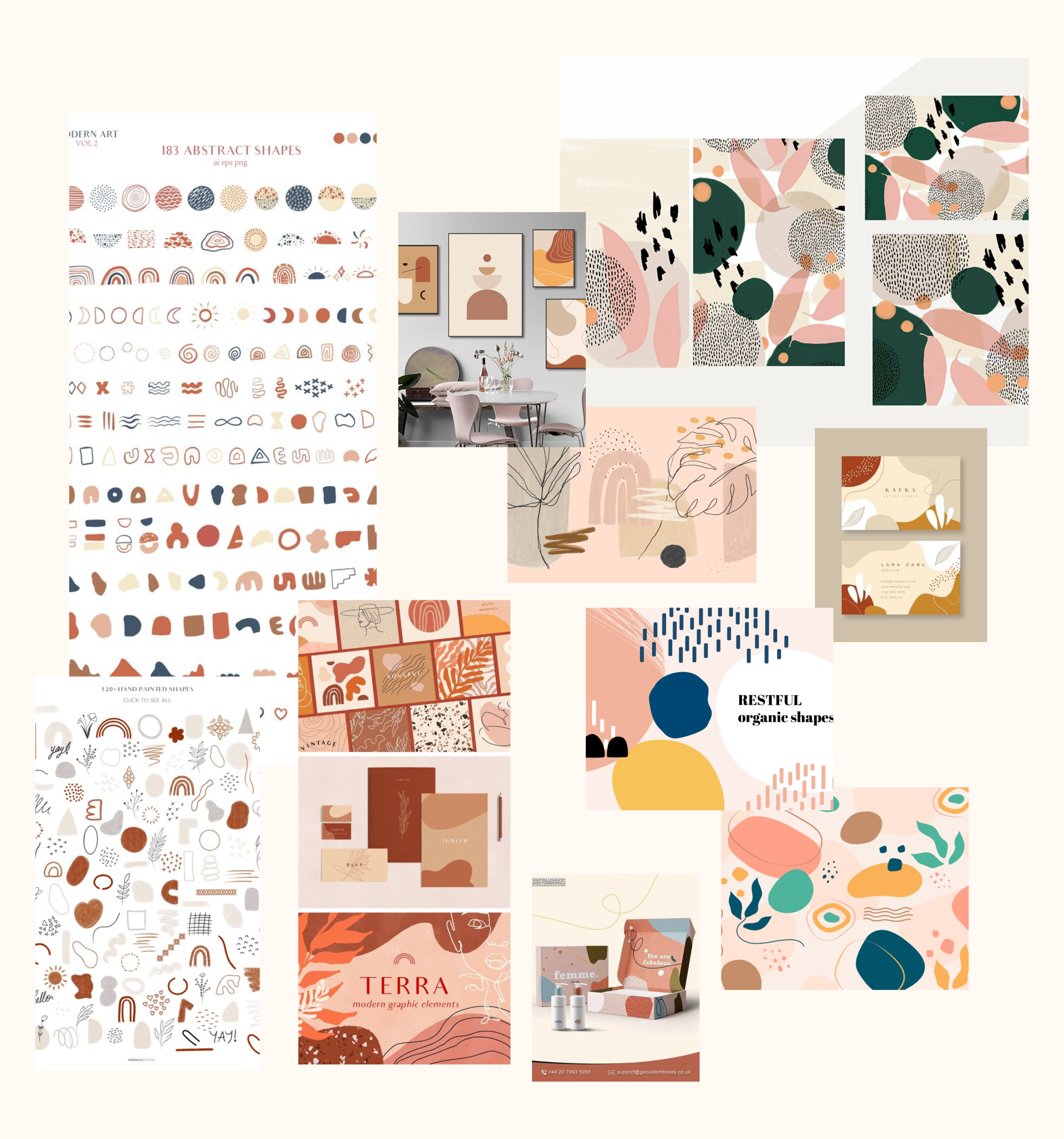
Illustration
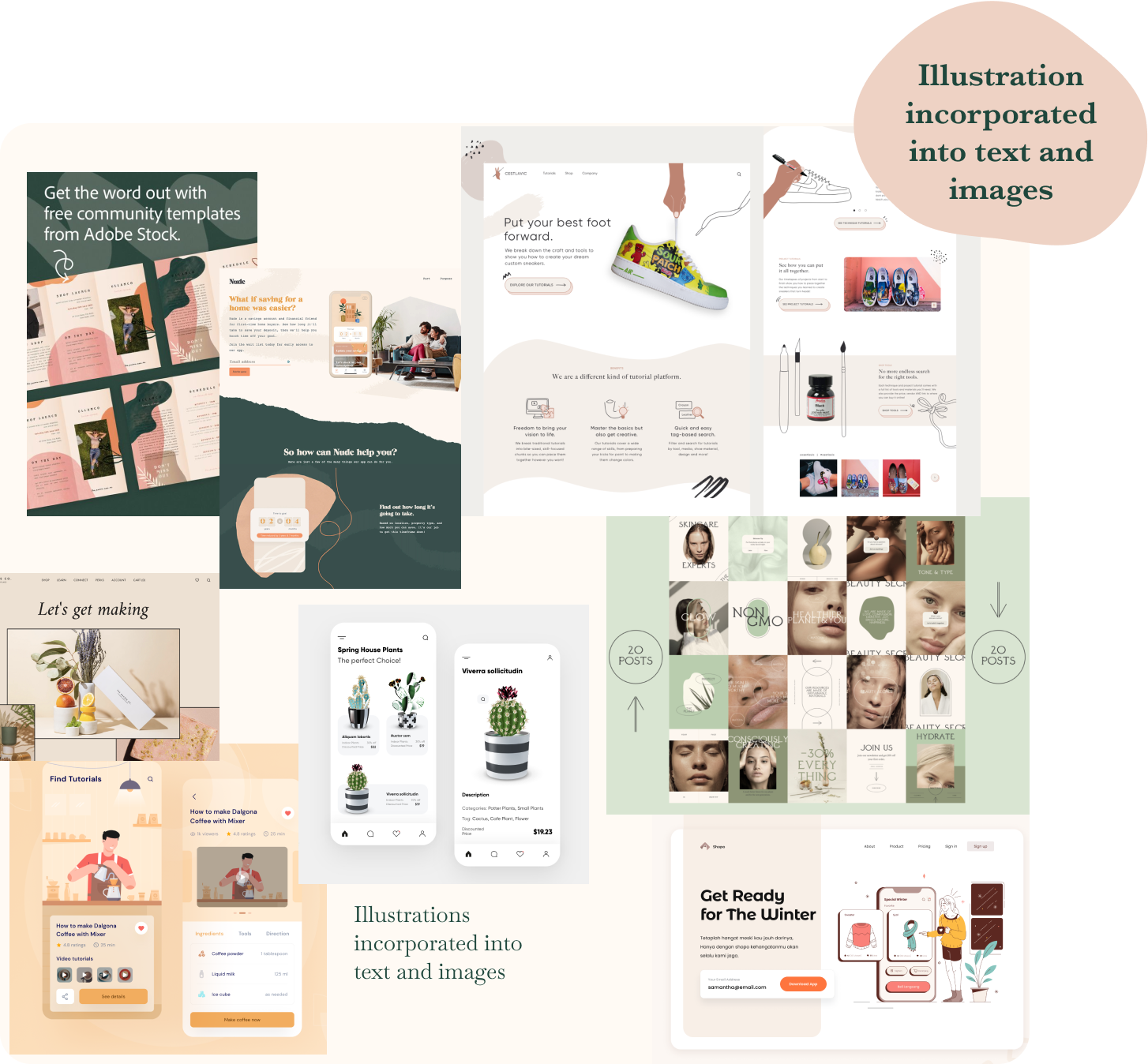
As I continued to build mood-boards, I found that simple illustrations were often used to frame call to action areas and help break up bodies of text. They helped create an engaging interface that is informal and friendly whilst ensuring the content remains digestible.
Style
Sketched line drawings
Abstract & Organic Shapes
Simple and Repetitive Patterns
Why?
Line drawings will help create a friendly, approachable and informal tone whilst being minimalistic and not distracting.
Simple lines remind the user of wool and yarn, emphasising creativity
Organic and abstract shapes align with the brand's values of being natural and eco-friendly
Simple repetitive patterns are reminiscent of knitting patterns and stitches
Composition
Style
Simple
Modern
Minimalistic
Why?
Simplicity will help keep navigation clear and direct
Using a modern style will help express the brand's core value of youthfulness
A minimalistic design will allow the app to exude a sense of calmness and mindfulness
Typography
Composition, Illustrations and Colours were not enough to reflect the brand's values and personality. The typography was also a key factor which determined the overall tone of the app.
Style
Simple
Clean
Classic yet modern
Why?
Serif fonts for headers and subtitles help create classic look and feel with rustic undertones, reminding the user of natural & organic products the company uses and their values regarding sustainability.
Balancing the text with Sans Serif fonts for the main body will help maintain a modern and youthful feel.
Creating mood-boards for each element of the interface allowed me to consider each visual aspect in-depth. This was crucial, as every characteristic would need to holistically work together to communicate the brand's overall personality.
Designing the Brand
Ideating
Using the mood boards I began ideating my design concepts, creating quick sketches to test various ideas.
Accessibility Tests
Having chosen the concepts for each page, I then went onto develop the sketches further by digitising the concepts on Figma. This allowed me to explore and experiment with various colour and text combinations.
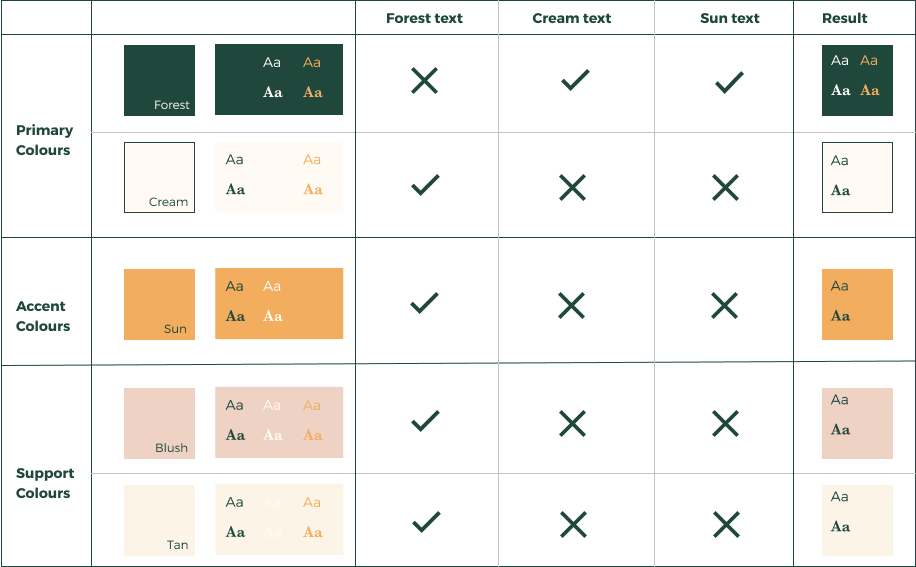
Alongside my design experiments, I ran some accessibility tests which ensured my final design was accessible and usable to both normal and colourblind users.
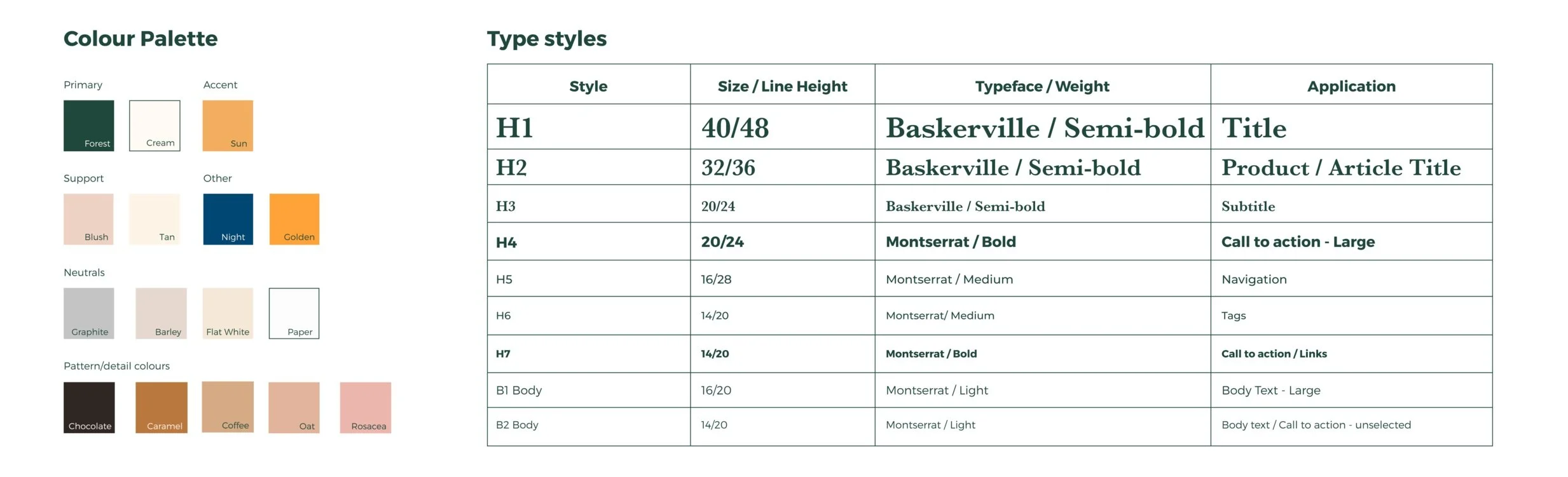
Style guide
These tests helped finalise my style guide and product.
What I Learnt
Before I began designing, I tried to finalise my colour palette by applying colour theory but staring at a colour wheel ended up causing more confusion.
How could I finalise my colour palette if I didn't even know what my design looked like and what elements would go where?
In the end, what worked best for me was going back and forth between practice and theory. Through practice I was able to put the colours into context whilst theory guided me and kept me from going overboard with my explorations.
Any good design process involves the seamless combination of both theory and practice - and this is what made my design process less challenging, more enjoyable and successful.